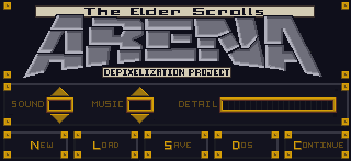
Tag: ADP

  • Line them up and knock them down

    Start strong

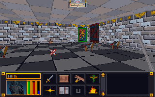
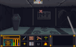
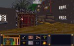
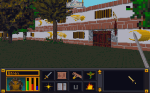
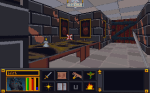
    As I have stated in the past, one of the most taxing aspects of editing the TES:Arena textures is coming up with a unique take on the image within the constraints of the limited pixel and color count. While I was thinking about my methods and ways to be more efficient, it occurred to me that I don’t appropriately leverage my motivation. For the last 1 1/2 I have been working one texture at a time. This would exhaust my creativity for the day too quickly. I would waste a bulk of my time “finishing” said texture after I decided how I wanted it to look. All of the “fresh mojo” that I had when I started for the day was worn away by the time I got through a few (sometimes one) SET files. This is especially true with the most of the remaining SET files that have no defined look or image (i.e. barely recognizable as any thing but random colored pixels).  Not only was that detrimental to the quantity of work completed in any one sitting, but it also deterred me altogether. There were days that I just didn’t have the energy or initiative to try and figure out a new take on what looked like white noise so I just wouldn’t decide to spend my efforts elsewhere.

    Shotgun effect

    To better capitalize on that “creative fronted”, I tried an experiment. I loaded up 18 SET files in GIMP. Then one by one, I worked on just getting the look I wanted for a small portion, enough to establish the look. I didn’t waste time completing the whole texture as that is really the easy and mostly mundane part. It worked quite well. Using this method, I was able to solidify my design for 16 SET files in just one day (really just a couple of hours). As I said the design is the hardest part with this project, and I wiped out almost half of the remaining SET textures left. Now, if I don’t feel particularly creative but still want to make progress, I can just finish up some of the ones I have already started (template on itself) and if I do…I may just be able to finish the other 16 or so.

    – Martin

  • Kicking down the door

    Interior doors


    Last week when I was lacking of motivation to work on the walls sets, I decided to fiddle with the interior doors and more specifically the wooden doors. Those are the ones that connect rooms and hallways and not ones leading out of buildings or dungeons. These particular doors are one single texture that is a door (the entry exit ones have borders that match the interior walls). That door occupies one square of dungeon space (all dungeons are square chunks of one texture). While in-game it appears that there are only two or three different wood door textures, there are actually over a dozen. It’s just that there are only 3 different  textures among them. Here’s a sample of one image among multiple IMG files:

    5 Doors don’t have to equal 1

    What I don’t understand is why Bethesda used multiple files with the same IMG when space and memory was a concern back then. They could have easily used one file through the INF files (the ones that decide what textures to use on each level). However, this does give me an opportunity to add some variation to the ingame art. As such, as with walls and etc., I will make each door appearance different.


  • Where is Bob Ross when you need him?


    Color balancing

    After wandering around in the game, I started feeling a need to go back and tweak some textures. I was just not happy with some of the combinations. Sometimes it’s just best to strike while the inspiration is strong. So I have spent quite a bit of time adjusting colors, cleaning up some of my more “questionable” decisions, and generally making them all play a little better together. I especially tried to tone down the floors and ceiling so they don’t clash or draw away from the walls. Some of the texture combos are much easier on the eyes now. For some of them, I removed the splotches or other weird marks that I had left to stay close to the original…the resolution/texture sizes are just to low to be that craz…er creative.

    Breaking away

    I have stopped trying to adhere strictly to the source material in interest of keeping the textures unique and fun. Additionally, I plan to add some “detail” to the wall sets that are just a group of plain walls  (e.g. a small object on the wall). I want each wall image in a set to be unique but I’ll be sure to keep unadorned walls too to balance the aesthetics.


    Floors darkened to not match the tables and added minor definition to the ceiling
    Floors darkened to not match the tables and added minor definition to the ceiling


    Removed splotches and added shelves
    Removed splotches and added shelves


    Floor tamed, darkened walls and trim at top to better see the gold (now just need to do the ceiling)
    Floor tamed, darkened walls and trim at top to better see the gold (now just need to do the ceiling)


  • Strange times at Septim High

    Ingame appearance

    As I have worked on several games, I have noticed various oddities. I have covered one before: unused assets. However, there are a few others. In the game TES:Arena, most SET files are reserved either for walls or for floors. The exception is this one:

    WALLC

    Which gives us the below separate ingame dungeons:

    So far, it’s the only SET file to do that. Not sure what happened or why it’s like that. The main challenge with is that while I liked it on the floor against the dark walls, I don’t care for it as a wall texture. I’ll have to go back and tweak/balance it later.  In theory, with further modding of the INF files (they determine which art files each level uses), it can be made so that a different file is used but I’m not inclined at this time to do that.

    Ummm…what

    Right off the bat, I’ll admit that my “working” copy of TES:Arena has been in use since I first started this project (several years now). It is now a Frankenstein-mess of my experiments. I expanded that executable file with an ancient program, expanded all the resource files, installed “WinArena” over top, fiddled with the INFs, etc. So I don’t know if the weird things I see in the game are my fault or not (easily enough to verify but I don’t really care that much).

    I even had a very odd problem of an Imperial City textures completely changing from one style to another. I just walked into a mages guild and came out to a completely different looking city. I wished I had made a video of that weirdness.

    -Martin

  • RETRO POST : The long road to Arena

    Why Arena?

    *This post was originally drafted in 2012 but never submitted. I have revised and updated it.

    The next brief diversion was an even older game called The Elder Scrolls:Arena. It is the first game in one of my favorite video game series and I did play this one a lot when it first came out in ’94.  I found a website that packaged it (and it’s sequel) in a neat, easy to install package. But, the low resolution graphics (320 x 200…trust me it’s very low) were so pixelly that it was hard to play and enjoy for me, particularly in the cities where anything in the distance was just a blob of small blocks.

    ArenaBox

    Mods?

    After some quick checking, I found that there were NO graphic altering mods out there. No one on the forums seems to think it was even possible. I found that hard to believe and felt the “challenge bug” nibbling at my toes. I wanted to find out how to do it. But I only got as far as checking how the files were stored (container file ending in .bsa). I did find that someone attempted to remake the game (didn’t get finished).  It claimed to allow you to extract the art file out of the BSA file for you. BUT in actuality, it converts them to a common image format that the original game can not recognize and thus was not a viable option. Due to real life busyness (yes I mean busy-ness), this too faded to the background. Eventually, I did come back to it later (much like Darkstone) and succeeded in extracting all the files (using a old program).

    You did what?

    Even though the image files were not in any common standard format, I figured out how to open them in GIMP (free editing software). This involved loading the images as RAW images with a offset header of 12 (think “ignore first 12 bytes of file”) and then loading a special palette files.  I could then save it as a RAW image. The drawback to this method was that for images that had the 12 bytes that needed to be ignored (all the IMG files), the saved image wouldn’t have those bytes. That meant that I had to (BRACE YOURSELF) open the file in a hex editor (think super nerdy ), copy all the bytes, then open the original file and paste the copied bytes over starting at byte 13.  Then, I tossed that file in main file directory as the game. The only way to see how it worked was to load the game and look for the texture.  It was a overly cumbersome process that eroded my enthusiasm and by the time my “interest” (i.e. attention span) waned, I only completed 8 textures.  Although I moved on to a different project, I came back once in a while to do a texture or two. I deluded myself in thinking that over time (probably decades), I would eventually finish it.

    Progammer in Shining Armor

    It wasn’t until Hallfiry released his “Arena Modding Suite” that the project took off in a major way. His tool not only unpacked the entire BSA resource file (BSA = Bethesda Softworks Archive) but converted most of the textures into PNG files for easy editing. Afterwards, it could be used to “repack” the BSA easily without destroying the “working folder” and converting the files back to the original format. Besides some textures that used a funky compression, it had removed the technical barriers to changing images in the game. Now to date, I have completed 126 of 172 SET files (wall texture sets) with 12 additional ones that aren’t even used in game. The two biggest challenges for me now are: making unique interesting textures that work well in game (after having already made 126 of them) and figuring out how to do some of the more organic textures to match my style (since the pixel dimensions are very limited). 64 x 64 does limit the amount of creativity I can use.

  • Sometimes the baby is just ugly

    Wandering the land

    I spent some time this week searching in-game for textures yet to be done using a pre-edited overpowered save file so I could roam unimpeded. I looked for dungeons, cities, wilderness, etc. that hadn’t yet been retextured. The side effect to this is that I found places where the textures WERE done but I had never seen them in-game or at least not in combination with other textures. From this I learned that some textures don’t work as well in-game as I hoped.

    Proud Poppa

    However, there are many that I feel are just right (or close enough for me to be happy). These I feel keep a unique appearance AND work well not only for their intended purpose but also with other textures. For example:

    Avert your eyes

    Of course, they all can’t be winners. I expected that I would have to go back and tweak later, but some textures combos were just horrible. To be fair to myself, I had two limitations: one, I was trying to make each texture unique and two, some textures were awful to begin with (one of the mage guild textures is a complete mess). These will be easy to tweak up though as all the hard work is already done.

    Dirty walls and floors

    I have starting tackling some of the vague pixelly mess of some wall and floor textures that I have been avoiding. The limitations on resolution and colors will probably force me to deviate from “source” more than I care but it can’t be avoided. There are so many in the DW series alone (A through S). The reason I started looking for textures in-game was so I could see the context in which the textures were being used.

    – Martin

  • Quick Before and After

    Here is the before and after for the in-game menu. I probably should have shown it more clearly in the last post (and the video). Overall, I’m very pleased with it.

    – Martin

    OP (original) OP (new)

  • One texture to rule them all….

    In-game menu

    I’ve held off on doing the in-game menu because I didn’t feel the necessary inspiration to tackle it yet. For me that texture is the face of the game; the one the player sees most often and serves as a sort of “anchor” for the player. Another factor may have been that I knew I would end up spending several hours on it to get it just right. Going in, I knew I wanted to keep the ARENA word at the top in roughly the same shape but with a much cleaner design and that it needed to be similar to the HUD on the main screen. That covered most of the core design and all I was lacking was gumption.

    Once I finally found the urge to tackle it, it didn’t take long for my mojo to kick in. I knew that although I only had 75% of the design mapped out in my head, the other 25% would either come to me while I was editing or result from trial and error (that’s my favorite part anyways). Although I sped this video up twice as fast as the last one, you can still see spots where I paused to consider how to continue and where I changed my mind or adjusted on the fly (very evident with the Save, Load, Quit buttons on the bottom). In the end, I even found room for the project name!

  • Pixels….so many pixels

    Project statuses

    Minecraft

    At request of my son, I had resumed working on PinkertonCraft, my Minecraft mod. Although almost all (99%) of the original game textures are complete, I don’t want to release till I complete the art for the mods my sons use. Most of those are complete but a few are quite large. In fact, one mod called Divine RPG has almost 4 times as many textures as the original game. I have used most of my time since August working on it and am about 70% done with that.

    One thing I noticed with a lot of mods (and even “vanilla” Minecraft) is that many textures are the same except for the color. For example, all the “rugs” in the Divine RPG mod were just the same bland texture in a different color. Mods are especially bad about this. Divine RPG has many “dimensions” but in the original art set, they were all the same texture but in different colors. I have strived to avoid repeating textures in such a manner unless it made since (i.e. colored wool or glass). So for each of the dimensions, I tried to give them as unique a look as possible. I apply the same principle to the “mobs” (i.e. monsters). If the game has 7 “golems” then I want them all to actually look different and be distinct.

    (Click the pictures to see how they look different now)

    Arena 

    I had made a lot of progress before I switched back over to the Minecraft project. I have completed 102 of 184 set files. I should note that like many other resource file packs, Arena is chock full of unused files or files that were started and then switched to another format. I can think of 5 SET files off the top of my head that aren’t actually used. They are all ground files that Bethesda switched to IMG files (that I have already completed). A lot of the remaining SET files are less linear and more organic. Because they are base on 64×64 pixels, they require more creative approaches. I will start planning out how to handle them soon.

    Website

    I have been wanting to finish the website. Currently, the only thing linked are pictures. I need to add a Minecraft category and add to all the other categories. My goal is to have the site fleshed out in time to coincide with the release of PinkertonCraft (hopefully in October).

  • Easy doesn’t always equal quick PART ONE

    Editing the “easy” Arena SET files

    (remember sets are several images tiled into one)

    I mentioned that right now I’m “mostly” focusing on doing the easier images in Arena’s SET files. By easier, I mean contain simple angular designs that have minimal curves and diagonals. Why? The reason is that with these extremely low resolution art assets (most tiles are only 64 pixels by 64 pixels), curves and diagonals don’t look like smooth straight lines. With my Minecraft project (PinkertonCraft), I expressedly made almost ALL the art clean linear horizontal and vertical line combinations with no curves even implied.

    Unlike that project, in the ADP, I simplified most curves and diagonal lines but did not eliminate them. My goal with this project is cleaner textures but not abstract images.

    Palette Files, oh my!

    The first thing I do with an “easy” texture is try to picture the rough color scheme that I want to use. Since many of these type of images are brick or stone walls, that means deciding the color of the bricks or walls. I gauge if I am going to want lighter or darker colors from sight and then decide which color(s) already existing in the image to use. I have two reasons for doing this: the first is that it helps maintain a little integrity to the original unmodified image and second, it removes the issue of colors being changed when imported and converted to the original palette colors (the import tool approximates to the closest color if one doesn’t match a color in the palette file).

    The base palette of colors most Arena images use. Each image contains a single reference point per pixel to this file rather then the using the standard 3 numbers ranging individually 0 to 256.
    The base palette of colors most Arena images use. Each image contains a single reference point per pixel to this file rather then the using the standard 3 numbers ranging individually 0 to 256.

    NOTE: Arena uses a palette file for images. This means that exact colors for each pixel are found by referencing a separate file (palette). Consider a palette file as a real hand held paint palette: like a painter, Arena draws/paints it’s images using the colors from the palette. The whole reason to do this was to save space on the disk which was a concern in the early 90’s.