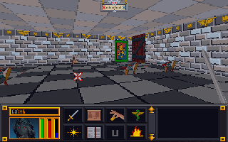
Color balancing
After wandering around in the game, I started feeling a need to go back and tweak some textures. I was just not happy with some of the combinations. Sometimes it’s just best to strike while the inspiration is strong. So I have spent quite a bit of time adjusting colors, cleaning up some of my more “questionable” decisions, and generally making them all play a little better together. I especially tried to tone down the floors and ceiling so they don’t clash or draw away from the walls. Some of the texture combos are much easier on the eyes now. For some of them, I removed the splotches or other weird marks that I had left to stay close to the original…the resolution/texture sizes are just to low to be that craz…er creative.
Breaking away
I have stopped trying to adhere strictly to the source material in interest of keeping the textures unique and fun. Additionally, I plan to add some “detail” to the wall sets that are just a group of plain walls (e.g. a small object on the wall). I want each wall image in a set to be unique but I’ll be sure to keep unadorned walls too to balance the aesthetics.


Leave a comment