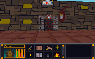
Tag: Art

  • Blakestone HD textures sneak peak

    Blakestone HD textures sneak peak

    Recap

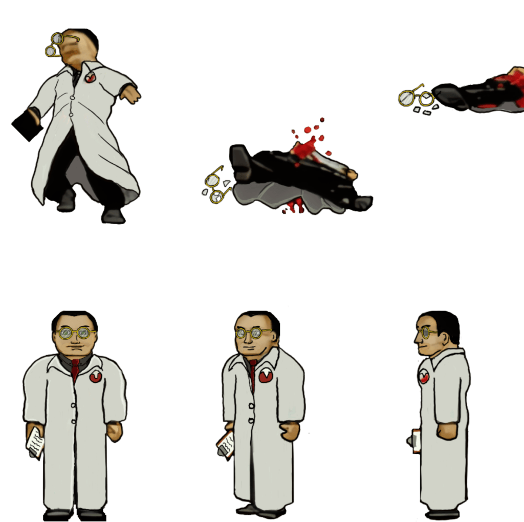
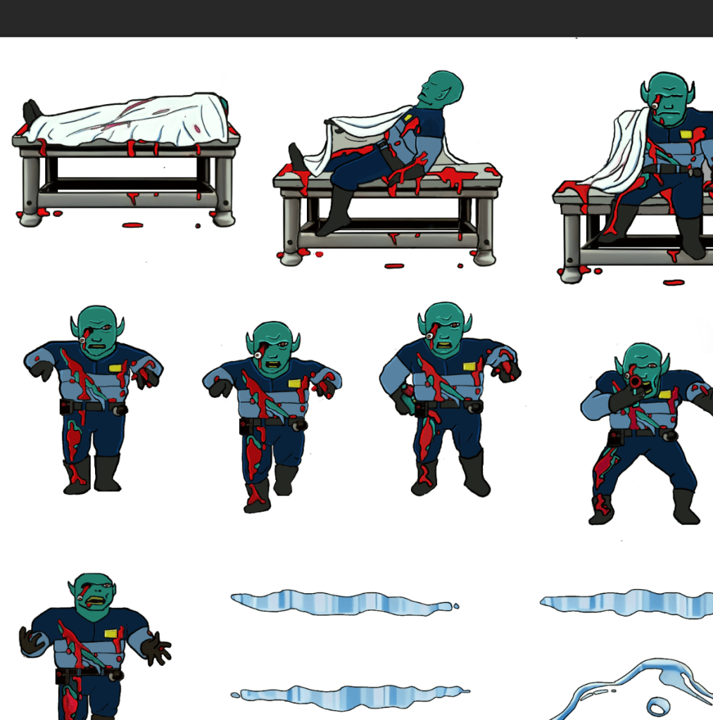
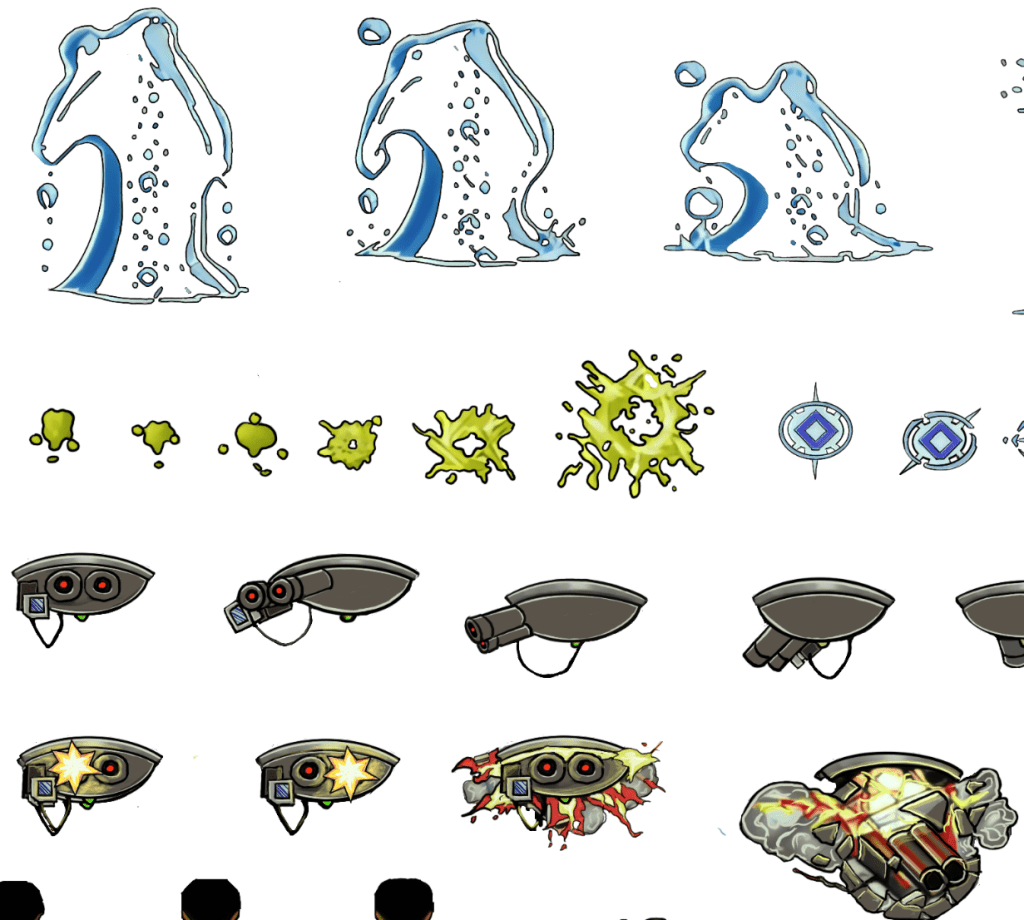
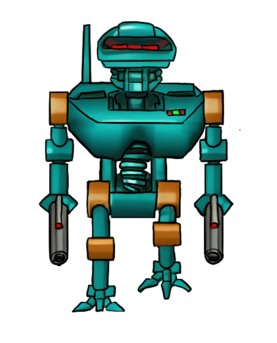
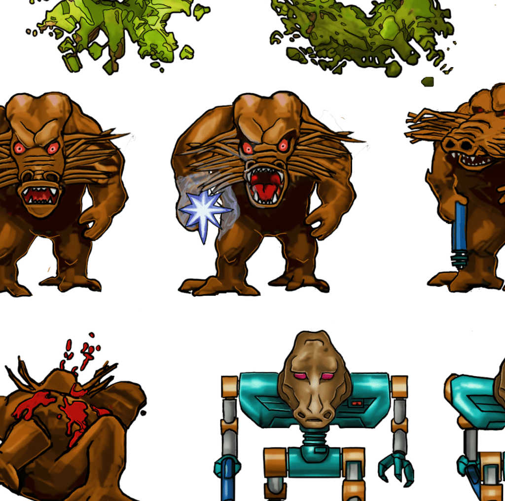
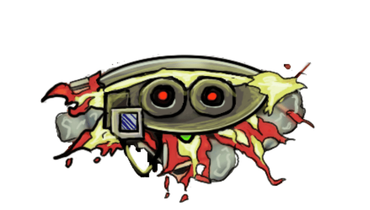
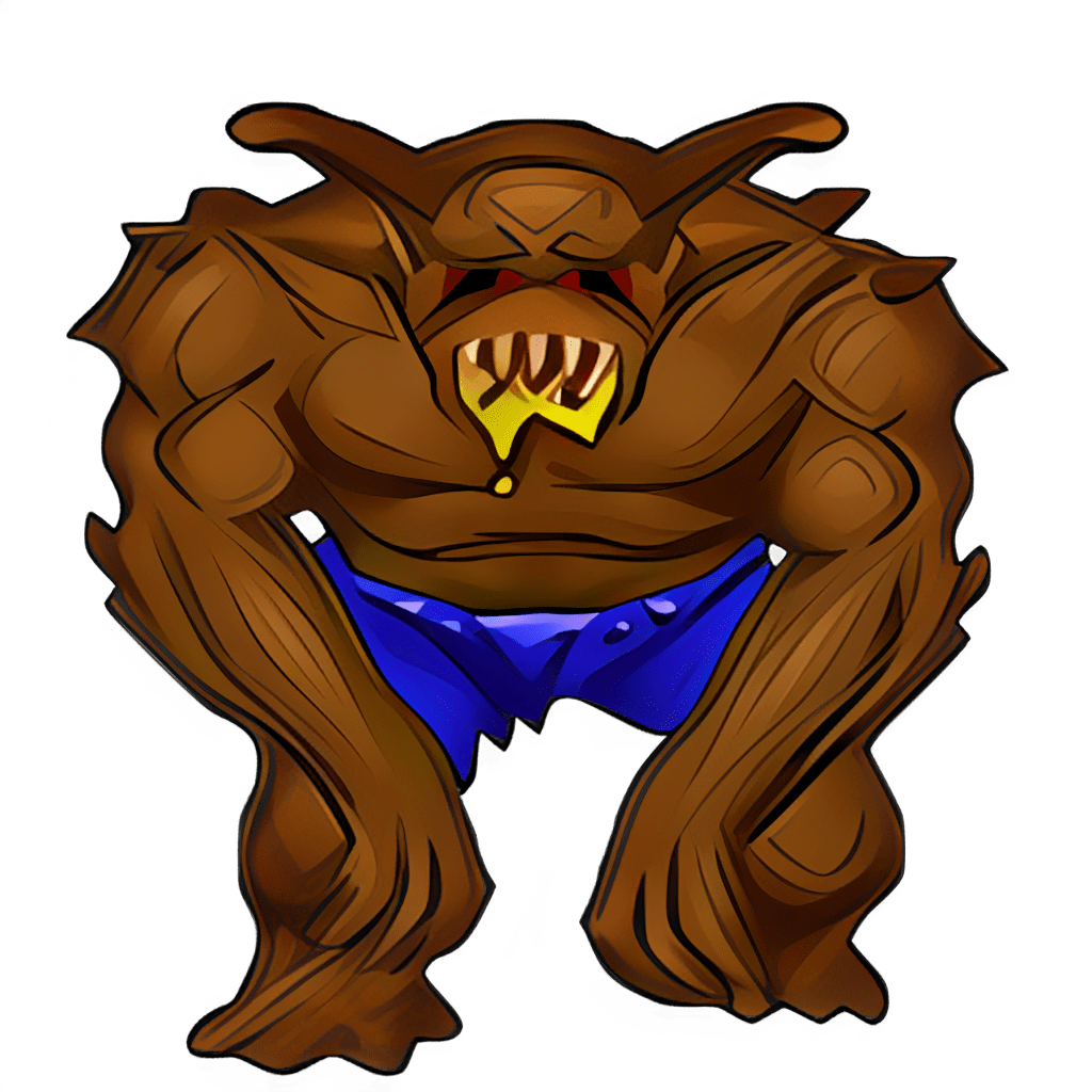
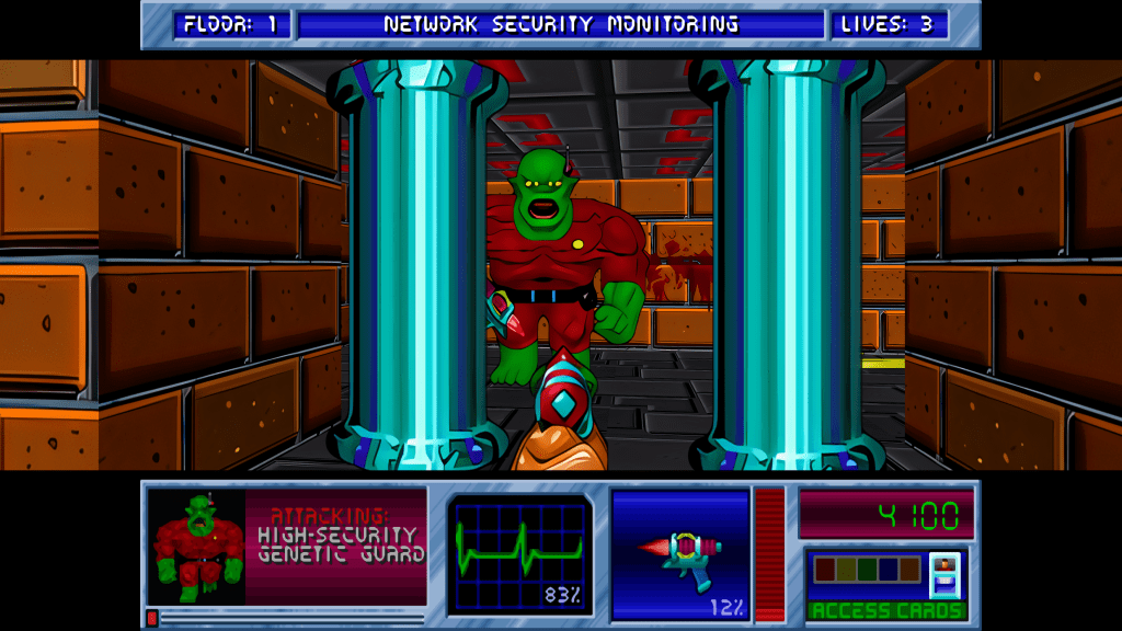
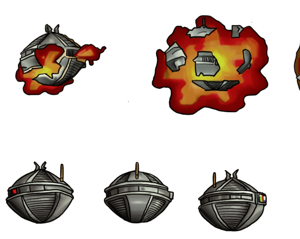
    I have been working on remastering the textures from Blakestone on and off for several years now, initially dumping and light upscaling them for ease of redesign. From there, I started hand drawing over the old textures adding detail and transforming a blurry pixel-y mess into what you see below.

    A key goal is to maintain the spirit of the original pixel art and only add detail that enhances or complements the composition.
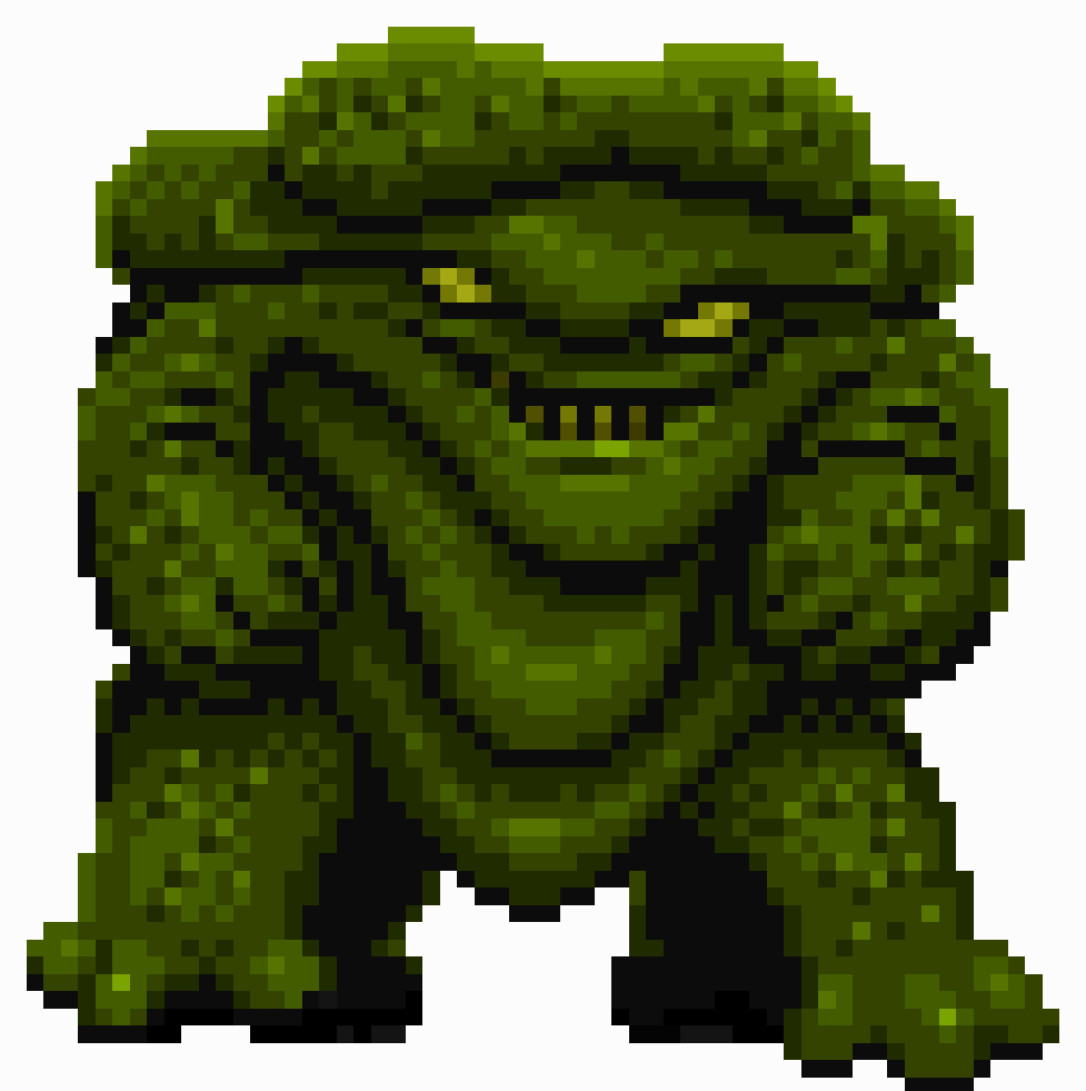
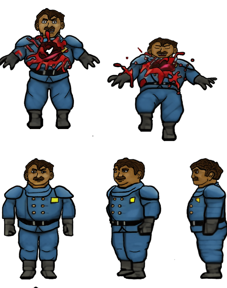
    The human NPCs are a pain in my rear

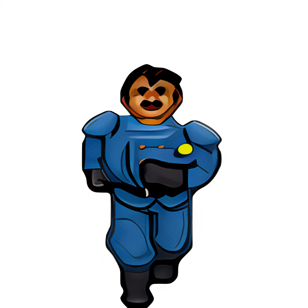
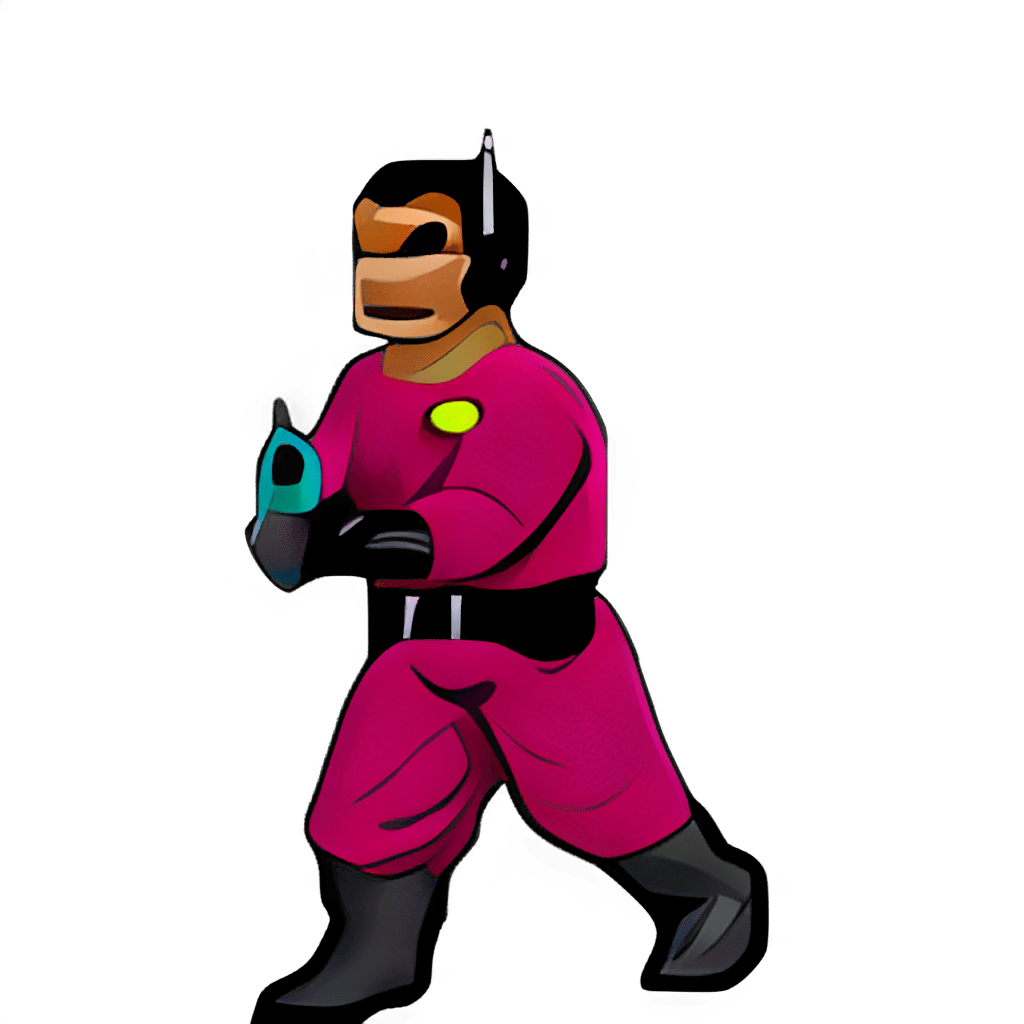
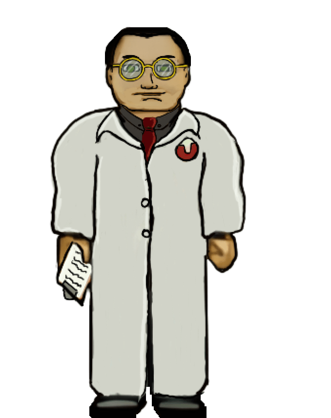
    Some of the images, such as above, are fairly straightforward and are easy to interpret for the new design. However, some of them aren’t the greatest in the original format or so low resolution that they require more creative effort to bring to life. The scientist’s face, for example, was a blobby mess that lacked defined detail in key places. I had to envision what the new one would look like and that too a lot of back and forth experimenting to get the vibe I wanted.

    Setbacks

    I do most of my work on my IPAD. I somehow corrupted a couple of my sprite sheets that I had already completed (but like a dummy hadn’t exported yet). That was about 150 completed textures (several of the monsters) of the thousand or so I’m redoing. It was a brutal motivation killer. I had to put the project aside for a while till the pain of it faded and I regained motivation.

    Now

    As with the TES Arena Depixelization Project (ADP), I’m slowing picking steam back up. I am also long overdue for a few sneak peaks. Please note, that these are still alpha. The combination of trying to keep the same shape and vibe of the amateurish looking originals and the fact that my versions are drawn on the IPAD “look” may seem slightly not ready for primetime (i.e., like a kids notebook drawings) but I have some post drawing steps to take to up the quality some more.

    SIDE NOTE: Some of these monsters are incredibly terribly designed. I wanted to change a few because of how childish they looked but decided to stick to the original version. So the goofy monsters are still goofy.

    Progress

    I have quite a bit done, most monsters have been completed or final designed. The initial security NPC is done, the scientist is 1/2 the way complete, but the other three are still pending. All miscellanceous textures are complete. The walls will be last but are the least difficult to fix.

    Enjoy

    Martin
  • ADP lives….yet again…well, technically it never died.

    THE RIGHT NOW

    Let’s just ignore the fact I haven’t posted in quite a bit (or that I started this project 13+ years ago). To be fair, I have released three other Arena mods in the meantime (more on that in the future).

    I recently started digging back into the Arena Depixelization Project (ADP), my graphics replacement mod for The Elderscrolls: The Arena, and I have been hitting it hard.

    I’m doing a recorded playthrough looking for missed art in the game and general quality control. This has led to me not only finishing missing textures but also tweaking (and sometimes overhauling) 90% of the work already done. I guess over 13 years of game art fiddling has matured my style slightly.

    THE SWAMP

    I first had to corral all my work over the last decade+. I had 7 different versions saved through the year and some files went missing so I had to extract them all compare and then pull any missing forward. This project was quite a mess (no file discipline at all, the shame). Then I had to relearn the tools, but that didn’t take too long. Then I created a new working directory and archived all the rest to clean up my sloppy work.

    In just 2 weeks, I have probably edited almost 100 textures already. As I record my playthrough, I save when a missing (or ugly/mismatch) texture is found and either fix it ASAP or catalog a bunch at once to do in a surge.

    GALLERY

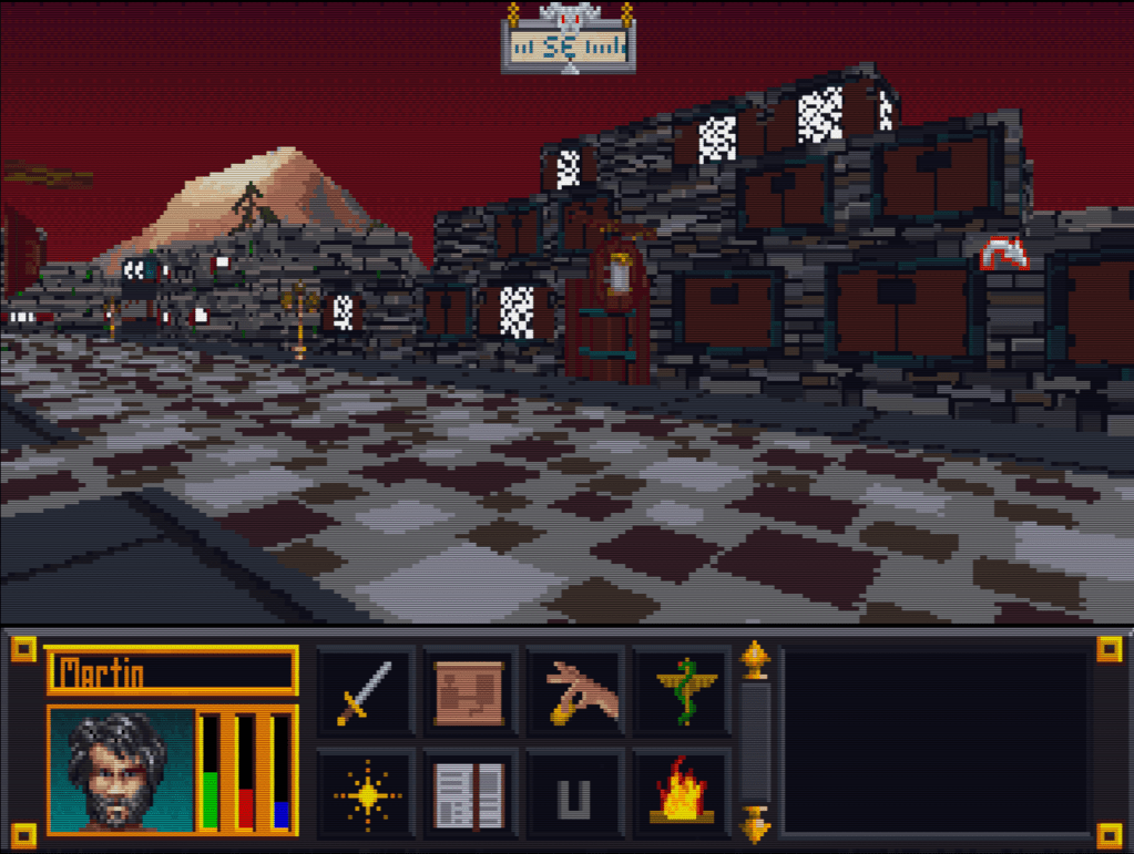
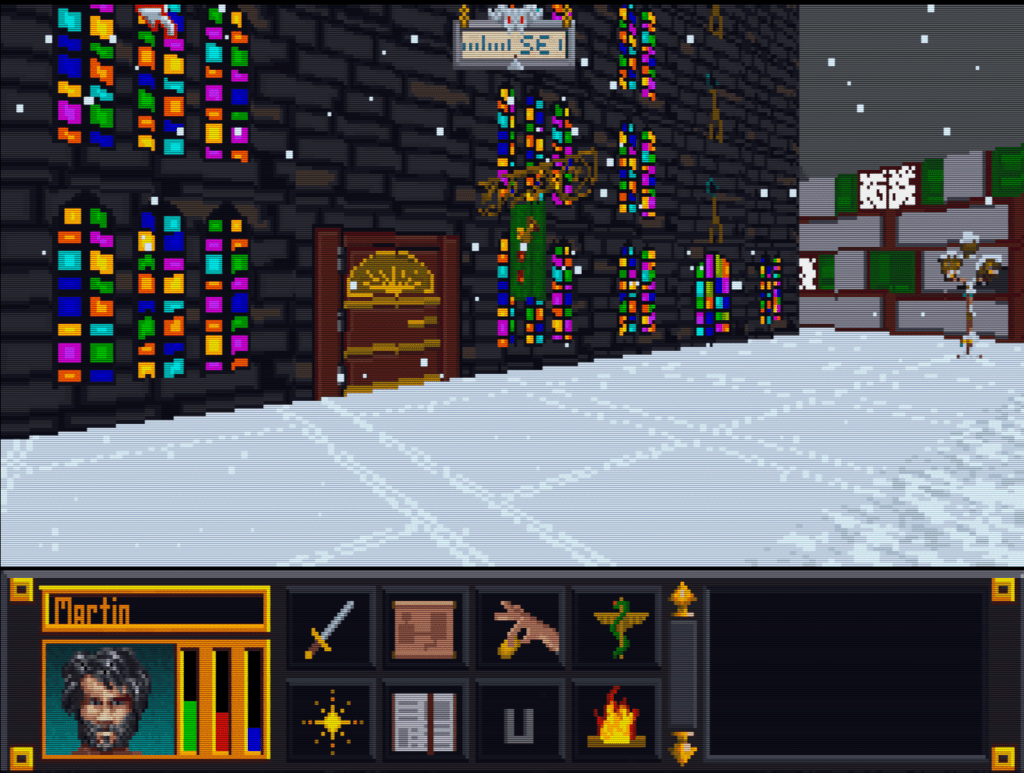
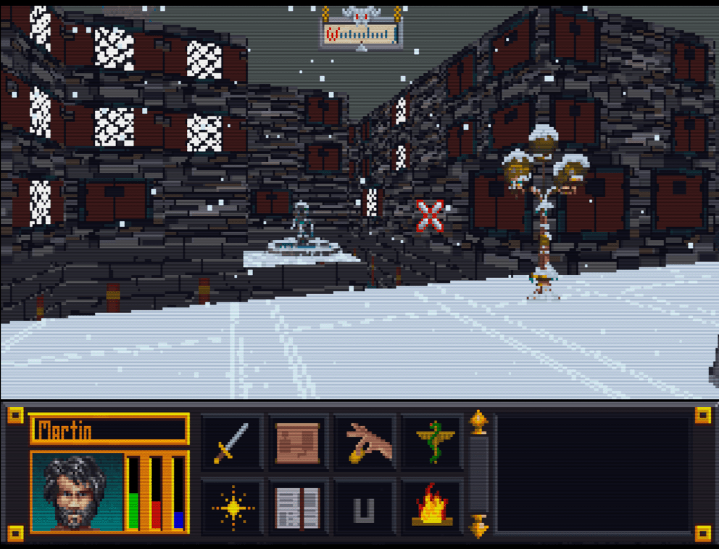
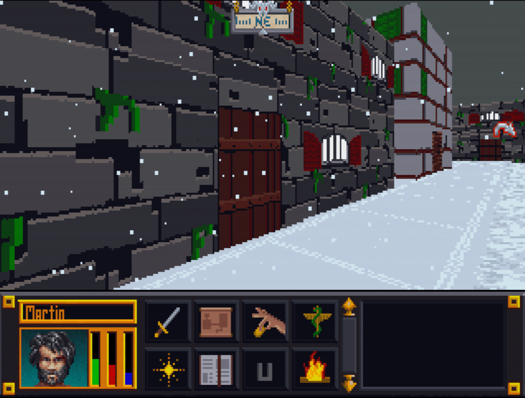
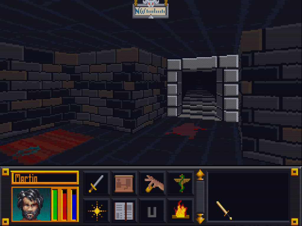
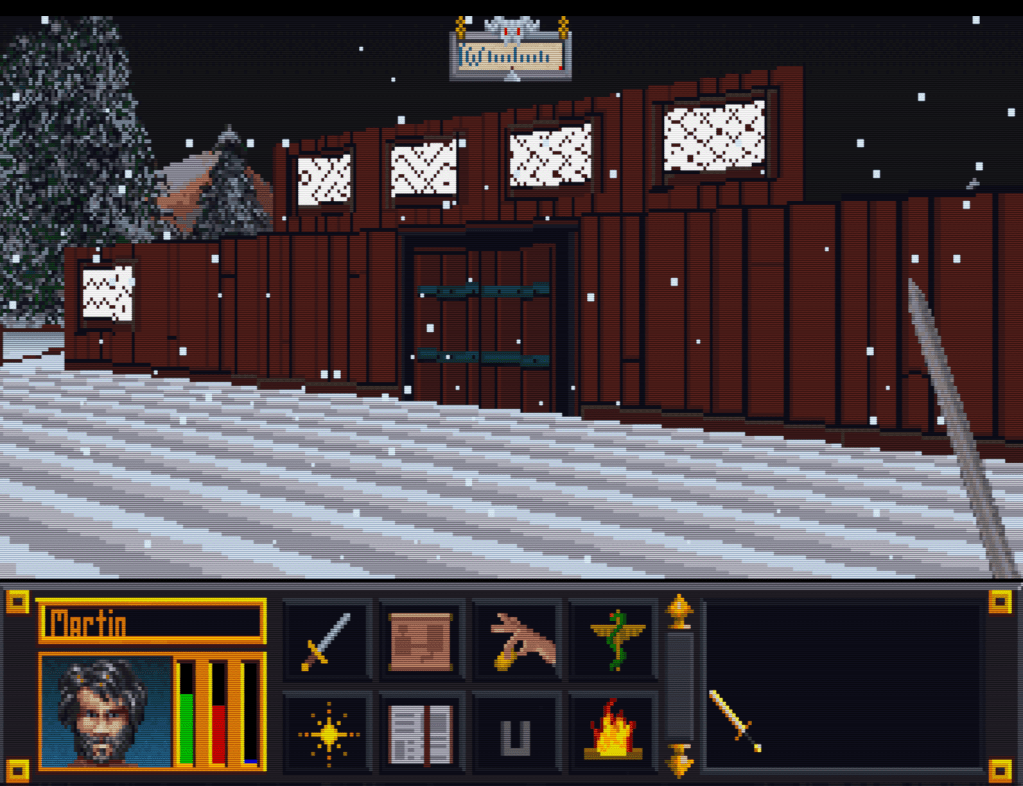
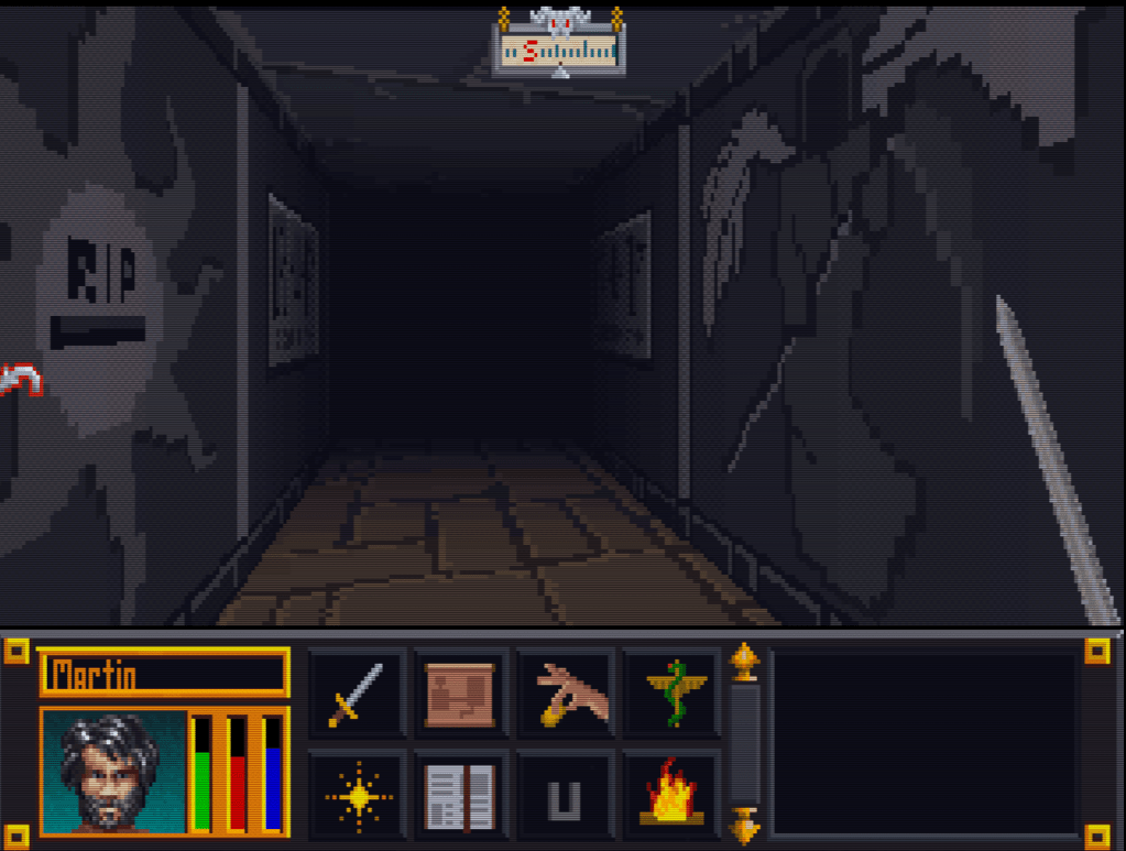
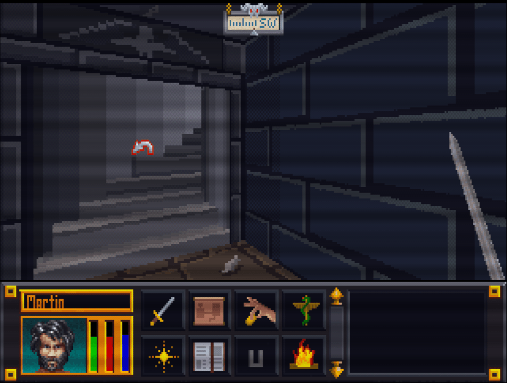
    Here’s a slew of screenshots I made from the most recent version.

  • Blake Stone gets a glow up (PART 3)

    InGame

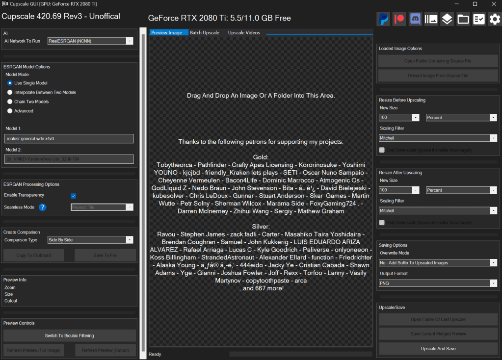
    Now the naming and image dimension issues have been resolved, so I loaded the game and it worked perfectly! Drunk with power, I ran a quick and dirty (i.e. impatient) bulk upscale on every texture just to get the payout of seeing that high resolution quality in gameplay. I wish I had a picture, but I don’t sorry. So you’ll just have to settle with one of my test pictures. The ultimate result of that initial effort was a messy, uneven upscale that wasn’t very good.

    WTF is upscaling?

    I’ll take this hot second to address this topic for those not in the know. One of the first “AI” booms was image upscaling using an algorithm model called ESRGAN (it stands for something, but no one cares). There are many models now, but that one paved the way. Note, when I say “AI”, that’s really just the media branding of this technology because the technical stuff is not as sexy. It (and most of the current AI stuff) is nothing more than highly sophisticated pattern recognition software. You teach it what 200 apples look like in low resolution and high resolution. It learns that when it sees a low resolution apple what the approximate of a high resolution apple might look like and gives you that. See how boring that already got….hence “AI”.

    I use a program called CUPSCALE, which is a frontend for the tech behind it. It allows bulk upscaling, supports most common image formats, and allows switching between different models. Best part, it will install all the needed files (python and all things related) for you, so it’s as close to plug and play as possible.

    Almost a mod?

    I spent many hours trying different combinations of upscale models. Finally, I settled on a workflow that best accomplished the cartoon look I wanted. I started with 1X upscales (meaning no change in size) just to clean up details. I focused on de-dithering, which was often used in old games and extremely low rez art, and sharpening detail a little, so colors weren’t bleeding as much (refocus model). Then I scaled it by 2X using 4XNickelBack model and reducing 50% afterwards. After much trial and error, I found this was the best option for Blake Stone art as it was the least destructive to the essence of the picture. After that I hit them with a couple rounds of a FSManga model to make them more cartoony, with a 50% resizing here and here. Ultimately, I ended up with game textures that were 6X the size of the originals that had a more cartoon appearance.

    UP NEXT TIME….A new mod is born!

    Part 4 will be about releasing my first full HD texture mod. But it doesn’t stop at Part 4 (wink wink).

    – Martin

  • “Extracting art from Blake Stone” is not a very funny title (Part 2)

    “Extracting art from Blake Stone” is not a very funny title (Part 2)

    Collecting Pixels

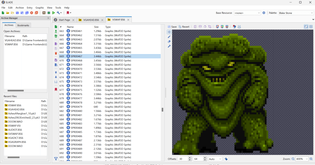
    Step one is figuring out how the game stores the art files (textures). Normally what I do is check for the largest files, as they are usually the texture and/or sound archive. However, with Blake Stone, I knew that this game used Wolfenstein 3d-style archives. Blake Stone’s format was slightly different and used the extension BS6. But it was close enough that Slade, a popular tool for actual Doom and Wolf3D games, worked perfectly to extract the files.

    FUN NOTE: I started this many months ago. I JUST noticed that BStone has a command-line option to extract textures. #facepalm #hashtags #DOH

    You may call me…”Tim…er… I mean SPRITE”

    The BStone program looks in the “aog” folder for any textures (Planet Stike has it’s own folder, “ps”). If it finds a texture there, it will use that texture instead of the original. Unfortunately, BStone only supports sprite and wall files. That means some elements can’t be replaced currently (mostly UI and cut scenes). For Blake Stone: Aliens of Gold, there are 1017 sprite and wall textures but there isn’t a folder structure. They all just go into that one folder which makes it easier to manage.

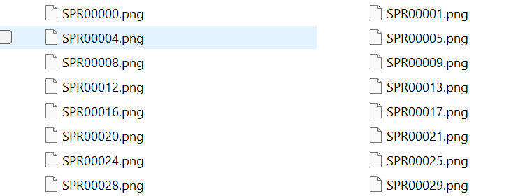
    I extracted all textures to a working folder and hit it with a quick and dirty upscale so I could check how it works in-game. After dumping them into the “aog” folder, I booted BStone and enabled “External Textures” in the option menu. It didn’t work. Turns out that the extracted files were names were very slightly misnamed when extracted (SPR instead of SPRITE, etc.). It was easy enough to fix with a utility called Bulk File Renamer. A quick touch up and I reloaded BStone to see if that fixed it.

    Stretching them on the rack (by rack I mean in Photoshop)

    It worked…sort of. The textures were definitely upscaled but many of them looked squished (skinnier than normal). Quick glance at the readme revealed that rendering of sprites was not 1 for 1 in-game.

    After a little experimenting, I realized that every texture just needed to be perfectly square. Maybe the extraction method was flawed, not sure. To fix it, I just made a quick macro on my Logitech keyboard (frequently my savior for repetitive tasks), dumped 100 or so textures on photoshop and ran the macro (it resized the canvases to be 64×64, saved and then closed the file). I just needed to hold down the macro button and let it work through each file. After finishing all 1017 textures, I saved a backup for the inevitable time I make a drastic mistake. (I will share the reformatted originals when I get around to doing Planet Strike)

    Up next time…..Version 1 of my Blake Stone HD texture mod

  • Tablet 2.0

    Tablet 2.0

    UpgradeHurion 650 Pro

    Over a month ago, the pen for my trusty Wacom Bamboo tablet (see first post ever) broke. This was quite disheartening as I love having an art tablet and it was hard to be motivated without it.

    After much research and reflection, I have finally picked up a new tablet: the Hurion 650 Pro. The great thing about it (besides the very positive ratings) is that it functions at the level of the middle tier Wacom products but only cost $79 US dollars on Amazon.  I can’t wait to take advantage of the added features it brings.

    Breaking it in

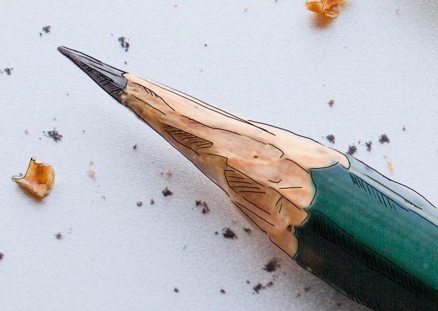
    After it got installed, I fiddle with my new toy using GIMP (side note: really tiring of using GIMP and its limitations). I was working on a homework project and had a picture of a pencil loaded. Just for fun, I attempted a very hasty and crude pencil outline of the pencil. It’s rough but I’m sentimental and it’s the first official drawing on the Hurion. I merely looked to trace the major lines and add some crosshatching…I wasn’t very attentive to keeping straight lines because this was more to test out the tablet than make art. However, I like it anyway.

    – Martin

    My first creation on the Hurion 650 Pro
    My first creation on the Hurion 650 Pro

  • Doors and Floors


    Get it together man

    Now that I have finished the “walls and halls”, it’s time to renovate the doors and remaining floors. I have finished almost all the ground textures though (well a few could used tweaked too). In the past, I just worked directly in the directory where I extracted the files and reinserted them into the BSA from there. However since there are so many IMG files (949 to be exact) and that isn’t the cleanest way to work from a project management perspective, I pulled all the door files out to a separate folder/workspace and created a completed folder to use for importing files back to the BSA.

    Tavern with old door art
    Must have ran out of paint

    Doors, Doors, Everywhere there are Doors

    There are 112 door files not including non-doors that would serve as potential transition points (e.g. ladder up/down, stairs, etc..there are about 12 of those). These IMG files come in two variety, framed and whole texture.

    I’ve been framed

    The framed doors are “framed” with the texture of the building to which they belong (e.g. the Mage Guild door has a frame art that matches the building).  To do these, I’ll just copy and paste a wall from the matching set file and layer it under the door so it’ll be a perfect fit with the rest of the building. All exteriors and some interior doors are framed doors, pretty much any door that transitions between outside and inside.


    That’s no small wall…it’s a door!

    The other type of door is the whole texture door. I have done a few of these previously as you can see in the screenshot. These doors belong to all the interior rooms and are the ones that swing open so you can enter a room. Although they are relatively simple (as they repeat the same textures over and over for different files), I’m hoping to add a little more variety to them.


    First things first though, I will test to see if each IMG file is used in game (i’ll probably do them in batches). I have already found several that aren’t. I will likely still redo them just in case. Worst case scenario, if I ever can get anyone to figure out how to decipher the MTF files, I will use them to make new dungeons and buildings.

    – Martin

    ,

  • State of the Blog 2016

    Went away

    I know, I know. I have been away for some time. 2015 was a very difficult year in the non-digital realm and some things had to slide to offset the stress.

    Came back again

    However, despite my my absence on this blog, I was actually quite busy on the graphic arts side of the house. I either oversaw or personally completed several projects for coworkers and friends. One of which, I am extremely proud of (more on that hopefully in a future post…i.e. one that isn’t written late at night when I should be sleeping).

    It’s all fun and games

    While I didn’t really work on the Arena Depixelization Project too much (it had to slide too), I was involved with design aspects for a couple of mods focusing mostly on 3D layout & set design and got some interesting practice on cooperative project management as a graphic artist/designer. I even every so slightly fiddled with 3D modeling.

    Accelerate to 88 mphs

    I have Photoshop now, guess I should actually work on learning how to use it.The problem is that I’m so used to GIMP, Photoshop seems downright alien to me. I imagine my warm up period will probably not be the speediest.

    I want to experiment a little with my art projects. I am thinking of “remastering” some of my very very early and juvenile (i.e. decades old) artwork. I don’t know how it will turn out but at minimum, it seems like a interesting experiment.

    Another similar idea I read about was to take kids artwork and reimagine it. I have a lot of that lying around from over the years and that just seems like a fun concept.

    I guess we’ll see what the year brings but overall I feel healthier happier and more like my old self. I miss my old blog…and I seem to hear a certain collection of 64 x 64 pixel sprites calling my name ;

    –  Martin

  • Is that 80’s fashion?

    The straight and narrow

    Some days I can blaze through images getting 5 or 6 done in a sitting, then other days just part of an image can take a couple days. When it comes to the Arena Depixelization Project (ADP), the easier ones are just patterns (especially ones with straight lines horizontal or vertical). The low pixel count doesn’t really muck up the design too much since there is no need for a “fine detailed” line in those cases.

    It kind of looks like….

    However, once lines start curving or the image becomes complex, the time required is increased, sometimes dramatically. It’s hard to get non-angular shapes to look good when you only have a 64×64 grid to work with. I find that it takes multiple revisions to get it looking just right. To make matters worse, the source material for ADP contains many pictures that are either so pixelated as to be barely discernible or they generally don’t look very good as you clean them up (such as dress thing for the “angel” in this picture).

    WALLA Untouched
    Click to enlarge


    Close enough for horseshoes and hand grenades

    In that image, I had to make some artistic decisions on how “accurate” to the source material I would be. The image is generally too complex to leave unaltered for my “Depixelization” theme. At first, I didn’t even know how to tackle it. I completed all the background wall first and left the “Angel” and the “alcove” till last. The good thing about that is that it let me establish the colors for the image. Eventually, I had to do this one as I only have a few SET files left. I decided to break it up and focus on individual pieces of the angel. I really wished I had made a timelapse of this one to show how much back and forth I did on it.

    Mr. Potato Head

    I started with the more clearly defined shapes, to include the arms, head, and the key. Those came into place with minimal fuss. Then, I tackled the wings. It took me awhile as the initial version (closer to the source) just didn’t look very good. After a couple of iterations, I ultimately decide to make the wings bigger as if they were more full body sized. Next, I attempted to do the feet. However, they just did not look good, especially when I started working on the weird “billowed” dress/robe. I decided to put the feet off and do the clothing. I touched up the sleeves to improve the “hanging off the arms” appearance. I made my first rendition of the lower part of the robe very close the source version. However, it looked terrible because the source version is kind of ridiculous looking, as if someone tucked an oversized shirt into a skirt.  I played with it a little before I decided to just alter the design. I revised it to look more like a regular robe. Unfortunately, the feet still looked awkward, so I removed them and lengthened and curved the robe as if they were hidden by it and it was floating.

    – Martin

    ADP WallA
    Click to enlarge


  • Picking back up the brush

    Who’s down with ADP…yeah you know me

    After a substantial hiatus for real life, I’m back. My schedule has a lot more free time in it now and I should be able to make substantial progress on the Arena mod in the next few weeks. As of now, I am just 2 or 3 SET files away from reaching ALPHA! Once that is complete, I will be setting up a MODdb page and probably trying to host it on the Nexus mod site.
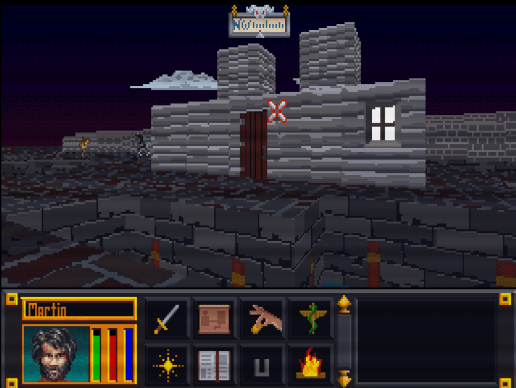
    The project will stay ALPHA until all door and ground files are done. I do hope to have all the font files and interface done too, but that is more of a nicety (most are already done though). Once ALPHA 2 is out that I will be going back and reevaluating each texture. I started this so long ago and have come quite a ways that some of them are not to my standard or vision anymore. As it is already, I occasionally retool one here and there but I plan to do a comprehensive review.

    Taking the plunge

    I finally gave in and purchased Photoshop (well subscribed really). I don’t anticipate being very proficient in it for awhile since I have been using GIMP for years and it’s so different. For the Arena project, this isn’t really a problem. It doesn’t require fancy functions. I am literally coloring individual pixels from a 256 palette. The biggest obstacle their is my creativity and not the tools.

    Some recent work below (really like how the first one turned out)…

    – Martin

    WALLH MINEA MINEE WALLG

  • Wake up! You were dreaming.

    Early on

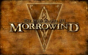
    Morrowind Main Menu (Original)
    Morrowind Main Menu (Original)

    Back about 4 1/2 years ago, I had just gotten into computer graphic design. I spent the first 1/2 a year experimenting and learning how to use the editing software (GIMP). One of the games I messed with was Morrowind, my favorite game. It wasn’t really meant for any project. I decided to make a desktop wallpaper of the main menu.

    At that time, I didn’t know much about GIMP or how to use it effectively. Additionally, I had just gotten my Wacom tablet and hadn’t become comfortable with it quite yet. To make it easy, I used the original Morrowind main menu texture as the base. Because of this, the end result was (and still is) useable in-game. I even went as far as retexturing the New/Load/Save buttons to match the theme.

    Morrowind Box Art

    It’s Alive

    I decided to use the box art as a supplementary inspiration when I began working on it. There were some key differences between the two; the major one being the border that framed the box art. I really liked the border and the “daedric” lettering on it. Unfortunately, my source copy of the box art wasn’t very good so I had to guesstimate when recreating them.

    Crayola version

    I did have a couple goals in mind with an overarching theme of applying a cleaner more art-lik

    • To boost contrast, the border was darkened and a similar color was used for the middle triangle.
    • The center was lightened with a complimentary but vivid color to liven up the image.
    • The “daedric” lettering was lightened up to look more dramatic and almost “glowing”.
    • A spot of white was placed on each “letter” and then the smudge tool was used to stretch that white color into highlights.
    • A level of depth was created by adding width and darkness to the inner edge of the frame. The “Morrowind” lettering was giving a simple perspective by adding a drop shadow angling to the lower right.
    • The dragon emblem was subdued so that it didnt’ overpower the wording. This also gave a subtle layer of interest.
    • Lastly, it hard to see but the entire image was given a paper texture filter to create a painted canvas feel.

    I use this as my background on my computer for inspiration
    I use it as my background on my computer for inspiration

    You never forget your first

    Most of these effects evolved through experimenting with the software and various visual styles that I had in mind. However the whole picture was hand drawn/partially traced using my art tablet. It’s not without it’s flaws and a level of crudeness to the picture shows my inexperience at the time. Despite all that, it is one of my favorite personal pieces because it’s the first complete computer graphic design work of mine.

    – Martin