Tag: Fate

  • The madness of Fate

    The madness of Fate

    What are they doing? Seriously, some one tell me.

    I mentioned Fate converts the textures added at install from PNG to DDS. This conversion happens upon the initial run of the game, but also again if any of the converted textures go missing (which I use when I tweak textures and such). In addition to the main texture (or diffuse map), some textures had an alpha map (for transparency such as making the black on the sails below invisible). Then there are the “completemaps” that funk up the textures in game and honestly, aren’t well done in Fate. Such as the one I posted last time. It was supposed to be a burned down building, but it looked completely black despite the original texture having detail and actual color. After I rebuilt the texture, it still looked dark in the game. There was a peculiarity with the coloring and shading/highlighting with several of the textures. It was clear my changes were in place, but something was distorting the image.

    (CLICK THE PICTURES TO SEE THEM LARGER)

    You can see in the image that my version of the boat is much cleaner (and detailed). However, when I loaded the game, my textures showed but were muddied with blemishes shown in the first texture. I thought maybe it was an engine thing (e.g. when building levels you can “paint” shadows and marks on the 3D landscape like Morrowind).

    I didn’t know what I don’t know

    Then I discovered there was a third texture related to the boat image. However, its structure is very weird. This texture does two things that I can discern: 1. highlights or darkens areas on the model and 2. adds color tinting. So my amateur status here doesn’t know what this layer is called or how the heck they made it or relates to the model. It’s not just another variant of the boat texture, but more like a piecemeal palette of portions of the 3D model.

    boatcompletemap
    I assume the 3D software creates the mapping on this texture…If anyone knows, please enlighten me

    Trying to make it work

    The lighter the color is, the brighter on the boat and the darker creates shadows. The hue tints the image of that color. But the mapping is crazy…I had to experiment just to get the white on the boat to be even. I plan to minimize my efforts on those files unless one (such as the boat) really needs it. The smelter (as it’s labeled in the filename) stays mostly red due to how its “completemap” is mostly shades of red.

    20161019203041_1
    Smelter walls should be light brown.


    20161026215121_1

    After some trials, I at least got the ship to a reasonable spot. I’m not sure if I’ll come back to Fate or not, but it was a fun bit of messing around.

    – Martin

  • No Fate but what you make

    No Fate but what you make

    The inspiration

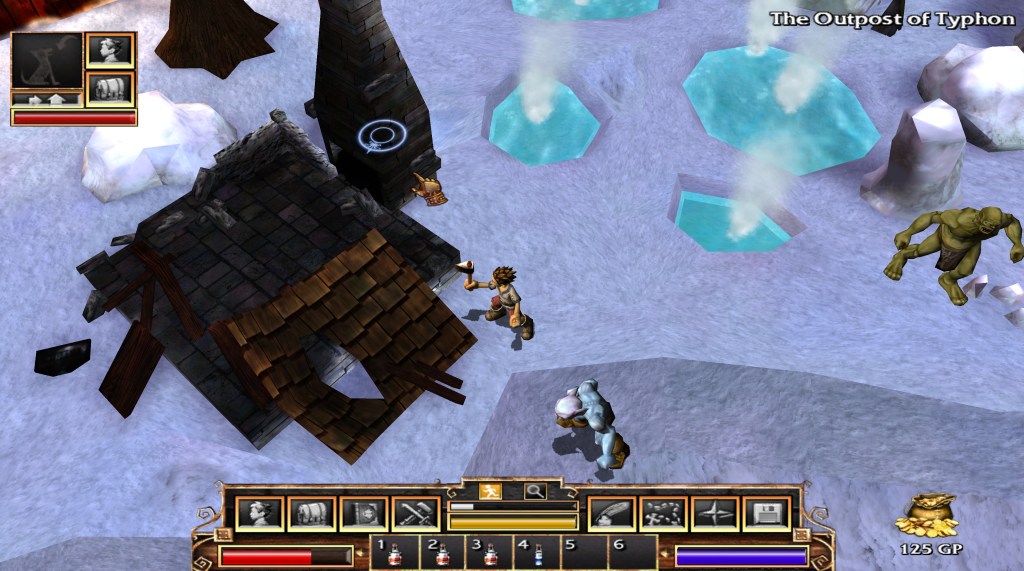
    This first picture shows the detail disparity between the building textures and most of the other ones. As I mentioned before, on a 4k monitor, most textures look great for being such an old game. However, the buildings look like crap. I attribute this to them using the same size texture files despite the much larger size models…that and poor planning. I could, maybe, buy that it was for frame rate purposes: lower sized texture = less needed memory, etc. However, that doesn’t explain why both Fate 2 and Fate 3 continued the same practice when the games by then hardly taxed computers. (NOTE: Both Fate 2 and Fate 3 have the areas from the previous games included).

    20161019203528_1
    Blurry structure but detailed characters/ground

    Alpha 1

    Even at lower resolutions, this blurriness is crap. So I tried to replace one texture with a high resolution one. I loaded it in Photoshop and found a semi-suitable replacement from online photos. For this mini-stone henge, I use a hieroglyphic style from some ancient tablet. I don’t actually like this one that much anymore, but it helped with seeing the impact in the game.

    20161019202931_1
    Now with detailed stone work

    Tricksy hobbits

    First try failed. I changed the texture, but in game; it had no effect. After trying a few things to see if I had the wrong format, I remembered that the game creates a cache file of the textures. Why? I know what it does, but I have no reasonable explanation on why they chose that method. What was the gain over just using the PNG files? All the textures that get installed with the game are in PNG format. Easy to edit, so that wasn’t a problem.

    When first running the game, it creates a cache of the textures CONVERTED to DDS format and stores that cache in a folder in the ‘Program data’ (usually on the C drive.) You can either edit the DDS directly (it’s another image format), or edit the PNGs, convert and then delete the conversion if you need more work. Believe it or not, I chose the latter. DDS files are “lossy” (loose detail as you save and compress them) and I rather have the masters in PNG files. It doesn’t really make sense because if I released this, I would use the DDS files, but I feel it somehow keeps me more orderly.

    There is another even more vexing graphic trick they use that I’ll cover next time…

    – Martin

    20161019203604_1
    Why is it doing this?…I found out
  • Fate: The Tortured Texture

    Fate: The Tortured Texture

    Technomancer

    Occasionally, I like to test out games on my 4k monitor to see how they look at such a high resolution (3184×2160). For some games, that impact is less than you would expect while others look surprisingly good. For example, Bethesda Gamebyro engine-based games (Elder Scrolls and Fallout) look a little better, but I’m not very wow’d by it. I think it boils down to the engine and lower resolution textures. Less aliasing (jagged edges around the 3D model) and more detail, but not the punch you would expect.

    On the other hand, Two Worlds looks fantastic. The textures are high resolution enough to make them really pop. Unfortunately, the interface doesn’t scale, so it’s very “difficult” to play at such a high resolution. Visually, it’s very pleasing though.

    2005 called

    So one day, I got a bug to try the old game Fate. It was the predecessor to Torchlight. A top-down action-RPG click fest. My boys played all but last one in the series, so as usual, there is a touch of nostalgia for me. The only thing I had to figure out tech-wise was how to get the resolution desired in the game. Some games work out of the box and some require manually editing “ini” text files. Here, I had to edit the “ini” file AND disable scaling on high DPI settings. I did that by right clicking the program executable file and putting a check under that line in the compatibility tab. Viola…4K work for a decade+ old game.

    Both ends of the spectrum

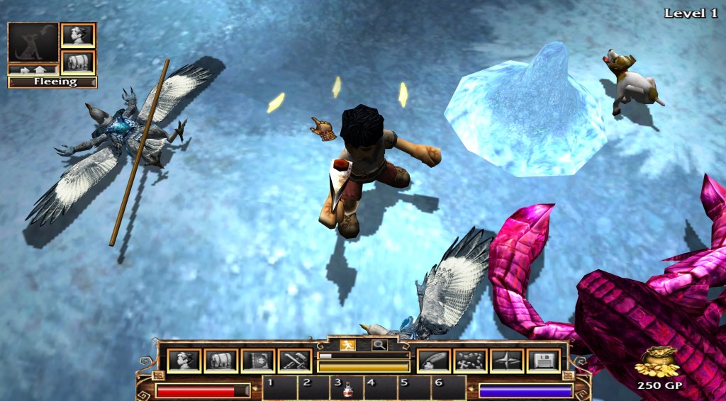
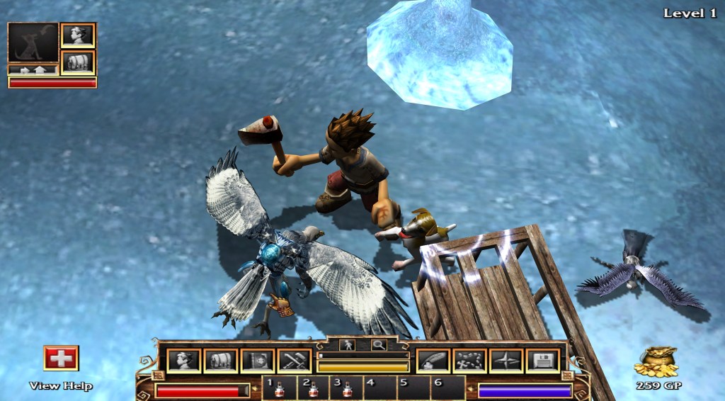
    You can see in the screenshot (even if you don’t have a 4K monitor) that the character models are actually quite detailed. In 4K, they really stand out and don’t really need any work. Well, I could do a little but I digress… they are perfectly nice. However, as you can see in the “snow/ice” texture, the non-character models are blurry low-resolution messes. Basically, they are tiled 128×128 textures. They are so dramatically worse than the character/object textures in 4K. The buildings are also very low resolution…which is even more boggling since they don’t blend into the background like the landscaping. That is when I got inspired…to fix the disparity.

    Getting better….

    The above (partially complete) picture is post landscape editing. For the record, I’m still not crazy happy about it but small steps. The landscapes textures have revealed the oddities of the engine. A few places where they don’t actually blend and such, but not too much. The real work and most dramatic change was the building and landscape objects…but that is for next time.

    • Martin