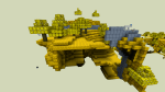
Wandering the land
I spent some time this week searching in-game for textures yet to be done using a pre-edited overpowered save file so I could roam unimpeded. I looked for dungeons, cities, wilderness, etc. that hadn’t yet been retextured. The side effect to this is that I found places where the textures WERE done but I had never seen them in-game or at least not in combination with other textures. From this I learned that some textures don’t work as well in-game as I hoped.
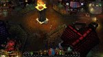
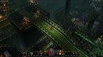
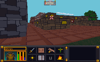
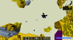
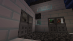
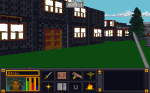
Proud Poppa
However, there are many that I feel are just right (or close enough for me to be happy). These I feel keep a unique appearance AND work well not only for their intended purpose but also with other textures. For example:


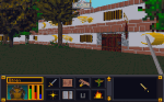
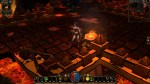
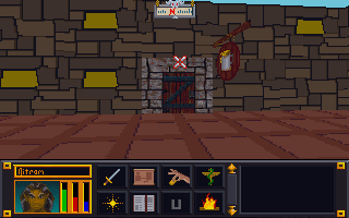
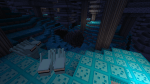
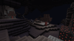
Avert your eyes
Of course, they all can’t be winners. I expected that I would have to go back and tweak later, but some textures combos were just horrible. To be fair to myself, I had two limitations: one, I was trying to make each texture unique and two, some textures were awful to begin with (one of the mage guild textures is a complete mess). These will be easy to tweak up though as all the hard work is already done.
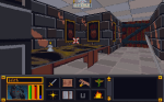


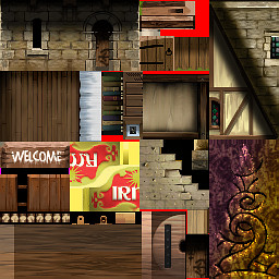
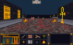
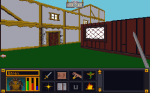
Dirty walls and floors
I have starting tackling some of the vague pixelly mess of some wall and floor textures that I have been avoiding. The limitations on resolution and colors will probably force me to deviate from “source” more than I care but it can’t be avoided. There are so many in the DW series alone (A through S). The reason I started looking for textures in-game was so I could see the context in which the textures were being used.


– Martin