Shapes
I try to stick to colors pulled from the original image. This eliminates any guesswork on making sure the colors match the palette file (really only important for older games that use palette files). Once I have a rough idea of what colors to use, I try and gauge what I want the new image to look like. For bricks and stone, I’ll usually try to draw inspiration from what I start with. In that I mean that I will try and mimic the rough shape and design of the original. I do try and give each set of images as unique an appearance as possible while being aesthetically pleasing.
Video
Since one of my main motivators for creating this website was to chronicle my artistic endeavors, I decided to make some time-lapse videos to highlight the process. The first one below demonstrates what I’m talking about for “easy” textures.
Points of interest
A couple of things to point out from the video:
1. I outlined the shapes ahead of time to create a frame when I colored in the shapes.
2. I colored in one image in the SET file to get a good feel of the colors and general appearance that I’m going for.
3. I do a lot of on-the-fly tweaking (and sometimes overhauling). Sometimes what I end up with is nothing like what I started with.
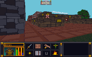
4. I have to check the image in the game in order to see if there are any issues AND to make the final decision on whether I like it or not. In this case, I ended up changing several of the other textures because I didn’t like how they looked. Note in the image below that the city wall and road are different (and in my opinion better) than in the video.


Leave a comment