For the HUD (that shows at the bottom of the screen when playing), I fiddled extra long on how to redesign the buttons. I wavered back and forth on keeping the original art or replacing it with words or a different picture. I considered removing or subduing some of the more garish design aspects such as the yellow squares pinning the corners. However, unlike my other projects, ADP is quasi-purist in it’s attempt to keep the “feel” of the original artwork. I ultimately decided to just clean up the buttons but keep the art as close to the original as possible (making minor modifications). The only exception was the USE button; That one was a pain in the butt. Nothing I tried seemed to work well AND convey to the user that it was meant to be the “USE” button. In the end, I settled for a “U”. Not overly inspired but I wasted a lot of time on it and we have to pick our battles sometimes.
Example
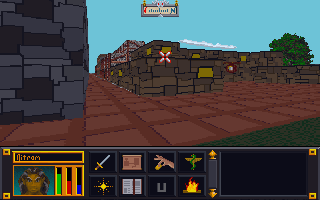
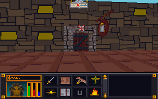
You can see above the original HUD and below the new one. I used one sword for attack to keep it simpler and clean and I changed the journal parchment to a book which I feel better conveys it’s purpose while differentiating it from the map directly above.
NOTE: While I did the background around the players head, in game it must use a different texture since it’s the same as the original. Also, I experimented with making the HUD partially transparent but as I suspected, the game doesn’t render below the start of the HUD and it just turned out black.
I try to stick to colors pulled from the original image. This eliminates any guesswork on making sure the colors match the palette file (really only important for older games that use palette files). Once I have a rough idea of what colors to use, I try and gauge what I want the new image to look like. For bricks and stone, I’ll usually try to draw inspiration from what I start with. In that I mean that I will try and mimic the rough shape and design of the original. I do try and give each set of images as unique an appearance as possible while being aesthetically pleasing.
Video
Since one of my main motivators for creating this website was to chronicle my artistic endeavors, I decided to make some time-lapse videos to highlight the process. The first one below demonstrates what I’m talking about for “easy” textures.
Points of interest
A couple of things to point out from the video:
1. I outlined the shapes ahead of time to create a frame when I colored in the shapes.
2. I colored in one image in the SET file to get a good feel of the colors and general appearance that I’m going for.
3. I do a lot of on-the-fly tweaking (and sometimes overhauling). Sometimes what I end up with is nothing like what I started with.
4. I have to check the image in the game in order to see if there are any issues AND to make the final decision on whether I like it or not. In this case, I ended up changing several of the other textures because I didn’t like how they looked. Note in the image below that the city wall and road are different (and in my opinion better) than in the video.
As I have mentioned in previous posts, my experience in working with game art resources has revealed that the game creators often leave behind orphan files that aren’t actually used in the game. It is very frustrating to spend a couple hours on a texture only to not be able to see it in game (as I did many times in for Torchlight texture pack). To combat this waste of time, I have started “marking” texture files so that I can see if they get used in game or not. For example; Arena has SET files (2-6 textures all in one image) and IMG files (single image). I have discovered that many wall and ground sets are repeated in both SET and IMG formats. So a single “Wall” set would have up to 4 IMG files that mirrored that SET file. For any suspect files, I would mark the IMG file and see if it shows in game. Then I could avoid redoing a texture that isn’t even used. In theory, I can save time and shrink the overall pack size by eliminating these orphan files. Lastly, using this process I can find the file in the game to see how it looks when I texture it.
SET files (multiple images in one)
IMG sets (single images)
The process
The process is fairly simple. After completing some wall SET files for ADP, I tested them. I could see my new textures in-game so I knew these were correct files. But when I did the same for ground SETs, they didn’t show. So I decided to “mark” the IMG files and see if they were used or not.
STEP 1: I loaded about 30 IMG files in GIMP at one time (only the ones I was unsure of). Since they are so small (64 pixels by 64 pixels), GIMP could load them without too much trouble.
STEP 2: One by one, I would draw a symbol (nothing fancy) on the texture. I would use a color that stood out so it would be easy to spot in game. I tended to use the alphabet then numbers then symbols so I could narrow them down easily if needed.
STEP 3: Since I have a fancy Logitech keyboard that supports macros, I created a macro that would overwrite the original file then close the file (about 12 keystrokes each). Then all I had to do was hit the macro key a bunch and it would keep executing the macro; saving and closing each file one by one. I managed to do this all in an hour or so while watching a football game.
STEP 4: I would load the next 30 or so and repeat the process until all the textures in question were marked. In all I ended up marking 150 files (all wall and ground textures).
Results
After a preliminary check, I realized that ground textures seem to favor IMG formats (to allow better mixing and matching in levels?) and walls were almost exclusively SET files except for city walls. Out of 150 textures marked, I have so far only found 3 in game. The caveat on that is that I haven’t explored a lot of the game. I will most likely go ahead and texture all the ground and outer city wall IMG files and then check again. But if even half of those are just junk files, it would well be worth the saved time.
At request of my son, I had resumed working on PinkertonCraft, my Minecraft mod. Although almost all (99%) of the original game textures are complete, I don’t want to release till I complete the art for the mods my sons use. Most of those are complete but a few are quite large. In fact, one mod called Divine RPG has almost 4 times as many textures as the original game. I have used most of my time since August working on it and am about 70% done with that.
One thing I noticed with a lot of mods (and even “vanilla” Minecraft) is that many textures are the same except for the color. For example, all the “rugs” in the Divine RPG mod were just the same bland texture in a different color. Mods are especially bad about this. Divine RPG has many “dimensions” but in the original art set, they were all the same texture but in different colors. I have strived to avoid repeating textures in such a manner unless it made since (i.e. colored wool or glass). So for each of the dimensions, I tried to give them as unique a look as possible. I apply the same principle to the “mobs” (i.e. monsters). If the game has 7 “golems” then I want them all to actually look different and be distinct.
(Click the pictures to see how they look different now)
Arena
I had made a lot of progress before I switched back over to the Minecraft project. I have completed 102 of 184 set files. I should note that like many other resource file packs, Arena is chock full of unused files or files that were started and then switched to another format. I can think of 5 SET files off the top of my head that aren’t actually used. They are all ground files that Bethesda switched to IMG files (that I have already completed). A lot of the remaining SET files are less linear and more organic. Because they are base on 64×64 pixels, they require more creative approaches. I will start planning out how to handle them soon.
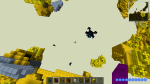
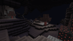
Home outside the city
Lake side cottage
I need to fix the grass
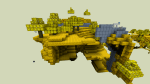
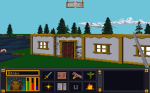
More buildings and UI updated (some)
Website
I have been wanting to finish the website. Currently, the only thing linked are pictures. I need to add a Minecraft category and add to all the other categories. My goal is to have the site fleshed out in time to coincide with the release of PinkertonCraft (hopefully in October).
I mentioned that right now I’m “mostly” focusing on doing the easier images in Arena’s SET files. By easier, I mean contain simple angular designs that have minimal curves and diagonals. Why? The reason is that with these extremely low resolution art assets (most tiles are only 64 pixels by 64 pixels), curves and diagonals don’t look like smooth straight lines. With my Minecraft project (PinkertonCraft), I expressedly made almost ALL the art clean linear horizontal and vertical line combinations with no curves even implied.
Nether Ores – Original Minecraft 16 x 16
Nether Ores – PinkertonCraft (still 16 x 16)
Unlike that project, in the ADP, I simplified most curves and diagonal lines but did not eliminate them. My goal with this project is cleaner textures but not abstract images.
Palette Files, oh my!
The first thing I do with an “easy” texture is try to picture the rough color scheme that I want to use. Since many of these type of images are brick or stone walls, that means deciding the color of the bricks or walls. I gauge if I am going to want lighter or darker colors from sight and then decide which color(s) already existing in the image to use. I have two reasons for doing this: the first is that it helps maintain a little integrity to the original unmodified image and second, it removes the issue of colors being changed when imported and converted to the original palette colors (the import tool approximates to the closest color if one doesn’t match a color in the palette file).
The base palette of colors most Arena images use. Each image contains a single reference point per pixel to this file rather then the using the standard 3 numbers ranging individually 0 to 256.
NOTE: Arena uses a palette file for images. This means that exact colors for each pixel are found by referencing a separate file (palette). Consider a palette file as a real hand held paint palette: like a painter, Arena draws/paints it’s images using the colors from the palette. The whole reason to do this was to save space on the disk which was a concern in the early 90’s.