Let’s just ignore the fact I haven’t posted in quite a bit (or that I started this project 13+ years ago). To be fair, I have released three other Arena mods in the meantime(more on that in the future).
I recently started digging back into the Arena Depixelization Project (ADP), my graphics replacement mod for The Elderscrolls: The Arena, and I have been hitting it hard.
I’m doing a recorded playthrough looking for missed art in the game and general quality control. This has led to me not only finishing missing textures but also tweaking (and sometimes overhauling) 90% of the work already done. I guess over 13 years of game art fiddling has matured my style slightly.
THE SWAMP
I first had to corral all my work over the last decade+. I had 7 different versions saved through the year and some files went missing so I had to extract them all compare and then pull any missing forward. This project was quite a mess (no file discipline at all, the shame). Then I had to relearn the tools, but that didn’t take too long. Then I created a new working directory and archived all the rest to clean up my sloppy work.
In just 2 weeks, I have probably edited almost 100 textures already. As I record my playthrough, I save when a missing (or ugly/mismatch) texture is found and either fix it ASAP or catalog a bunch at once to do in a surge.
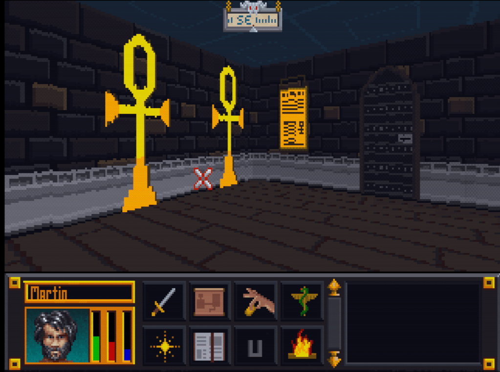
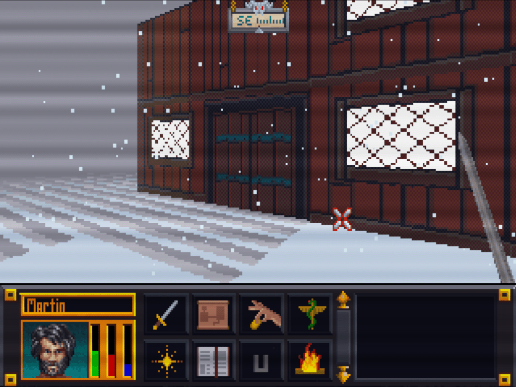
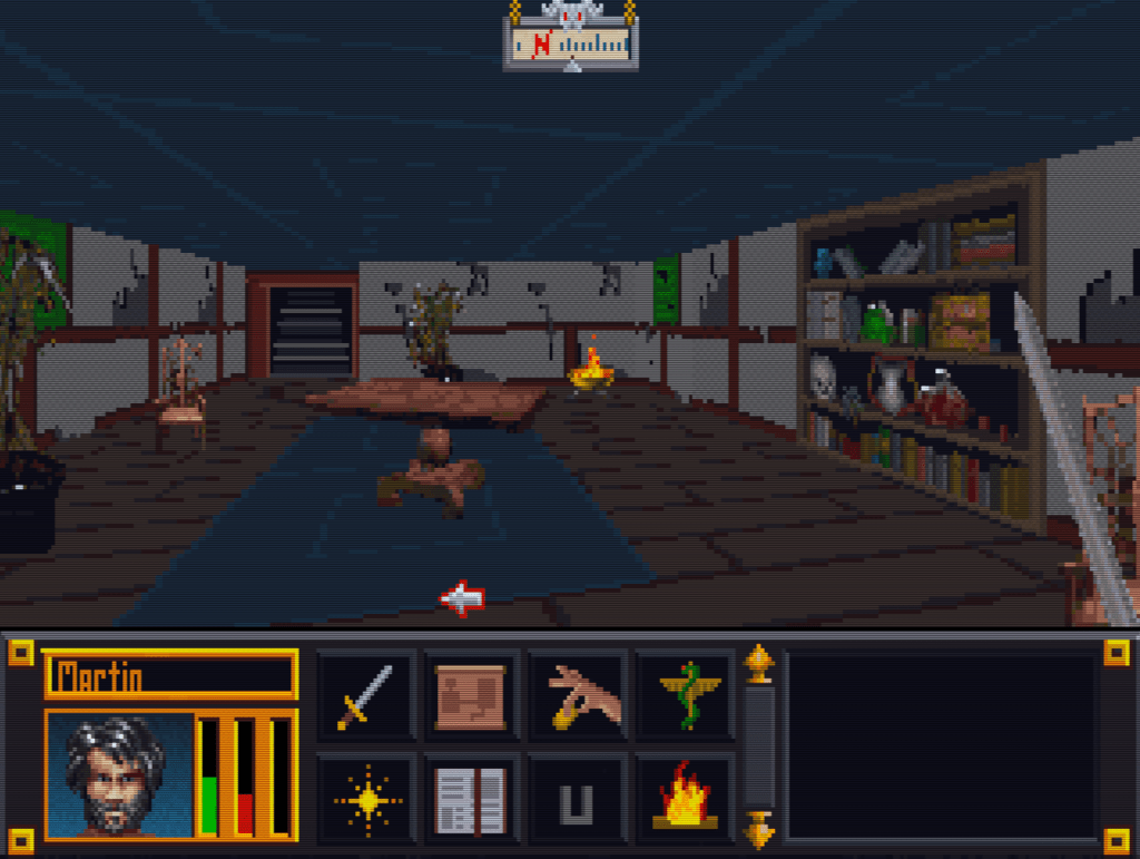
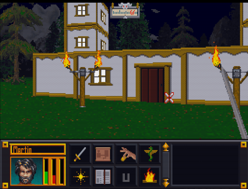
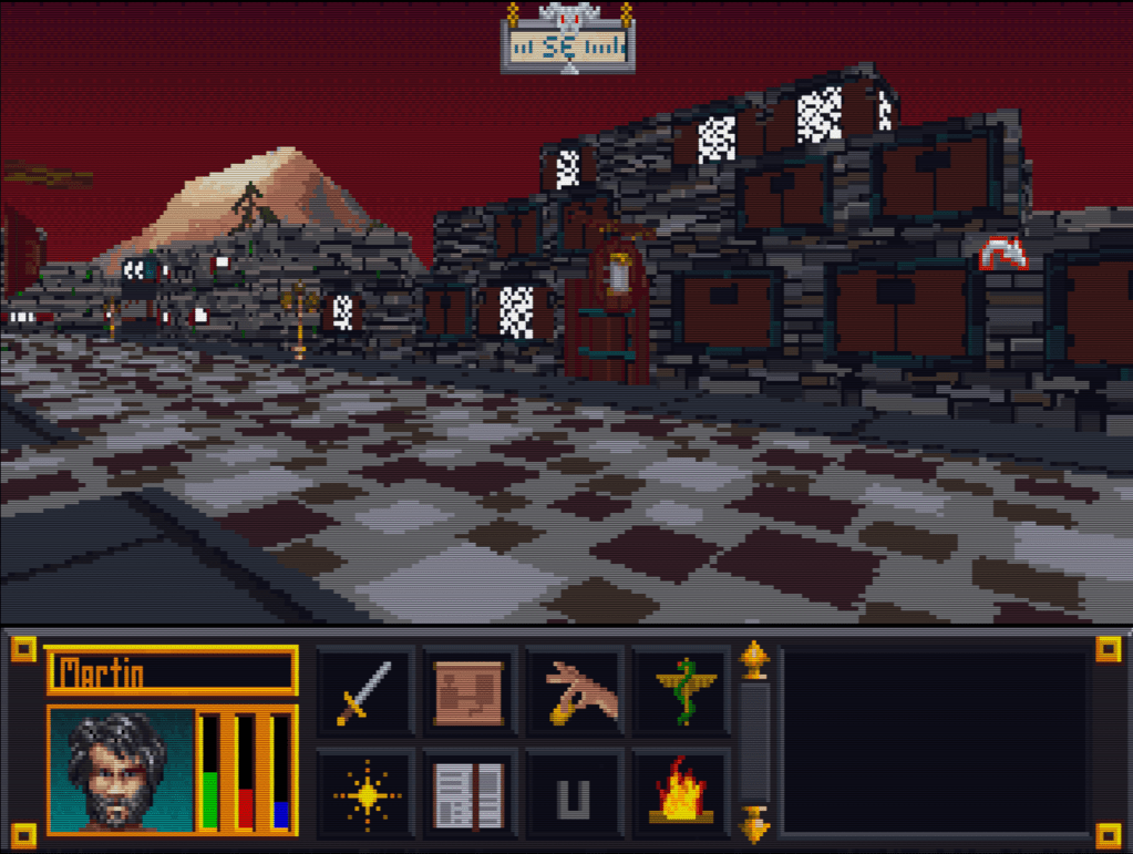
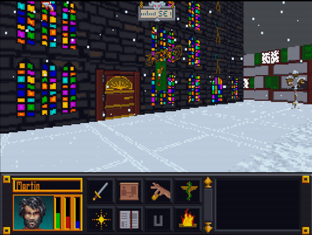
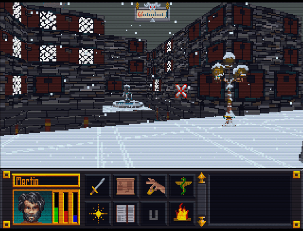
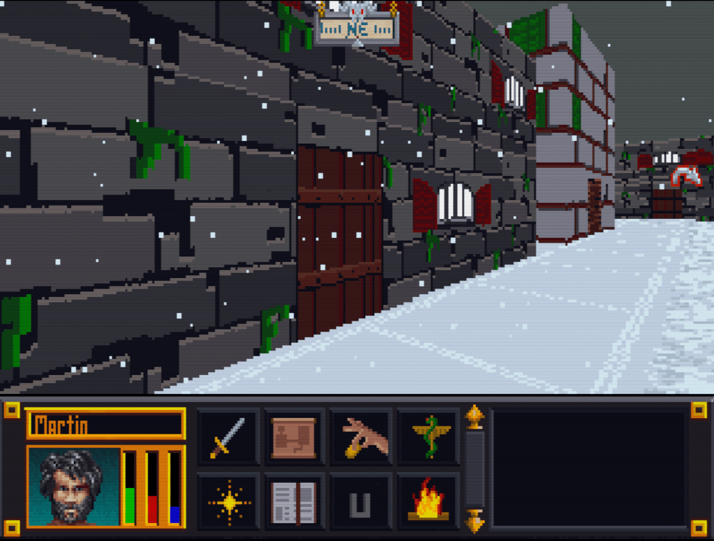
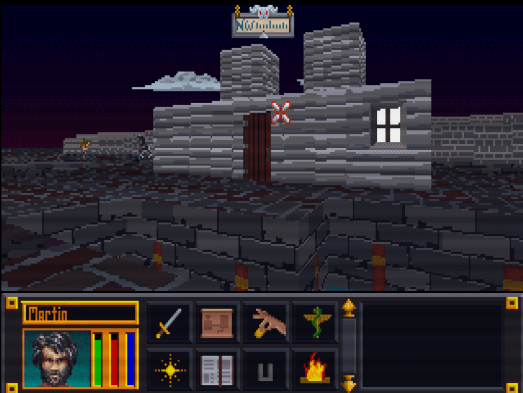
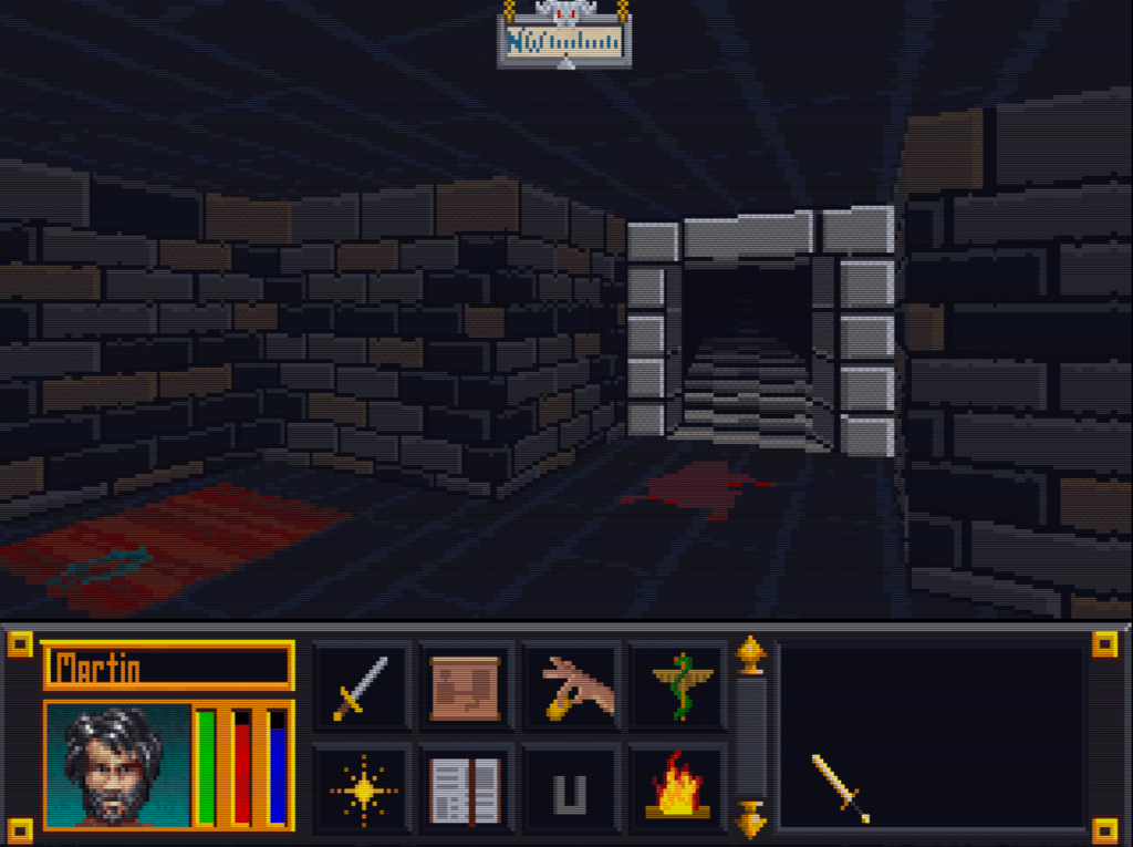
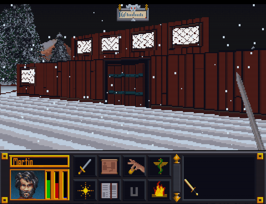
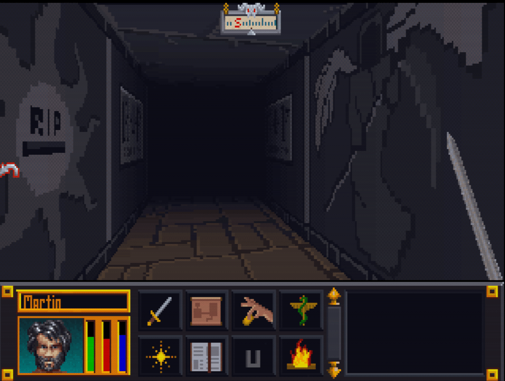
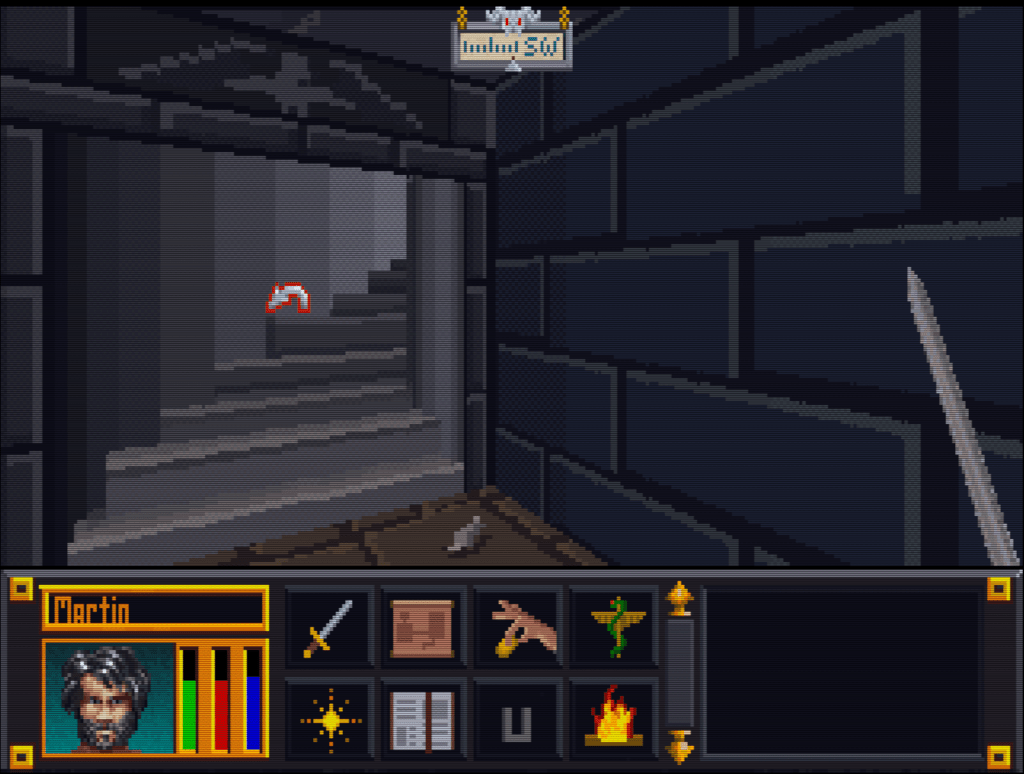
GALLERY
Here’s a slew of screenshots I made from the most recent version.
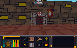
Now that I have finished the “walls and halls”, it’s time to renovate the doors and remaining floors. I have finished almost all the ground textures though (well a few could used tweaked too). In the past, I just worked directly in the directory where I extracted the files and reinserted them into the BSA from there. However since there are so many IMG files (949 to be exact) and that isn’t the cleanest way to work from a project management perspective, I pulled all the door files out to a separate folder/workspace and created a completed folder to use for importing files back to the BSA.
Must have ran out of paint
Doors, Doors, Everywhere there are Doors
There are 112 door files not including non-doors that would serve as potential transition points (e.g. ladder up/down, stairs, etc..there are about 12 of those). These IMG files come in two variety, framed and whole texture.
I’ve been framed
The framed doors are “framed” with the texture of the building to which they belong (e.g. the Mage Guild door has a frame art that matches the building). To do these, I’ll just copy and paste a wall from the matching set file and layer it under the door so it’ll be a perfect fit with the rest of the building. All exteriors and some interior doors are framed doors, pretty much any door that transitions between outside and inside.
That’s no small wall…it’s a door!
The other type of door is the whole texture door. I have done a few of these previously as you can see in the screenshot. These doors belong to all the interior rooms and are the ones that swing open so you can enter a room. Although they are relatively simple (as they repeat the same textures over and over for different files), I’m hoping to add a little more variety to them.
First things first though, I will test to see if each IMG file is used in game (i’ll probably do them in batches). I have already found several that aren’t. I will likely still redo them just in case. Worst case scenario, if I ever can get anyone to figure out how to decipher the MTF files, I will use them to make new dungeons and buildings.
Awhile back I had posted that I had learned that I could update the font files. I never liked the font in Arena as it was too flowery for readability at such a low resolution. Each letter in the fonts was ranged from 3×3 to 8×8 pixels in size. They were all really just super small pictures.
A little rough but it works
If I build it, I’ll build it thrice
I wasn’t satisfied with my previous attempts and decided to quickly rebuild them again. This time, I tested each one out in game to see how well the effect worked. Surprisingly, this took more time than I imagined and I ended up completely revamping each font file 3-4 times till I was happy with them. In game testing allowed me to see where I missed or added a space, what characters didn’t look right, and generally if the font looked ok when playing. As you can see in the picture, the editor lets you click each pixel, one by one. While each character font file can have the spacing and padding adjusted using the slider (thus bigger or small amount of horizontal pixels), the height of the characters was fixed for each font file. Although it would be relatively easy to just rename one of the other font files that have a bigger height setting, I think that might play havok on how the game displays text and didn’t really see the need for it.
Someone shut off the faucet!
What am I supposed to do with all these points?
She made it sound like it was practically around the corner
Blue pill or red pill?
Yes…my new mod is a Battlemage. What of it?
But I can’t read!
Does anyone ever use this option?
Whoa where did you come from!
Through some in for spares?
To determine which font affected which portion of the game, I filled in a different set of characters in each font file as a solid box. Then I just looked to see which font was being used in each portion of the game containing text. Like with the art (and probably sound files), I found that not all fonts were used. Of the 10 font files included with the game, I have only been able to find 4 of them in game. Or at best, the others are used in some obscure corner of the game.
NOTE: The screenshots were taken with a vanilla version of Arena since this mod will be released as a separate mod from ADP.
UPDATE: I released TES Arena ReFonted on the nexus. You can get it here.
In this mod, I fixed three slides from the intro when you select new game.
3-Card monte
I had completed these some time ago but forgot to release them. Unfortunately, my file managment has been less than stellar and it took awhile to find them again. When I did, I noticed that there were still a couple of errors that needed fixing. So I fixed them and now no one need ever suffer under Uriel Septim IV’s oppressive need to steal the limelight from his great grandson.
Uriel is an odd family name
Uriel Septim VII is rightfully restored.
Once I had the textures in PNG format (a common image format), fixing the slides was a matter of several well placed cut and pasting.
However, getting them to a PNG format was more of a challenge. I had to use Arena Toolbox by Dysperia. That tool is a fantastic counterpart to ArenaModdingSuite. One of it’s unique functions is that it can convert the compressed images into PNG. Before this tool, no one knew how to uncompress those images (there are quite a few).
One hidden feature of the program is that it allows you to import the palette file (where it determines color) into the image itself versus being external to the file in the root directory. To make it work though, you have to trick the program into thinking it’s a new image. Simply adding a letter in the filename sufficed. The Toolbox can also convert back to the native IMG file.
Last thing left was to test it. I dropped my 3 new IMG Intro slides into the root folder of Arena, booted it up, and IT WORKED. Awesome. Sometimes it’s the little wins that keep you going 😉
Some days I can blaze through images getting 5 or 6 done in a sitting, then other days just part of an image can take a couple days. When it comes to the Arena Depixelization Project (ADP), the easier ones are just patterns (especially ones with straight lines horizontal or vertical). The low pixel count doesn’t really muck up the design too much since there is no need for a “fine detailed” line in those cases.
It kind of looks like….
However, once lines start curving or the image becomes complex, the time required is increased, sometimes dramatically. It’s hard to get non-angular shapes to look good when you only have a 64×64 grid to work with. I find that it takes multiple revisions to get it looking just right. To make matters worse, the source material for ADP contains many pictures that are either so pixelated as to be barely discernible or they generally don’t look very good as you clean them up (such as dress thing for the “angel” in this picture).
Click to enlarge
Close enough for horseshoes and hand grenades
In that image, I had to make some artistic decisions on how “accurate” to the source material I would be. The image is generally too complex to leave unaltered for my “Depixelization” theme. At first, I didn’t even know how to tackle it. I completed all the background wall first and left the “Angel” and the “alcove” till last. The good thing about that is that it let me establish the colors for the image. Eventually, I had to do this one as I only have a few SET files left. I decided to break it up and focus on individual pieces of the angel. I really wished I had made a timelapse of this one to show how much back and forth I did on it.
Mr. Potato Head
I started with the more clearly defined shapes, to include the arms, head, and the key. Those came into place with minimal fuss. Then, I tackled the wings. It took me awhile as the initial version (closer to the source) just didn’t look very good. After a couple of iterations, I ultimately decide to make the wings bigger as if they were more full body sized. Next, I attempted to do the feet. However, they just did not look good, especially when I started working on the weird “billowed” dress/robe. I decided to put the feet off and do the clothing. I touched up the sleeves to improve the “hanging off the arms” appearance. I made my first rendition of the lower part of the robe very close the source version. However, it looked terrible because the source version is kind of ridiculous looking, as if someone tucked an oversized shirt into a skirt. I played with it a little before I decided to just alter the design. I revised it to look more like a regular robe. Unfortunately, the feet still looked awkward, so I removed them and lengthened and curved the robe as if they were hidden by it and it was floating.
After a substantial hiatus for real life, I’m back. My schedule has a lot more free time in it now and I should be able to make substantial progress on the Arena mod in the next few weeks. As of now, I am just 2 or 3 SET files away from reaching ALPHA! Once that is complete, I will be setting up a MODdb page and probably trying to host it on the Nexus mod site.
The project will stay ALPHA until all door and ground files are done. I do hope to have all the font files and interface done too, but that is more of a nicety (most are already done though). Once ALPHA 2 is out that I will be going back and reevaluating each texture. I started this so long ago and have come quite a ways that some of them are not to my standard or vision anymore. As it is already, I occasionally retool one here and there but I plan to do a comprehensive review.
Taking the plunge
I finally gave in and purchased Photoshop (well subscribed really). I don’t anticipate being very proficient in it for awhile since I have been using GIMP for years and it’s so different. For the Arena project, this isn’t really a problem. It doesn’t require fancy functions. I am literally coloring individual pixels from a 256 palette. The biggest obstacle their is my creativity and not the tools.
Some recent work below (really like how the first one turned out)…
NOTE: This kind of a rehash of a previous post from a different angle (slightly) that walks through the process more “visually”.
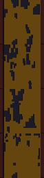
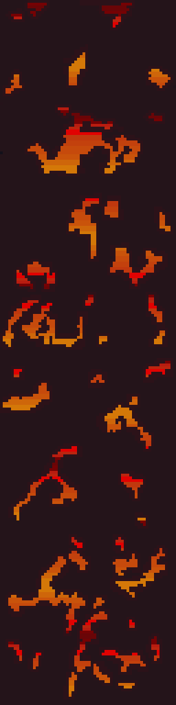
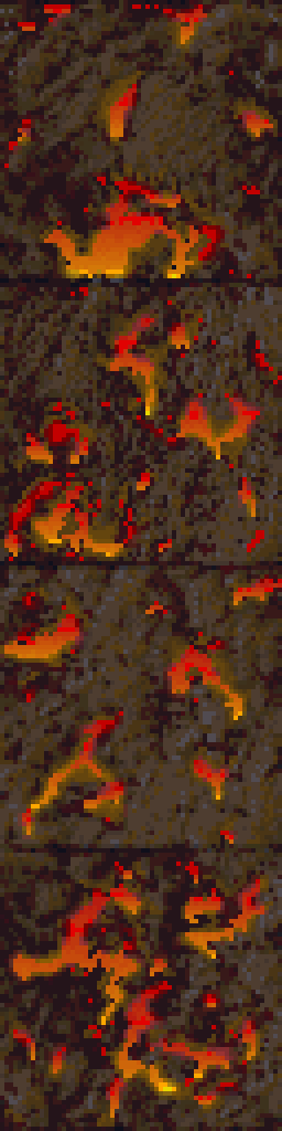
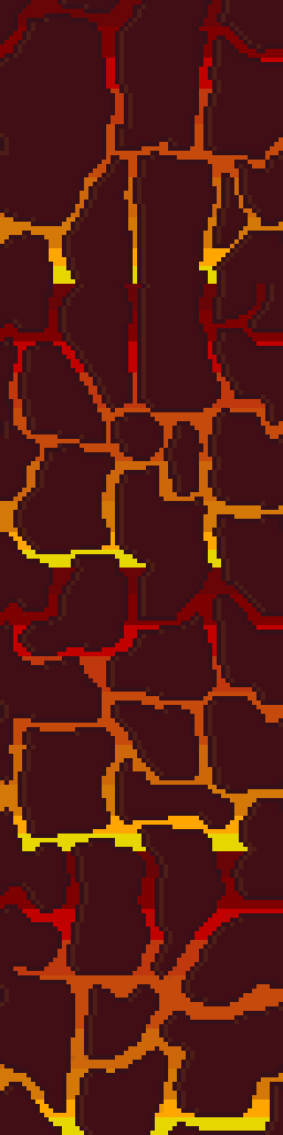
One of the texture SET files edited recently for ADP was a 4 texture wall set that resembled a wall with lava or fire spots. I had already settle on using a mostly flat wall color to more dramatically contrast the flames/lava parts of the textures. But in order to maintain a uniform look to the fire, the image needed to be built in layers. A good first step is to make a duplicate layer of the original before making any changes, especially major ones. That way, the duplicate can use as a reference when editing the image.
Layers in GIMP (and I’m sure Photoshop) allow you to create/edit different pieces of a picture individually but still be able to see them as a whole…like may layers of tracing paper stacked together but each having a different element drawn on it.
Cut it out
In this instance, the first element designed was the “wall” layer. Using the Erase function, all spots containing a decent amount of fire were erased. In GIMP, the eraser needs to be set to “hard edge” because of the technical limitations of the image format, it can’t deviate form the original palette or be partially translucent. Later on when the “fire” layer was created, it would be placed underneath this layer so that it show through only the holes.
Sticking to colors in the image, one was chosen as the new wall color. Before mass painting the “wall” (usually just by increasing the pencil/brush size to larger than the image), the “lock” transparency option had to be enabled to prevent the cutout holes from being filled in. Lastly, another complementary color was used to border the cutout sections and add a smidge of depth and interest.
Heating it up
Next, another layer was created for the “fire”. The plan was to fill the whole layer with the fire effect. If the “wall” layers transparent parts are changed (holes made bigger or moved), it wouldn’t need any adjustments. Also, it’s just easier that way. The fire is created by using alternating gradients of yellow to red and then back. This is repeated for the whole image.
Lastly, the final step is to “merge” the two layers together so that they show the wall but with spots of fire. In GIMP, you can right click the “wall” layer and just select “merge down”.
This technique is very similar to the one used on another firery wall that I completed months ago. Additionally, I used it for the lava in my Minecraft texture pack.
It’s fairly simple but still creates that fire/lave effect I like despite the limited palette.
The tool that saved the Arena Depixelization Project (ADP)
Last post, I covered the Arena Font Editor, 1 of 3 tools that I use to edit TES:Arena graphics (and fonts). The font editor is part of the Arena Modding Suite by Hallfiry. The other part of that suite is the 2nd (set) of the three tools I’m going to write about.
Prior to the Arena Modding Suite, I used the method detailed in a previous post that was laborious and unpractical. Fortunately, this thread popped up on the Bethesda forums. And instantly my little “experiment” became a project and grew in scope. Were it not for Hallfiry, I would have surely abandoned it ADP before it every took off.
What’s it do?
The main functions of the Arena Modding Suite come in the form of the ArenaPacker and ArenaUnpacker. Rather than being a program that you work in, they are utilities that enable you to easily manipulate the game assets directly in Windows. Both programs directly work with the GLOBAL.BSA. Appropriately enough, one unpacks the entire BSA into a set of folders and the other takes that set of folders and packs it right back up although that is a bit simplistic view of what they do.
This slideshow requires JavaScript.
In reality, the programs not only work with the files but they also convert the files to the appropriate format. For ArenaUnpacker, when it extracts the files, it converts the non-standard IMG and SET files into easily edited PNG images. Additionally, it converts the INF files (map asset listings) to a text editor friendly format and SND files to WAVs (although I don’t have any interest in that part). ArenaPacker reverses the process and creates a packed GLOBAL.BSA based on files in the unpacked directory but doesn’t alter those files that were already extracted. This means I can have a working directory of all the files and my changes then “pack” my work-in-progress easily at any time to test in game.
All work is done from Windows
Some notes about the Arena Modding Suite:
1. Quite a few of the images are compressed in a bizarro compression routine used by Bethesda and this software doesn’t have the functionality to uncompress them. No one had cracked that compression in all the years since the game was released (that is until very recently but more on that next time).
2. ArenaPacker is designed to compensate for using colors outside those available in palette file by converting non-palette colors to the nearest equivalent color in the palette. While it’s a handy feature, the images should be checked in game to make sure the colors aren’t changed to something wonky (as happened before I learned to use the palette tool in GIMP. If you stick to the exact palette (either by using a palette file or be just using colors in the actual images being edited), this isn’t a problem.
3. ArenaPacker is a little sensitive to what files are being repacked. When files are extracted, ArenaUnpacker creates a file list of all the files in each directory. This file list is used for when the files are repacked by ArenaPacker. So, if a file is missing or added that isn’t on the file listing, it will crash the program. So if I plan on “trimming” out the IMG/SET files not actually used, I’ll have to edit the file listing. However, it is very easy to fix so this isn’t that big of a deal.
After the recent work on the user interface, I decided to take a hack at changing the fonts. Arena fonts are stored as DAT files (the file extension that a lot of the text tables use). There are 9 separate font files and the game using them each in the game in different places (I.E. the character stat numbers are different than the travel menu summary). However, some of the text in the game isn’t from a font at all but part of a texture or image already premade (e.g. in the spell book, only the spell specifics is actually a font and not part of the image).
Only the spell specifics are a font
Click the font away
Thanks to Hallfiry’s Arena Modding Suite, I had the tools necessary. Hallfiry’s suite includes a separate program for editing fonts, called the Arena Font Editor. While the program isn’t the most elegant design, it does allow for editing of fonts in a fairly simple manner. The font editor allows for simple pixel checking and unchecking. Blocks checked will show and blocks unchecked wont. The size of each font letter can be set separately and while that size can be changed with the slider in the upper right corner of the editor, it should be noted that the game itself may not look good if the font size is too big.
Hallfiry’s Arena Modding Suite
Hacking away
At first I didn’t understand how to use the editor. It turns out that in order to edit a font, the DAT file needs to be dragged and dropped onto the Font Editor. Additionally, there was no clear explanation on what the slider did. I eventually learned that it allowed resizing of each individual character in the font file (e.g. changing it from 5×5 to 6×6). I had already completed half of the font files when I discovered it’s purpose. The slide proves handy so that you can control the spacing between letters. In other words, you can have it one extra space wide so that the letters don’t touch. I did notice that not all letters were properly aligned to the left side of the box.
Pop-up text
Testbed
I have somehow broke one of the fonts (my guess is that it’s out of range of what the engine can handle or maybe it just got corrupted). I have been using the same copy of Arena for a testbed since I started this project back before there were any tools or this website. There are errant files and folders all over the place in the Arena directory (too include early BSA upackers, WinArena, and other crud). With this latest erratic behavior, I have decided to spend the grueling 5 minutes to download and install a clean copy. This way my efforts will match the end-user’s experience more accurately. Then it’ll be time for the second run through on the fonts to tweak the letters (and fix the broken font file).
One item that bothered me was that the interface elements didn’t really match. It seemed as each screen had it’s own style, particularly when you compare the “esc” menu and the inventory. Once I knew I could edit the inventory backgrounds, I wanted to make it match the other screens. However, I discovered that they use different palettes and I couldn’t find the right color that was on both palettes.
Inventory screen (original)
ESC menu (original)
Compromise
I ultimately had to settle on as close as a match as I could get. Additionally, I tried to port over a few of the stylistic elements of the ESC menu into the other GUI elements to tie them together better.
– Martin
Dark green is as good as it gets
I used an alternate (unused inventory graphic) and tweaked it to add a little more character