Polka dot shirts with checkered pants

Interface

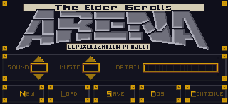
One item that bothered me was that the interface elements didn’t really match. It seemed as each screen had it’s own style, particularly when you compare the “esc” menu and the inventory. Once I knew I could edit the inventory backgrounds, I wanted to make it match the other screens. However, I discovered that they use different palettes and I couldn’t find the right color that was on both palettes.

Inventory screen (original)
ESC menu (original)
ESC menu (original)

Compromise

I ultimately had to settle on as close as a match as I could get. Additionally, I tried to port over a few of the stylistic elements of the ESC menu into the other GUI elements to tie them together better.

– Martin

Dark green is as good as it gets
I used an alternate (unused inventory graphic) and tweaked it to add a little more character
ESC menu (redone)
ESC menu (redone)


Leave a Reply

Fill in your details below or click an icon to log in:

WordPress.com Logo

You are commenting using your WordPress.com account. Log Out /  Change )

Facebook photo

You are commenting using your Facebook account. Log Out /  Change )

Connecting to %s

%d bloggers like this: