Starting somewhere
As the title suggests, I am going to pursue being an author.
Upfront, I technically settled on this decision back in August 2020. But, I have a spectacular social anxiety coupled with a healthy dose of self doubt that delayed this “official announcement”. I also found many reasons to procrastinate, such as revamping this very website. I now acknowledge that I can’t wait till everything is perfect to begin. So here I am…my name is Martin, and I am a writer.
I have been planning on doing this post for a long time. My original idea was to simultaneous post on this website while also releasing the first of a video log series on a YouTube channel called “I Dream of Electric Sheep” (logo seen above). I meant this blog and that channel to be complimentary pieces journaling my road to becoming a published author. NOTE: That is still my goal, the deadline has just slipped.
Why a writer?
I have always, and I mean always, seen things differently than many people. I tend to see the world from a different angle and built my entire “wacky/weird” sense of humor on that skill. This isn’t me trying to say “I’m not like other guys” or that I’m special; just that, it allows to me take ideas and put interesting spins on them. I have only ever shared these ideas with family and friends (and then usually only fragments). But like a writer, these stories stick with me and over the years and I developed them more in my head space. I think writing will not only allow me to share them with others but I will also get to relish seeing how my own creations grow and take a form I may have never expected.
What can we expect?
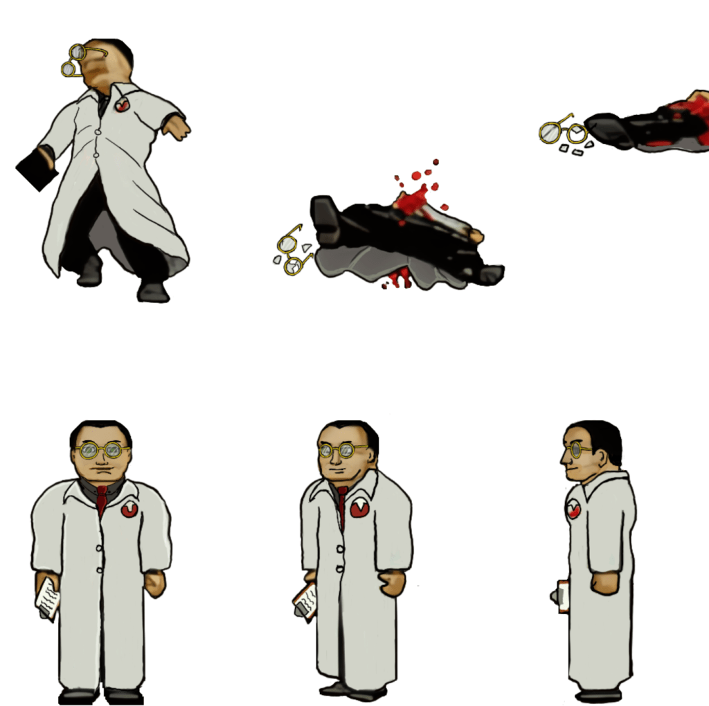
I have a lot of practice writing to do before I can write a full book. So up first will be smaller stuff, some from ideas I committed to for my podcast; others will be stories I spit-balled with friends. Either way, my stories will be like me, a little off and hopefully fun. I’m ok with that as I think it lets me bring something new to the table (or at least something less common). For example, my first practice story is Hogwarts Fight Club: yes, a fanfiction and it’s kind of exactly what it sounds like but even more bombastic (but also with a plot). Another, I’m calling “Rapt-her”, is an action story about a teenage girl with spliced Velociraptor DNA who fights Nazis. You get my point. They seem odd and silly, but I want to write them with heart. I feel even the most off the wall concept can be good if you treat (and write) it respecting the idea behind it.. Just warning you ahead of time so you’re not shocked when Dino-Hitler arrives on the scene complete with funny mustache.
Why now?
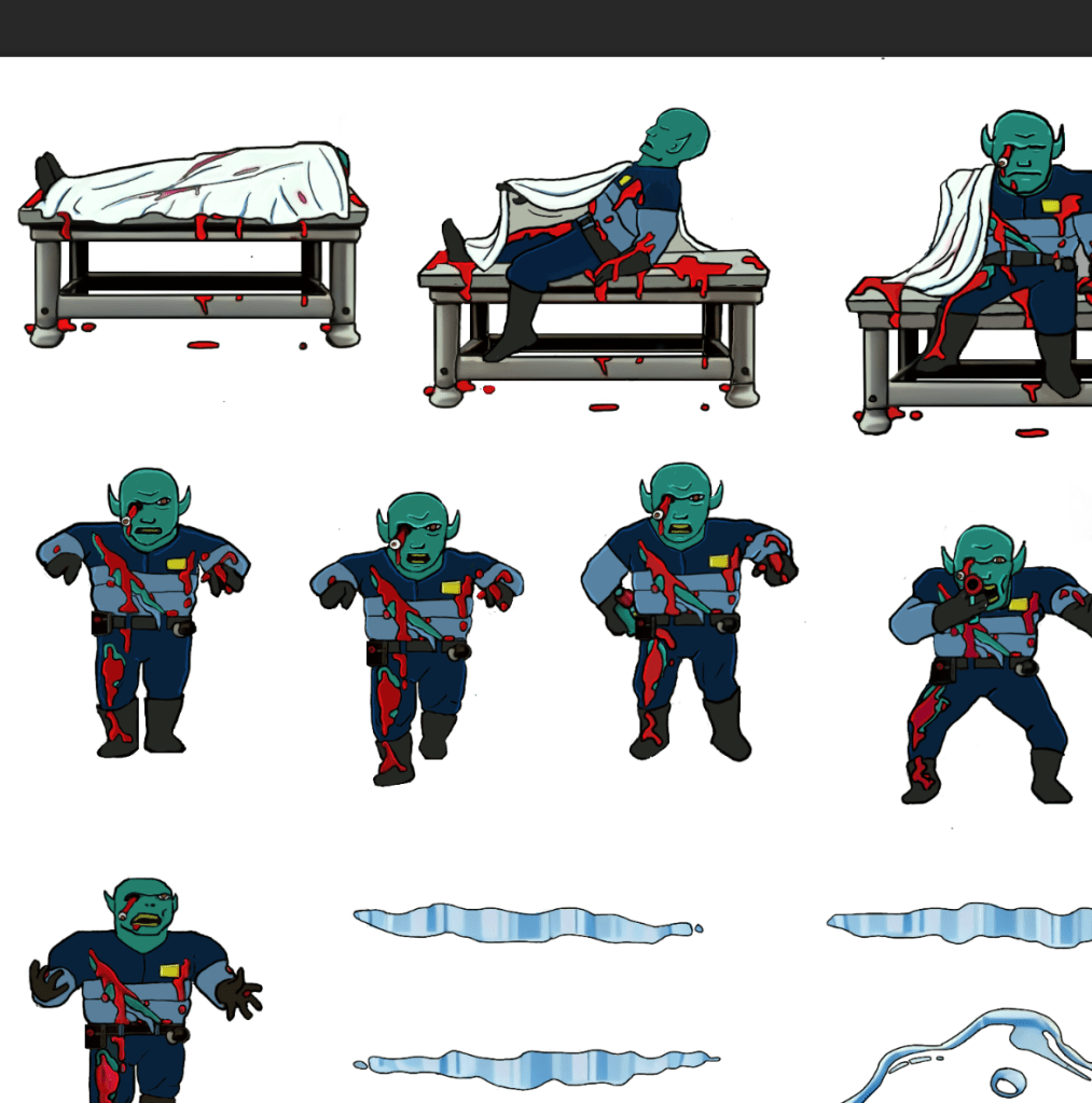
I’m approaching 50, retired from the military, and have NEVER WRITTEN A SINGLE STORY. I always had the distant notion that someday I might write a book, but the idea was a like a distant mirage that never seemed in focus. Most stories just swirled around in my crazy noggin. Though some saw daylight through other mediums (art, D&D, game modifications, etc), I never felt the urge to write them to paper.
Even when I started pitching fanfiction ideas as part of my podcast, Nerds and Normies, it felt more like an academic exercise than a “need”. In August 2020, I was in the telling my friend about my first podcast story idea (Hogwarts Fight Club) when, mid conversation, a switch flipped and I just knew that I wanted to be a writer. It wasn’t a “stop the presses” moment, but more like a there was a familiar presence that had been hanging back for a long time, waiting for me to feel ready only to step forward when the time was right.
And just like that, I was all in.
– Martin Pinkerton