Pixels so sharp they will cut you
For anyone who reads this blog (all 3 of you), it’s no secret that I favor a more cartoonish and abstract style when editing game artwork. With the Arena Depixelization Project (ADP), this was mostly a necessity since I was looking at simplifying images because of the extremely low resolution and terrible graininess (grain E ness?).

Original screenshots

darkened and reduced the color variation on the floor

I’m pretty happy with this one. Clean and aesthetically appealing
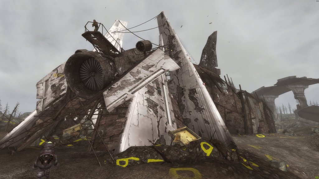
Textures so muddy, they have to take their shoes before coming inside
However, with Morrowind, it was more of a desire to undrab (not even a real word, I’m pretty sure) it some. The individuals textures were unimpressive but all together they worked (for back in 120 A.D. when it was created). With my early experiments, I used the cartoon method to add interest to the individual textures, but it was crude.
“You know my name is Simon and the things I draw come true”
From here, I had a detour with a little experiment. For all the games I work on, I have a soft spot. Darkstone was one such game. Its low resolution blurry textures begged for me to edit them. It was a challenge just figuring out how to access them and understand the file structure: there are odd duplicates, art sheets (many art assets on one texture), and strange encryption. I wanted to create a chalk-like art style. It was a side diversion and never meant to be a full project, though. I really liked the results, though.

Exit to Forest

Near the target range in town
STOP CHANGING THE DAMN FORMAT ALREADY!
I had very little experience back then, and it was before Borderlands captured what I desired so well (ICE CREAM…wait no…CELL SHADING!). So I switched to working on Minecraft for my sons. I finished not only the main game but several of the most popular modification. However, Mohjang (the makers of Minecraft) changed the texture format and naming several times over the duration I was working on it; breaking my texture pack (Grrrrr!) more than once. I never released it as by the time they completed it, they had added so much more that I hadn’t done. However, it gave me time to work on learning the graphics software (GIMP…not the one from Pulp Fiction).
But the name almost begged it!
I’m not sure how I started working on it, but the next project I worked was Torchlight. I think I had just wanted to see if I could do it. During this phase, I dedicated quite some time experimenting with different styles and the software. Eventually, it turned into a full-blown project which I called “Toonlight”…I am so clever…so damn clever. Looking back, I think I lamented how little the backgrounds “popped” and though I could smooth and outline them to make them defined. My biggest failing on it (beside the wee-bit of amateurish work…cough cough) was that I was so focused on the individual textures, that I didn’t account for the whole picture and scene. So much detailed “polluted” the screen. This is relevant for when I get to my newest endeavor. Toonlight was never finished (I had illusions it might be). I didn’t like the results on a game level and didn’t want to start over. The creatures looked nice, though.

More town filtering

Lava level…I still like it
Nailed it….
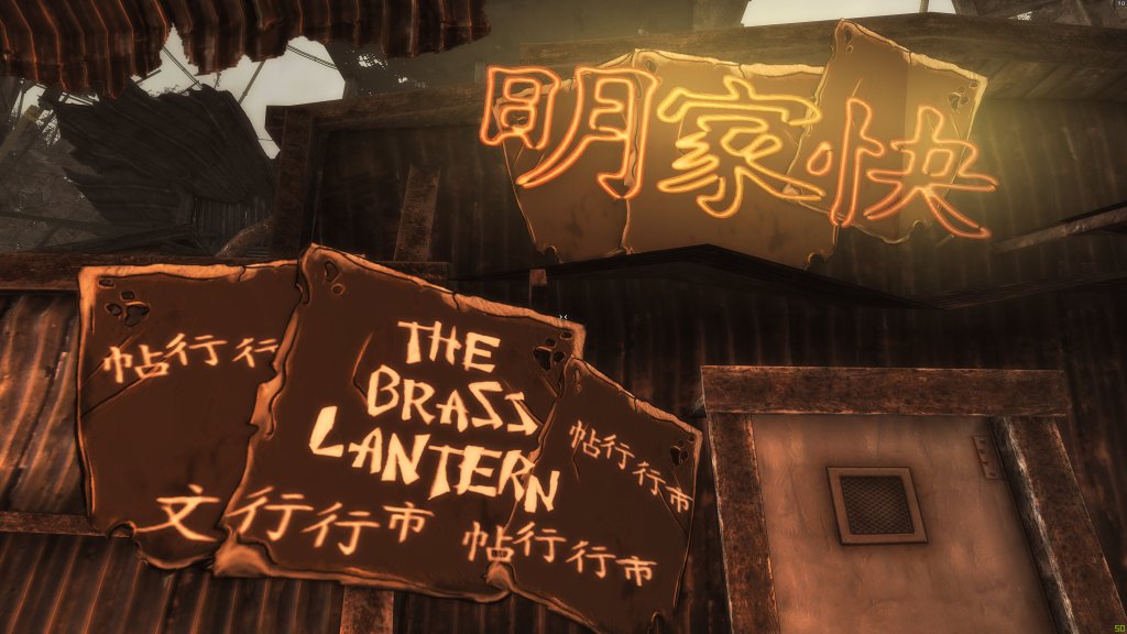
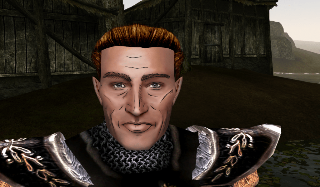
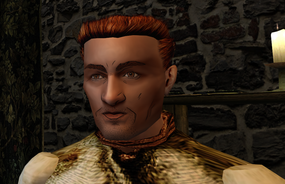
Then came Borderlands. It perfectly encapsulated what I was going for. I loved the art style and now I had an inspiration to study and evolve my style. It was here I learned about rim lighting (making dark lines pop with a lighter line near it) and ways to make larger blank areas look less dull (hint: random lines and squiggles). I didn’t try it for some time as I was working on finalizing ADP (which is….sigh…not done yet). When I finally took a break, I experimented with Morrowind again…this time on the faces; trying to capture that Borderlands style. Ultimately, I realized that my style was Borderlands-inspired but had my flavor added.
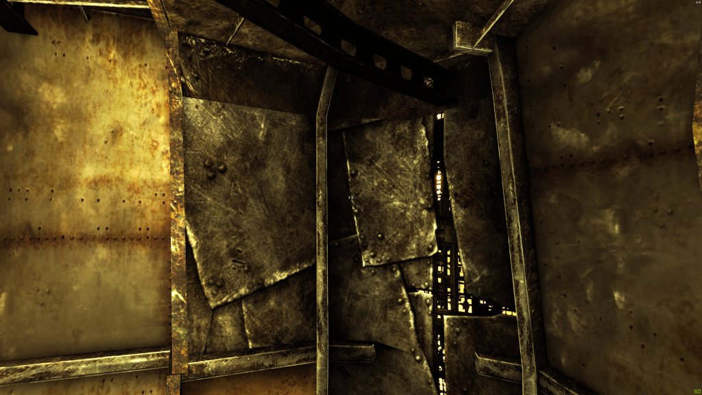
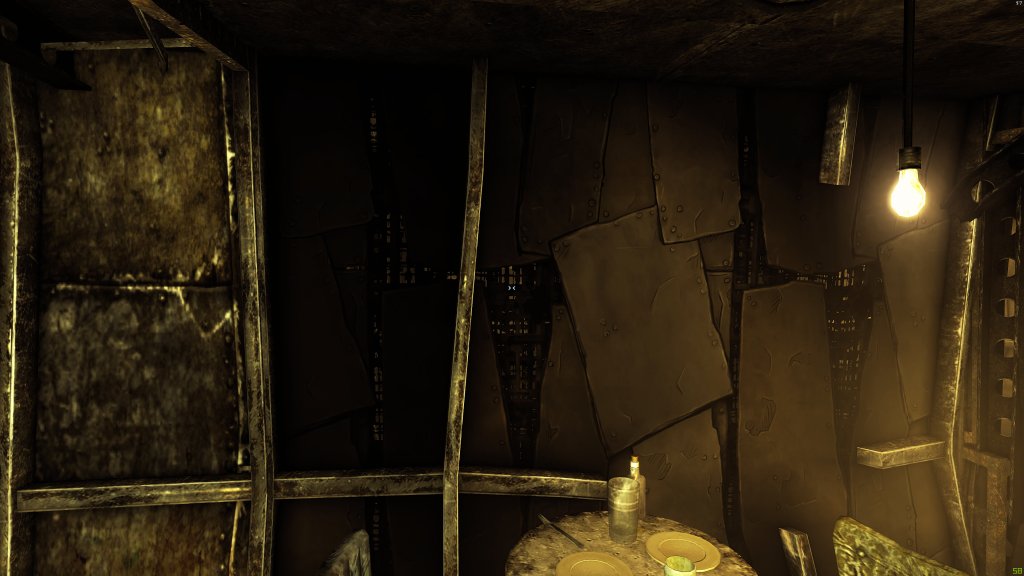
Brown…so much grainy awful pixel-y brown
I finally had enough experience to move forward. I had a few other side projects not “cartoon” style related (such as the FATE mod..so I can have all that crunchy 4K resolution…mmmmm tasty). Moving on, I had just the project in mind to hone those skills even further and put them to the test. Eventually, I’ll return to Morrowind and complete a full artwork overhaul once I’m done.
By then, I should have most of my style and workflow on lock (see I’m cool…I said “on lock”…like a boss). More coming next post……. (oohhhhhh a teaser…what can it be…).
Martin