Letters count?
Awhile back I had posted that I had learned that I could update the font files. I never liked the font in Arena as it was too flowery for readability at such a low resolution. Each letter in the fonts was ranged from 3×3 to 8×8 pixels in size. They were all really just super small pictures.

If I build it, I’ll build it thrice
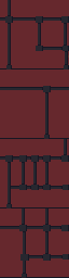
I wasn’t satisfied with my previous attempts and decided to quickly rebuild them again. This time, I tested each one out in game to see how well the effect worked. Surprisingly, this took more time than I imagined and I ended up completely revamping each font file 3-4 times till I was happy with them. In game testing allowed me to see where I missed or added a space, what characters didn’t look right, and generally if the font looked ok when playing. As you can see in the picture, the editor lets you click each pixel, one by one. While each character font file can have the spacing and padding adjusted using the slider (thus bigger or small amount of horizontal pixels), the height of the characters was fixed for each font file. Although it would be relatively easy to just rename one of the other font files that have a bigger height setting, I think that might play havok on how the game displays text and didn’t really see the need for it.


Through some in for spares?
To determine which font affected which portion of the game, I filled in a different set of characters in each font file as a solid box. Then I just looked to see which font was being used in each portion of the game containing text. Like with the art (and probably sound files), I found that not all fonts were used. Of the 10 font files included with the game, I have only been able to find 4 of them in game. Or at best, the others are used in some obscure corner of the game.
NOTE: The screenshots were taken with a vanilla version of Arena since this mod will be released as a separate mod from ADP.
UPDATE: I released TES Arena ReFonted on the nexus. You can get it here.
– Martin