Tag: retexture

  • ADP lives….yet again…well, technically it never died.

    THE RIGHT NOW

    Let’s just ignore the fact I haven’t posted in quite a bit (or that I started this project 13+ years ago). To be fair, I have released three other Arena mods in the meantime (more on that in the future).

    I recently started digging back into the Arena Depixelization Project (ADP), my graphics replacement mod for The Elderscrolls: The Arena, and I have been hitting it hard.

    I’m doing a recorded playthrough looking for missed art in the game and general quality control. This has led to me not only finishing missing textures but also tweaking (and sometimes overhauling) 90% of the work already done. I guess over 13 years of game art fiddling has matured my style slightly.

    THE SWAMP

    I first had to corral all my work over the last decade+. I had 7 different versions saved through the year and some files went missing so I had to extract them all compare and then pull any missing forward. This project was quite a mess (no file discipline at all, the shame). Then I had to relearn the tools, but that didn’t take too long. Then I created a new working directory and archived all the rest to clean up my sloppy work.

    In just 2 weeks, I have probably edited almost 100 textures already. As I record my playthrough, I save when a missing (or ugly/mismatch) texture is found and either fix it ASAP or catalog a bunch at once to do in a surge.

    GALLERY

    Here’s a slew of screenshots I made from the most recent version.

  • “Extracting art from Blake Stone” is not a very funny title (Part 2)

    “Extracting art from Blake Stone” is not a very funny title (Part 2)

    Collecting Pixels

    Step one is figuring out how the game stores the art files (textures). Normally what I do is check for the largest files, as they are usually the texture and/or sound archive. However, with Blake Stone, I knew that this game used Wolfenstein 3d-style archives. Blake Stone’s format was slightly different and used the extension BS6. But it was close enough that Slade, a popular tool for actual Doom and Wolf3D games, worked perfectly to extract the files.

    FUN NOTE: I started this many months ago. I JUST noticed that BStone has a command-line option to extract textures. #facepalm #hashtags #DOH

    You may call me…”Tim…er… I mean SPRITE”

    The BStone program looks in the “aog” folder for any textures (Planet Stike has it’s own folder, “ps”). If it finds a texture there, it will use that texture instead of the original. Unfortunately, BStone only supports sprite and wall files. That means some elements can’t be replaced currently (mostly UI and cut scenes). For Blake Stone: Aliens of Gold, there are 1017 sprite and wall textures but there isn’t a folder structure. They all just go into that one folder which makes it easier to manage.

    I extracted all textures to a working folder and hit it with a quick and dirty upscale so I could check how it works in-game. After dumping them into the “aog” folder, I booted BStone and enabled “External Textures” in the option menu. It didn’t work. Turns out that the extracted files were names were very slightly misnamed when extracted (SPR instead of SPRITE, etc.). It was easy enough to fix with a utility called Bulk File Renamer. A quick touch up and I reloaded BStone to see if that fixed it.

    Stretching them on the rack (by rack I mean in Photoshop)

    It worked…sort of. The textures were definitely upscaled but many of them looked squished (skinnier than normal). Quick glance at the readme revealed that rendering of sprites was not 1 for 1 in-game.

    After a little experimenting, I realized that every texture just needed to be perfectly square. Maybe the extraction method was flawed, not sure. To fix it, I just made a quick macro on my Logitech keyboard (frequently my savior for repetitive tasks), dumped 100 or so textures on photoshop and ran the macro (it resized the canvases to be 64×64, saved and then closed the file). I just needed to hold down the macro button and let it work through each file. After finishing all 1017 textures, I saved a backup for the inevitable time I make a drastic mistake. (I will share the reformatted originals when I get around to doing Planet Strike)

    Up next time…..Version 1 of my Blake Stone HD texture mod

  • Cork on a fork

    Cork on a fork

    This is Jiub. Jiub is the first person you see in Morrowind. He also has a fairly unique head so it was fitting to use him as my first experiment. Easy to test. This Jiub, being my first attempt, is a little crude compared to the later images. The transition as I refined the style is apparent. So here’s what I did.


    55fiqg
    I was watching you sleep

    Resize

    The initial resolution was 256 x 128 pixels. That’s not a lot of room for sharp lines and clarity. Additionally, it’s a good idea to work big and then shrink as needed so I resized the image to 2048 x 1024, keeping the aspect ratio but increasing the size by 8 times. As the fine lines of the borderland style are important, a higher resolution is preferable.  (I tested it when done and shrinking down to 512 x 256 looked OK but 1026 x 512 was ideal for size vs detail).

    Create layers

    I duplicated the image into two additional layers. I do this so I can have a pristine backup, a working copy and high pass copy (if needed). The high pass allows me to see the areas needing outlines more clearly. I don’t always use it but it’s handy if needed. I created a new layer that is transparent to be my actual canvas for the black outlining. Showing but underneath the active layer would be the working copy or the highpass copy to use as the base reference.

    Outline

    tx_b_n_dark elf_m_h09
    Jiub 1.0…crude untapered thick lines

    Like the video linked in my last post, I started creating outlines highlighting particular feature areas that stood out for change in shape. My  variation on this style leans more to outlining surfaces with changes in height but not color fluctuations (e.g. later on when I get to tattoos, I likely won’t outline the tattoo.) I looked for distinctive wrinkles and natural feature as well as abrupt marks like the scar.

    As you can see in Jiub 1.0, I failed to refine the lines after I finished outlining. I didn’t use shape dynamics or taper and thin out the lines. Crosshatching was also minimal.

    Check

    Jiub Vanilla Base to Borderland
    NifSkope and Jiub 1.0

    I used a program called NifSkope that lets you see meshes rendered with textures and animation if applicable. It was there that I saw how odd the texture stretched due to the 3d model’s crude animation and UV texture mapping. The eyes looked really weird as the mesh just stretched down a single point to mimic blinking but the texture stretched the area above the eye down with it. The mouth opened up very much like the canadians in South Park. Because of that, I had to go back and adjust the lines to minimize the line bleeding when the textures stretched.  You can also see where the original texture has errors such as the red eye’s inner lower corner bleeding onto the eyelid.

    Tweak

    Because this is a more cartoon-like look, I experimented with using an unsharpen filter on the working copy of the original image to exaggerate the colors and then a smart blur to blend the blemishes away some. Additionally, I added shadows and highlights by drawing on a new layer black and white respectively at 50% opacity and then blurring it to look like light smudging.

    Next time, I show the other, more refined textures I completed AND Jiub 2.0.

    – Martin

    20160606075309_1
    He fell passed out drunk and the guards found a Sharpee

  • Doors and Floors


    Get it together man

    Now that I have finished the “walls and halls”, it’s time to renovate the doors and remaining floors. I have finished almost all the ground textures though (well a few could used tweaked too). In the past, I just worked directly in the directory where I extracted the files and reinserted them into the BSA from there. However since there are so many IMG files (949 to be exact) and that isn’t the cleanest way to work from a project management perspective, I pulled all the door files out to a separate folder/workspace and created a completed folder to use for importing files back to the BSA.

    Tavern with old door art
    Must have ran out of paint

    Doors, Doors, Everywhere there are Doors

    There are 112 door files not including non-doors that would serve as potential transition points (e.g. ladder up/down, stairs, etc..there are about 12 of those). These IMG files come in two variety, framed and whole texture.

    I’ve been framed

    The framed doors are “framed” with the texture of the building to which they belong (e.g. the Mage Guild door has a frame art that matches the building).  To do these, I’ll just copy and paste a wall from the matching set file and layer it under the door so it’ll be a perfect fit with the rest of the building. All exteriors and some interior doors are framed doors, pretty much any door that transitions between outside and inside.


    That’s no small wall…it’s a door!

    The other type of door is the whole texture door. I have done a few of these previously as you can see in the screenshot. These doors belong to all the interior rooms and are the ones that swing open so you can enter a room. Although they are relatively simple (as they repeat the same textures over and over for different files), I’m hoping to add a little more variety to them.


    First things first though, I will test to see if each IMG file is used in game (i’ll probably do them in batches). I have already found several that aren’t. I will likely still redo them just in case. Worst case scenario, if I ever can get anyone to figure out how to decipher the MTF files, I will use them to make new dungeons and buildings.

    – Martin

    ,

  • Is that 80’s fashion?

    The straight and narrow

    Some days I can blaze through images getting 5 or 6 done in a sitting, then other days just part of an image can take a couple days. When it comes to the Arena Depixelization Project (ADP), the easier ones are just patterns (especially ones with straight lines horizontal or vertical). The low pixel count doesn’t really muck up the design too much since there is no need for a “fine detailed” line in those cases.

    It kind of looks like….

    However, once lines start curving or the image becomes complex, the time required is increased, sometimes dramatically. It’s hard to get non-angular shapes to look good when you only have a 64×64 grid to work with. I find that it takes multiple revisions to get it looking just right. To make matters worse, the source material for ADP contains many pictures that are either so pixelated as to be barely discernible or they generally don’t look very good as you clean them up (such as dress thing for the “angel” in this picture).

    WALLA Untouched
    Click to enlarge


    Close enough for horseshoes and hand grenades

    In that image, I had to make some artistic decisions on how “accurate” to the source material I would be. The image is generally too complex to leave unaltered for my “Depixelization” theme. At first, I didn’t even know how to tackle it. I completed all the background wall first and left the “Angel” and the “alcove” till last. The good thing about that is that it let me establish the colors for the image. Eventually, I had to do this one as I only have a few SET files left. I decided to break it up and focus on individual pieces of the angel. I really wished I had made a timelapse of this one to show how much back and forth I did on it.

    Mr. Potato Head

    I started with the more clearly defined shapes, to include the arms, head, and the key. Those came into place with minimal fuss. Then, I tackled the wings. It took me awhile as the initial version (closer to the source) just didn’t look very good. After a couple of iterations, I ultimately decide to make the wings bigger as if they were more full body sized. Next, I attempted to do the feet. However, they just did not look good, especially when I started working on the weird “billowed” dress/robe. I decided to put the feet off and do the clothing. I touched up the sleeves to improve the “hanging off the arms” appearance. I made my first rendition of the lower part of the robe very close the source version. However, it looked terrible because the source version is kind of ridiculous looking, as if someone tucked an oversized shirt into a skirt.  I played with it a little before I decided to just alter the design. I revised it to look more like a regular robe. Unfortunately, the feet still looked awkward, so I removed them and lengthened and curved the robe as if they were hidden by it and it was floating.

    – Martin

    ADP WallA
    Click to enlarge


  • Wake up! You were dreaming.

    Early on

    Morrowind Main Menu (Original)
    Morrowind Main Menu (Original)

    Back about 4 1/2 years ago, I had just gotten into computer graphic design. I spent the first 1/2 a year experimenting and learning how to use the editing software (GIMP). One of the games I messed with was Morrowind, my favorite game. It wasn’t really meant for any project. I decided to make a desktop wallpaper of the main menu.

    At that time, I didn’t know much about GIMP or how to use it effectively. Additionally, I had just gotten my Wacom tablet and hadn’t become comfortable with it quite yet. To make it easy, I used the original Morrowind main menu texture as the base. Because of this, the end result was (and still is) useable in-game. I even went as far as retexturing the New/Load/Save buttons to match the theme.

    Morrowind Box Art

    It’s Alive

    I decided to use the box art as a supplementary inspiration when I began working on it. There were some key differences between the two; the major one being the border that framed the box art. I really liked the border and the “daedric” lettering on it. Unfortunately, my source copy of the box art wasn’t very good so I had to guesstimate when recreating them.

    Crayola version

    I did have a couple goals in mind with an overarching theme of applying a cleaner more art-lik

    • To boost contrast, the border was darkened and a similar color was used for the middle triangle.
    • The center was lightened with a complimentary but vivid color to liven up the image.
    • The “daedric” lettering was lightened up to look more dramatic and almost “glowing”.
    • A spot of white was placed on each “letter” and then the smudge tool was used to stretch that white color into highlights.
    • A level of depth was created by adding width and darkness to the inner edge of the frame. The “Morrowind” lettering was giving a simple perspective by adding a drop shadow angling to the lower right.
    • The dragon emblem was subdued so that it didnt’ overpower the wording. This also gave a subtle layer of interest.
    • Lastly, it hard to see but the entire image was given a paper texture filter to create a painted canvas feel.

    I use this as my background on my computer for inspiration
    I use it as my background on my computer for inspiration

    You never forget your first

    Most of these effects evolved through experimenting with the software and various visual styles that I had in mind. However the whole picture was hand drawn/partially traced using my art tablet. It’s not without it’s flaws and a level of crudeness to the picture shows my inexperience at the time. Despite all that, it is one of my favorite personal pieces because it’s the first complete computer graphic design work of mine.

    – Martin

  • It’s getting hot in here AGAIN?

    It’s getting hot in here AGAIN?

    Warm to the touch

    NOTE: This kind of a rehash of a previous post from a different angle (slightly) that walks through the process more “visually”.

    One of the texture SET files edited recently for ADP was a 4 texture wall set that resembled a wall with lava or fire spots. I had already settle on using a mostly flat wall color to more dramatically contrast the flames/lava parts of the textures. But in order to maintain a uniform look to the fire, the image needed to be built in layers. A good first step is to make a duplicate layer of the original before making any changes, especially major ones. That way, the duplicate can use as a reference when editing the image.

    MINEB1 (original)

    • Layers in GIMP (and I’m sure Photoshop) allow you to create/edit different pieces of a picture individually but still be able to see them as a whole…like may layers of tracing paper stacked together but each having a different element drawn on it.

    Cut it out

    In this instance, the first element designed was the “wall” layer. Using the Erase function, all spots containing a decent amount of fire were erased.  In GIMP, the eraser needs to be set to “hard edge” because of the technical limitations of the image format, it can’t deviate form the original palette or be partially translucent. Later on when the “fire” layer was created, it would be placed underneath this layer so that it show through only the holes.

    MINEB1 (foreground)

    Sticking to colors in the image, one was chosen as the new wall color. Before mass painting the “wall” (usually just by increasing the pencil/brush size to larger than the image), the “lock” transparency option had to be enabled to prevent the cutout holes from being filled in. Lastly, another complementary color was used to border the cutout sections and add a smidge of depth and interest.

    Heating it up

    Next, another layer was created for the “fire”. The plan was to fill the whole layer with the fire effect. If the “wall” layers transparent parts are changed (holes made bigger or moved), it wouldn’t need any adjustments. Also, it’s just easier that way. The fire is created by using alternating gradients of yellow to red and then back. This is repeated for the whole image.

    MINEB1 (fire background)

    Lastly, the final step is to “merge” the two layers together so that they show the wall but with spots of fire. In GIMP, you can right click the “wall” layer and just select “merge down”.

    MINEB1

    This technique is very similar to the one used on another firery wall that I completed months ago. Additionally, I used it for the lava in my Minecraft texture pack.

    MINEA1

    It’s fairly simple but still creates that fire/lave effect I like despite the limited palette.

    – Martin

  • Polka dot shirts with checkered pants

    Interface

    One item that bothered me was that the interface elements didn’t really match. It seemed as each screen had it’s own style, particularly when you compare the “esc” menu and the inventory. Once I knew I could edit the inventory backgrounds, I wanted to make it match the other screens. However, I discovered that they use different palettes and I couldn’t find the right color that was on both palettes.

    Inventory screen (original)
    Inventory screen (original)

    ESC menu (original)
    ESC menu (original)

    Compromise

    I ultimately had to settle on as close as a match as I could get. Additionally, I tried to port over a few of the stylistic elements of the ESC menu into the other GUI elements to tie them together better.

    – Martin

    Dark green is as good as it gets
    Dark green is as good as it gets

    I used an alternate (unused inventory graphic) and tweaked it to add a little more character
    I used an alternate (unused inventory graphic) and tweaked it to add a little more character

    ESC menu (redone)
    ESC menu (redone)


  • Sometimes it’s easier to walk around then straight through

    Compressed

    Quite of few TES:Arena IMG files are compressed in a crazy-wack-funky format that only the executable can decipher. No one has successfully found a way to decompress them. I had, quite a long time back, experimented with trying to replace them with uncompressed images but didn’t succeed.

    Character screen
    EXAMPLE: The character screen is two parts: stats on the left and character image/provincial background on the right. Each section is it’s own IMG file that is unfortunately undeciphered as of yet.

    The “method”

    I picked the “QUOTE.IMG” texture to edit because it was quick to find in-game and had clearly defined dimensions (full screen at 320×200). I loaded Arena in DOSBOX and waited for the quote to load (it’s the second screen after loading). Then I took a screenshot and since DOSBOX already uses native resolution, I didn’t need to alter the image. However, when I replaced the “compressed” version with the new one, it didn’t show up in game (it stayed black until the next screen loaded).

    The screenshot version of the Quote image
    The screenshot version of the Quote image

    Wait there’s more

    However today, Hallfiry (the maker of the Arena mod suite I use) revealed to me that it was indeed possible to do what I had attempted. Reinvigorated, I retried my previous method and almost instantly found a flaw in my method involving his program. Basically, his program translates uncompressed image files from Bethesda’s non-standard image format to PNG files for easy editing. When it does the conversions it creates two additional files, .MET and .PAL, containing color and format information to be used when reconverting back to the original format (repacking the archive). I failed to accountfor his program needing these files to successfully convert back the image. So this time I copied a .MET and .PAL from a similar “uncompressed” fullscreen image and renamed them both to match the “QUOTE” image.

    Victory

    This time it worked although it looked normal because I hadn’t edited it’s appearance. What this means is that all full screen IMG files could easy be redone using the “improved” method above. However, I wondered about partial full screen images such as the character screen.  Using DOSBOX debug, I quickly found that the character screen images and made a screenshot. NOTE: Dos debug shows what images are loaded so I also knew which image to replace. The character screen is composed of two images. On the left is the blue-ish stat background and the right is the province background with the character image overlaid on it. I chose the stat background due to simplicity. Using the method above, I only had to add one step. Knowing that the CHARSTAT.IMG covered only a portion of the image, I had to crop the DOSBOX screenshot to just encompass that side. I did some messy edits to test a few things and the results are below…

    Now I can replace fullscreen graphics
    Now I can replace fullscreen graphics

    c

    NOTE: I confirmed my suspicions that not only were the DONE and NEXT PAGE buttons were just part of the background, but the stat names and other misc “yellow” text was too.

    Basically, this means I’m one step closer to a complete retexture. Fullscreen and partial fullscreen graphics are now replaceable to include: the title screen, the quote, all the image scrolls (yes this includes the text and I CAN fix the Uriel Septim typo), character sheets and backgrounds and what ever else is full screen. The only one I’m not sure about is the MAP. I’ll save that experiment for another day.

    – Martin

  • Bring marshmellows and a stick…

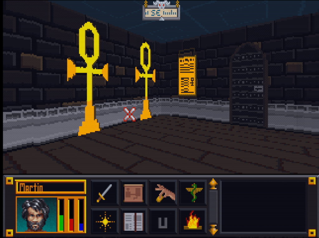
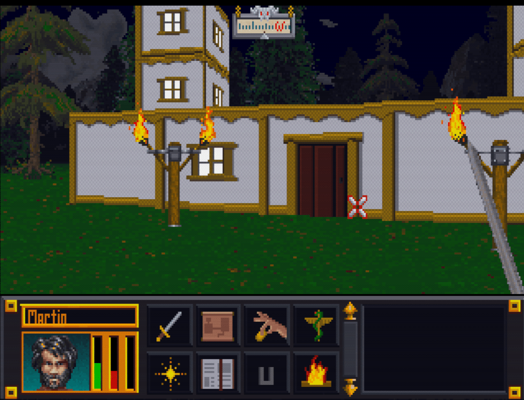
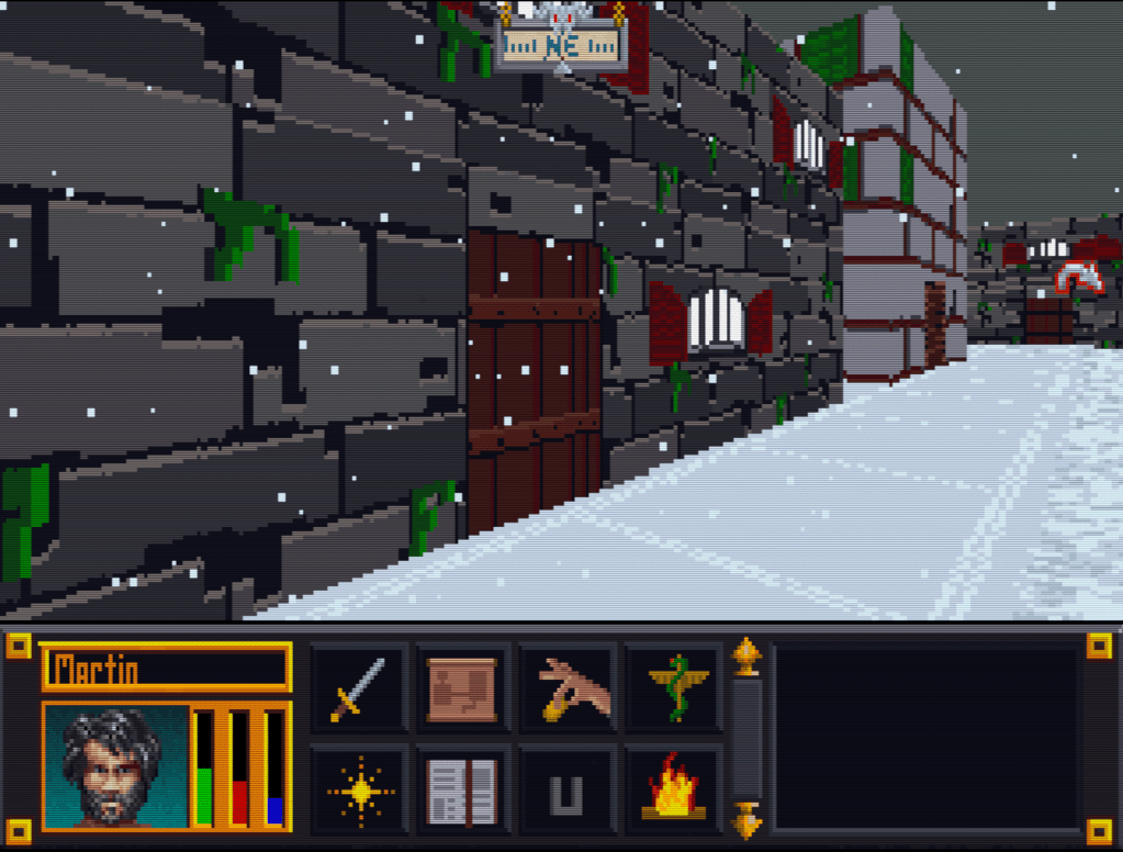
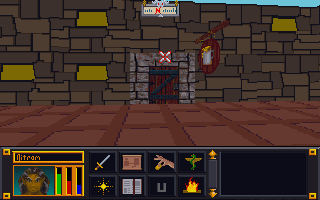
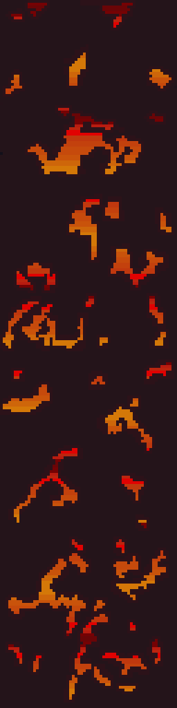
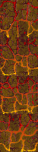
    For this texture set, I wanted to retain the fire/lava vein effect in the walls. Although I had mapped it out from my previous run through all the textures as covered in a previous post, I ended up making quite a few changes. Click the picture below for a closer look.

    Here’s a breakdown of the sequence of events from start to finish.

    1. Create an outline – To do this I selected a dark color and outlined all the rocks letting anything outside the outline be designated for the fire/lava. I followed the source fairly closely but did take some liberties to make some a little bigger.

    2. Fill in the rocks – I initially selected a tan color for the rocks since the original was largely tan-ish. I colored in every rock, one by one. There are easier ways but I enjoy it so I don’t mind using the color every pixel method.

    3. Make tiling template – Since any texture in the set could be next to the other, I had to make sure that they match up naturally and didn’t have any obvious seams. I copied the first 3 left-side columns of pixels in the top most texture and pasted them on each image all the way down. Next, I repeated the process but for the right side. This made all 4 textures (this SET is 4 textures in a column) have the exact same sides. Since the top one was seamless, they now all are seamless.

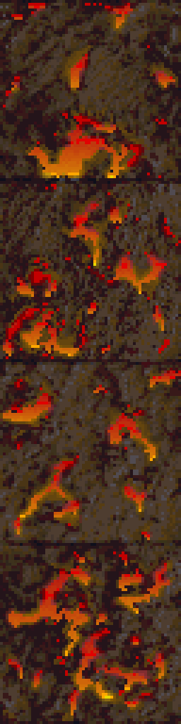
    4. Make duplicate of image in new layer – The duplicate layer is what I used to create a uniform and consistent lava pattern. To duplicate a layer, right-click on the layer in the layer toolbox, then select duplicate layer. An exact copy of that layer will be placed right underneath the original.

    5. Remove fire/lava from top layer – First, I turned off the bottom layer and make sure the top layer is selected. Then, using the eraser tool, I erased all the fire/lava and miscellaneous areas not already designated as rocks (and thus colored in). This made the lava area transparent but it is still preserved in the bottom layer which is “hidden” from view when turned off.

    6. Create lava layer – First, I turned the bottom layer back on and the top layer off. Then I started with the top image and hand created a gradient covering the whole image starting with yellow at the bottom and working to dark purple(ish) on the top. Then I copied this completed lava gradient and pasted it over the 3 bottom images.

    7. Merge the two images – I “turned on” the top layer (making both layers on), then right clicked on the top layer in the layer toolbox. From there I selected “merge down” so the top layer and bottom layer become a single image with both the new rocks and lava together.

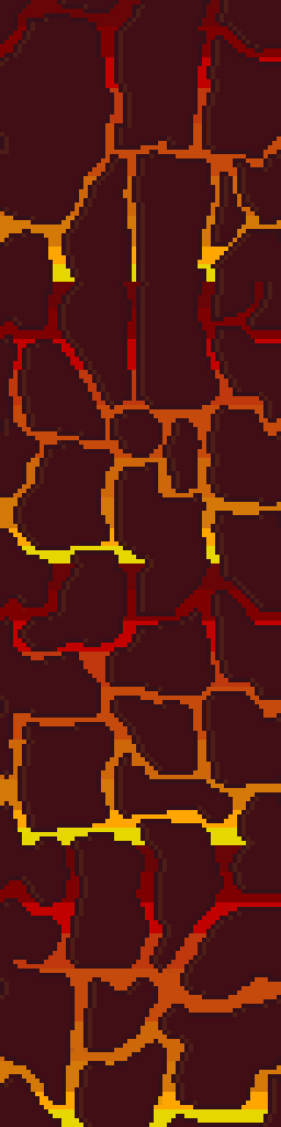
    8. Revise – At this point, I decided that the lighter color rocks didn’t contrast well enough or give the lava the pop I wanted. I loaded another copy of the original texture in GIMP, picked out a new brown but then decided on a slightly lighter color than the original rock outline. Using the bucket paint tool, I filled in all the rocks with the new color. In this process, I also caught a few miscolored pixels and fixed them.

    9. Create depth – Next, I added a lighter faded version of the rock color to the left side of all of the rock outlines. This created a highlight and adds the impression of depth to the rocks.

    10. Touchup – Lastly I offset the image 1/2 on the horizontal plane so I can see how the whole file tiles sideways. Since dungeons and interiors don’t exceed 1 tile in height, I didn’t have to worry about this texture set tiling vertically. To offset in GIMP, press Ctrl + Shift + O and in the “X” box typing 32 which is half the total width of the texture. After clicking the “offset” button, the whole image will shift 32 pixels to the right and placed the edges of the image in the middle. I scanned and fixed any mismatchs or slight errors then shifted the whole image 32 more pixels returning it to its original place.