Category: Art

  • Blakestone HD textures sneak peak

    Blakestone HD textures sneak peak

    Recap

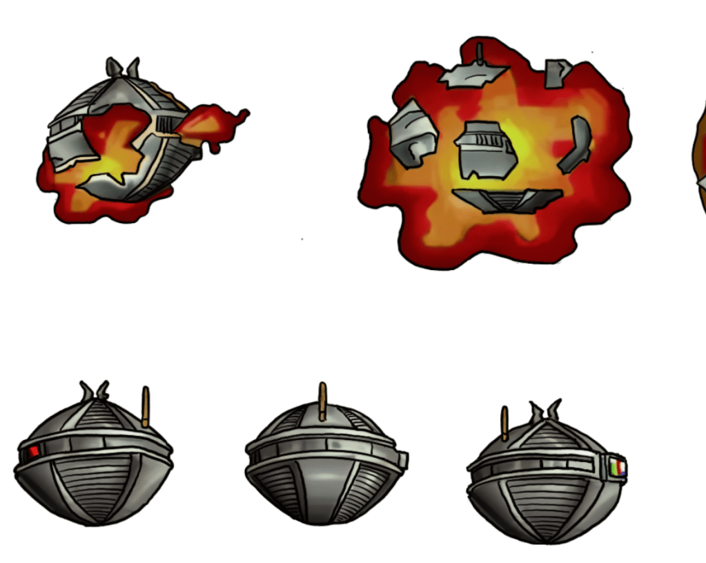
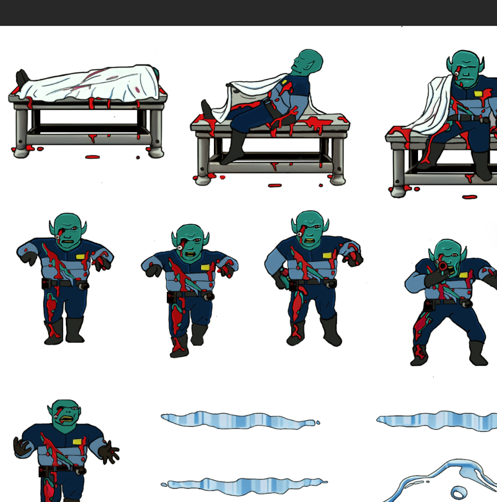
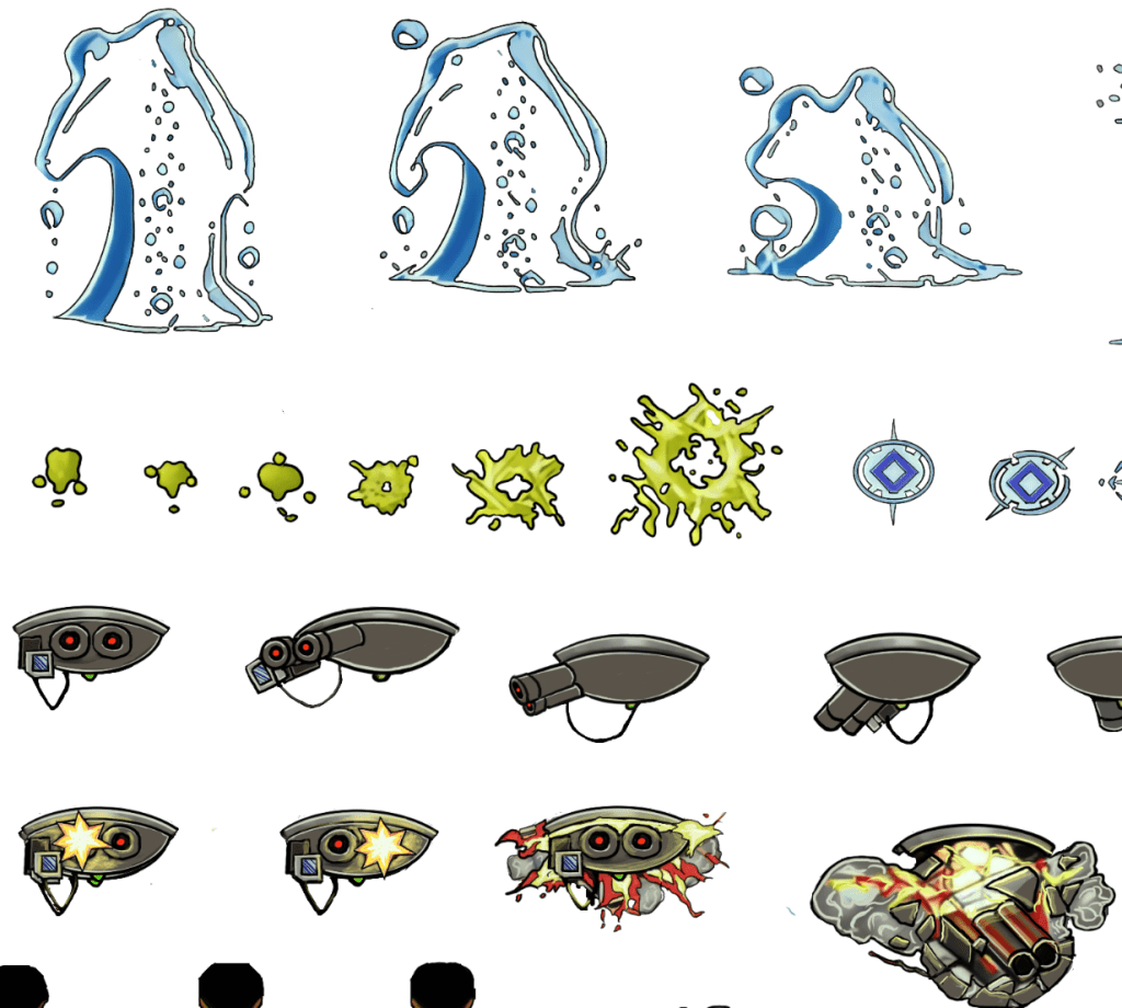
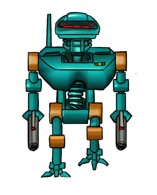
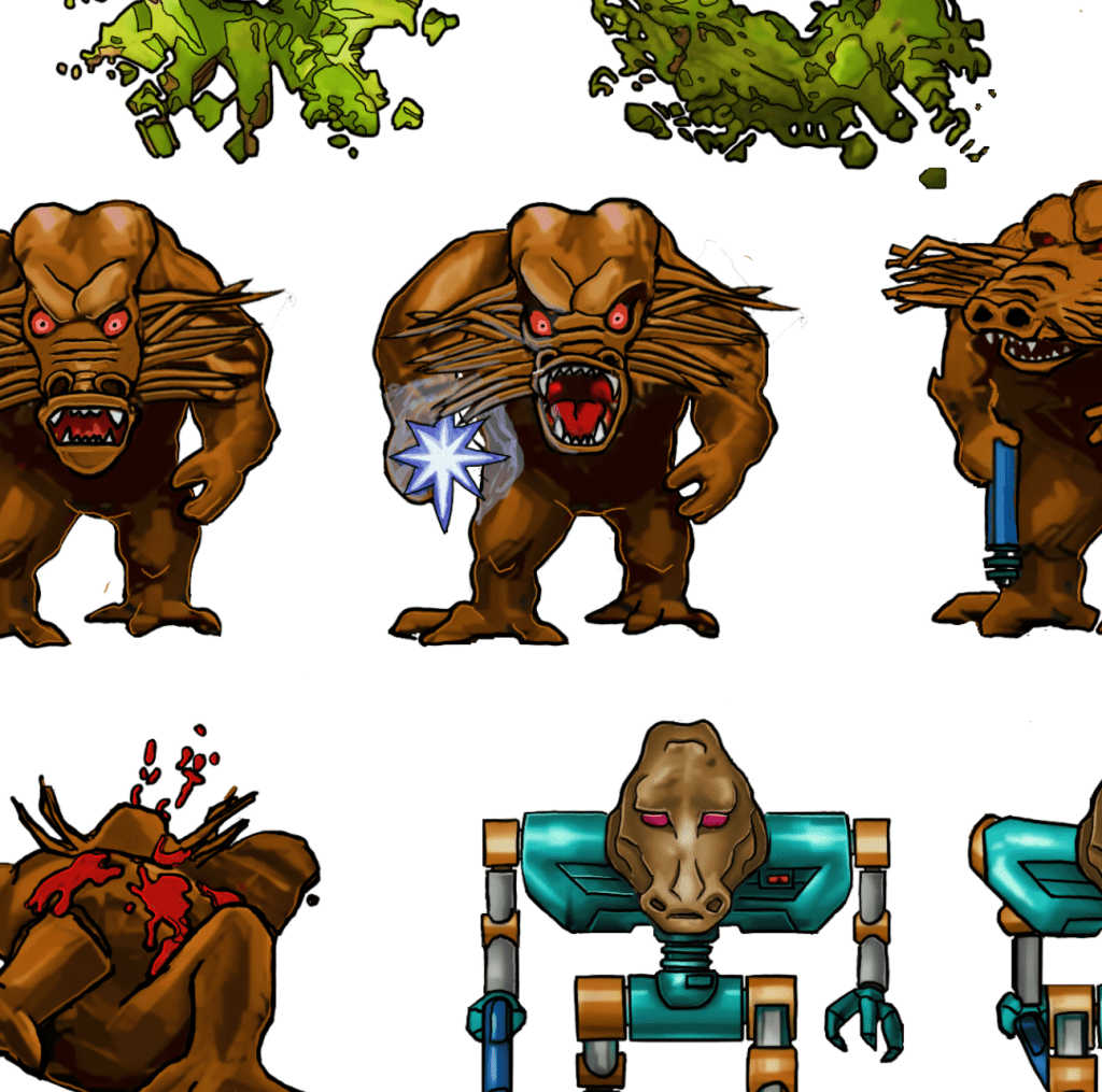
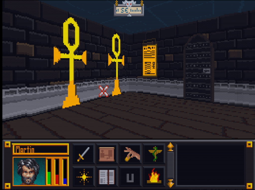
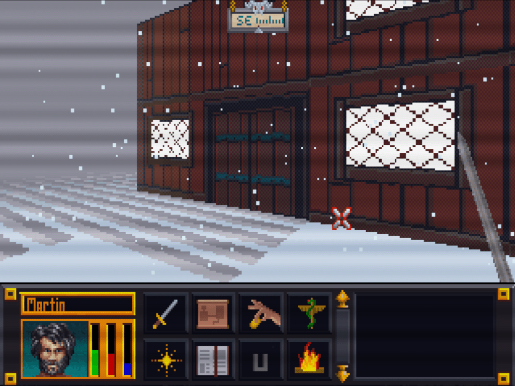
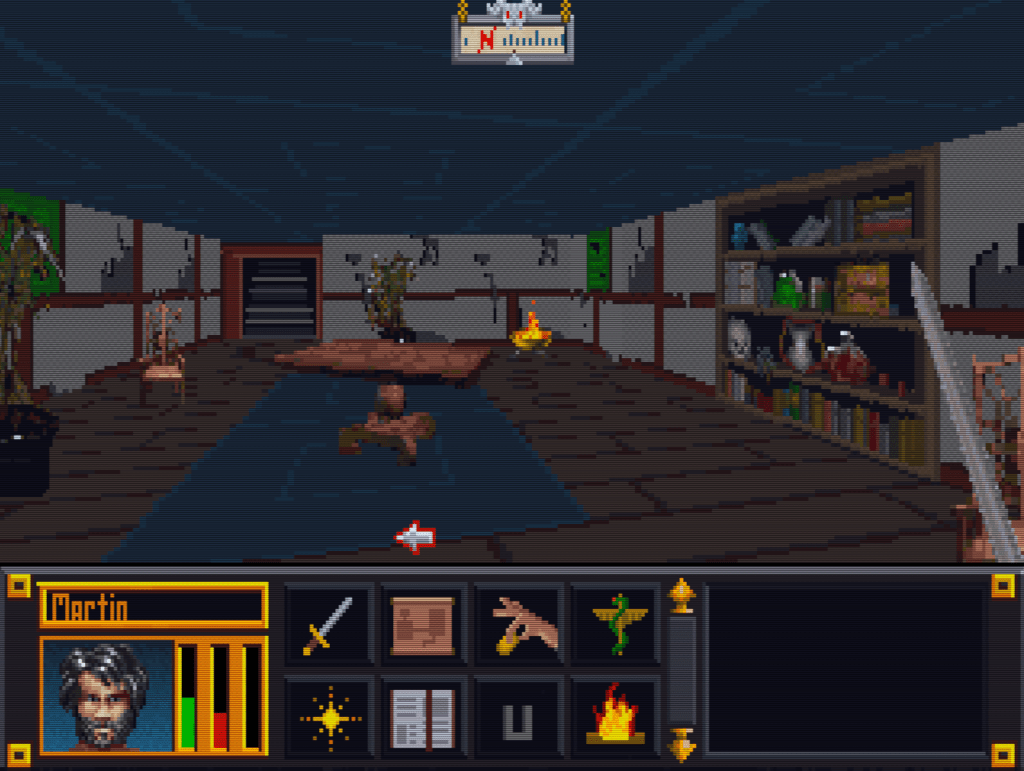
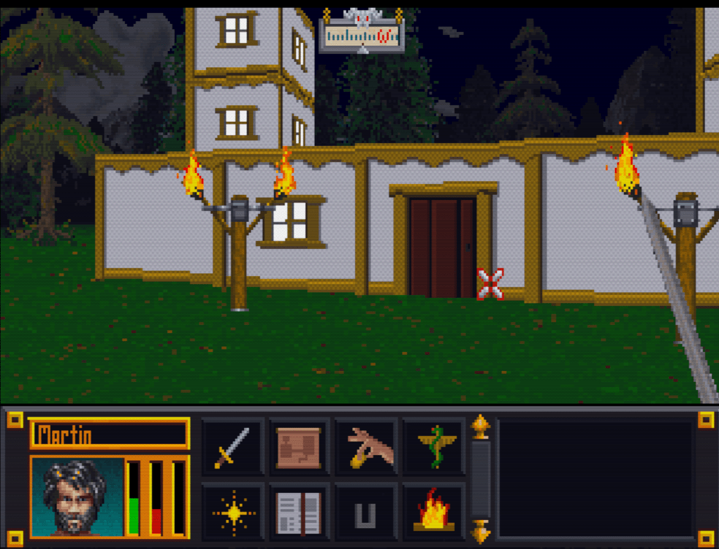
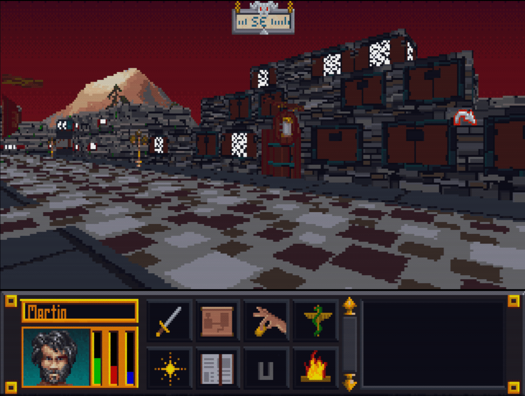
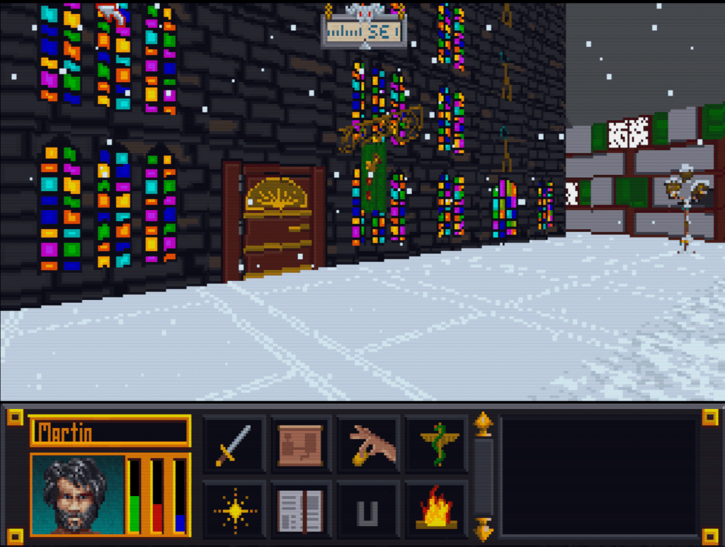
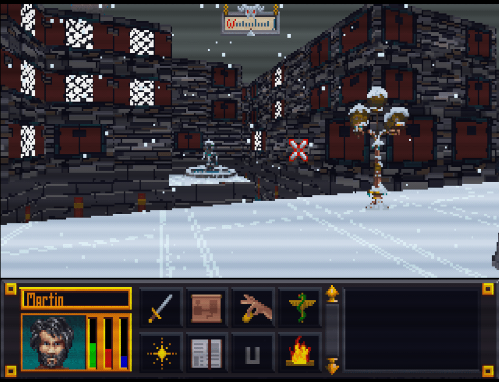
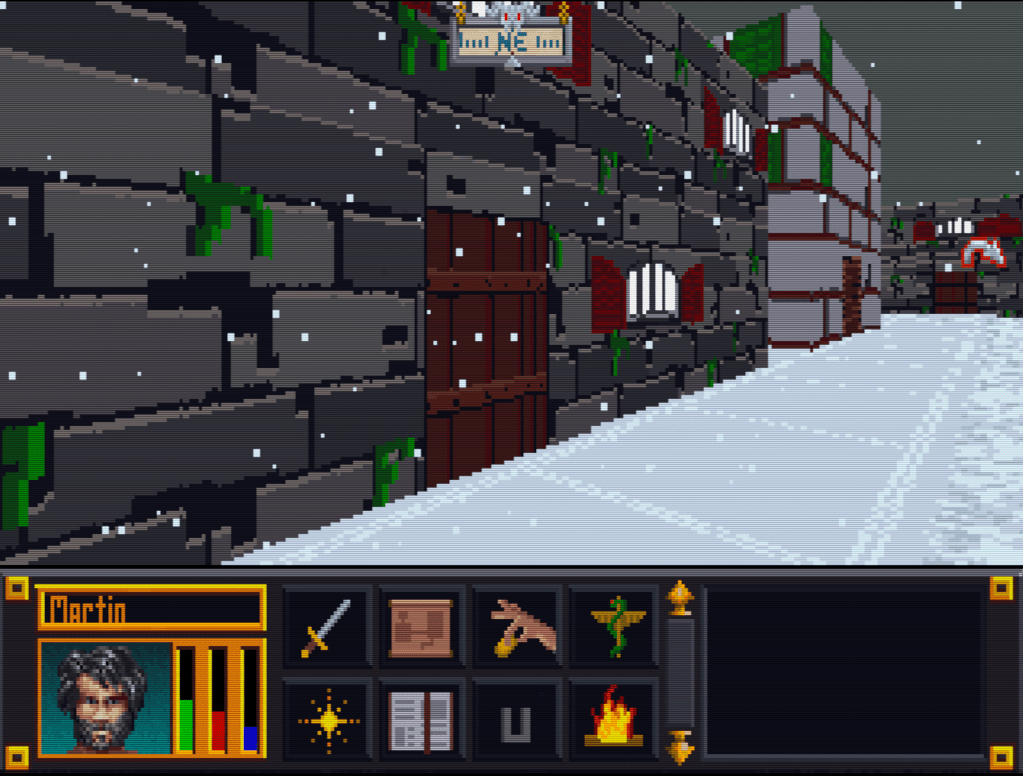
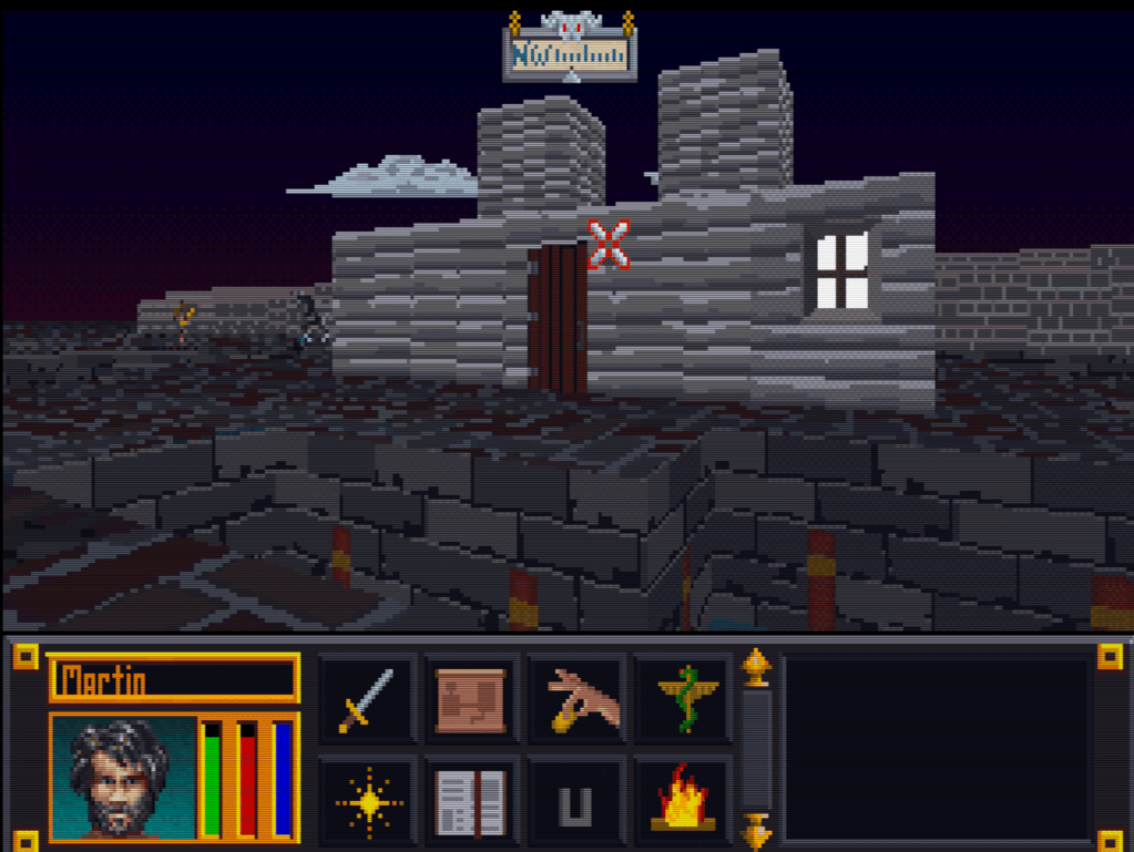
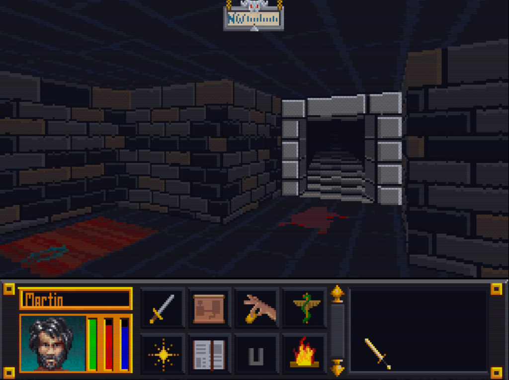
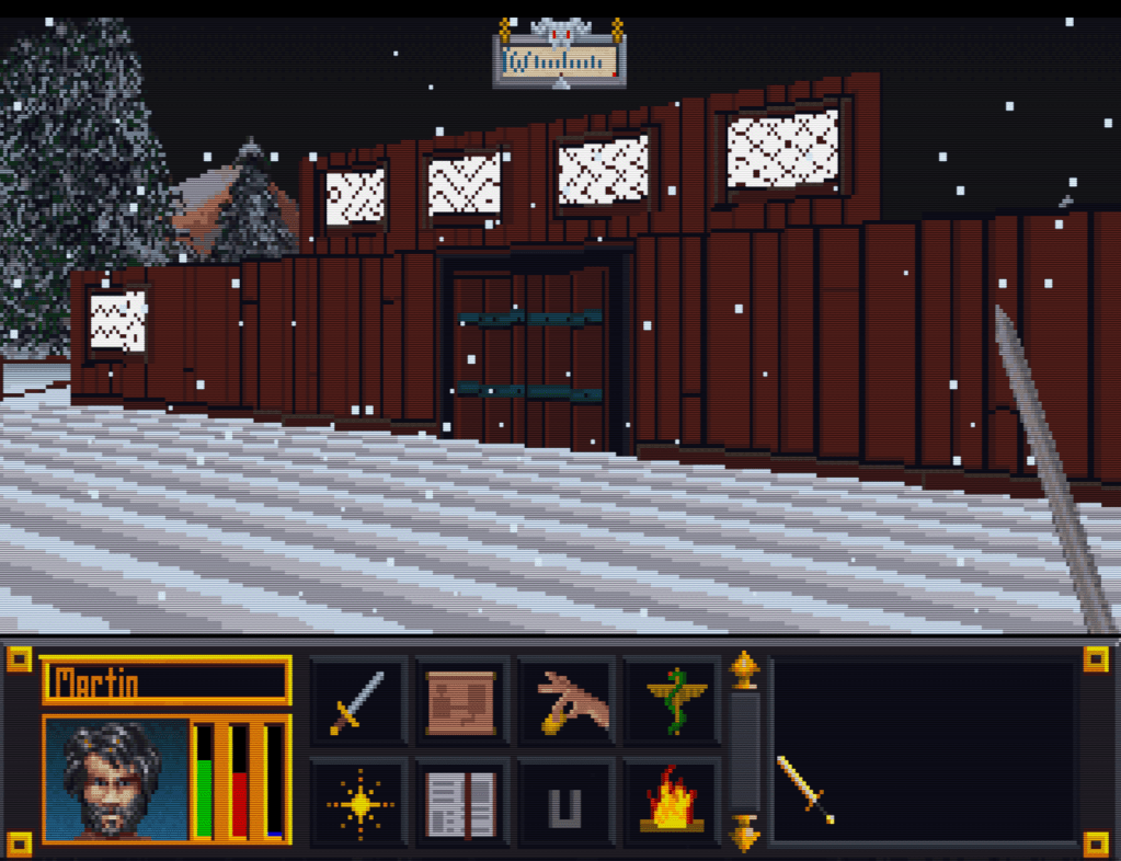
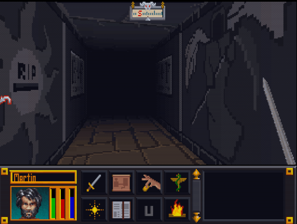
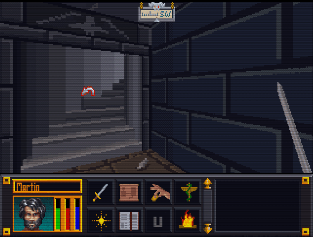
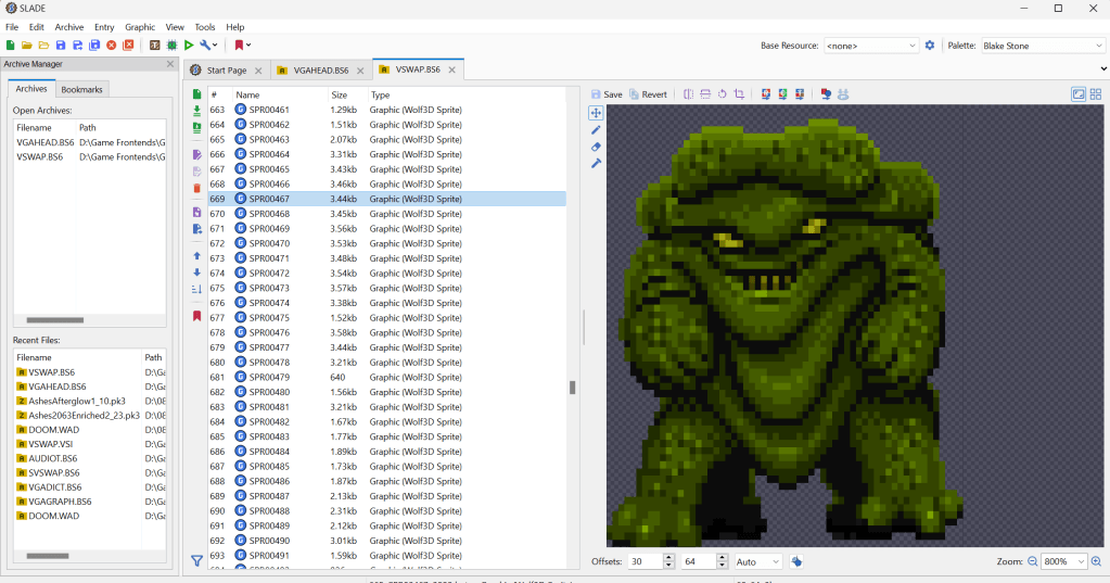
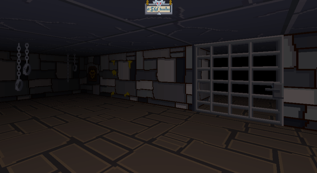
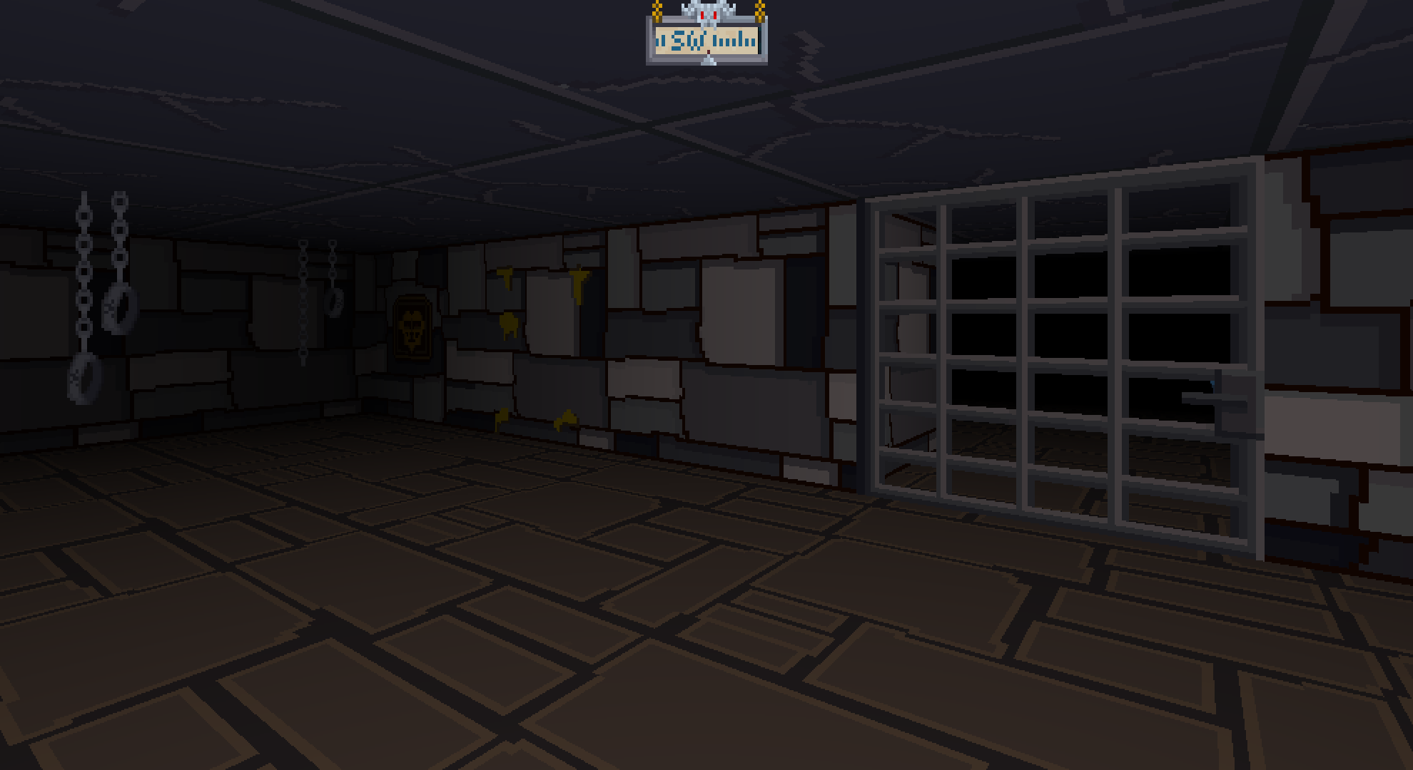
    I have been working on remastering the textures from Blakestone on and off for several years now, initially dumping and light upscaling them for ease of redesign. From there, I started hand drawing over the old textures adding detail and transforming a blurry pixel-y mess into what you see below.

    A key goal is to maintain the spirit of the original pixel art and only add detail that enhances or complements the composition.

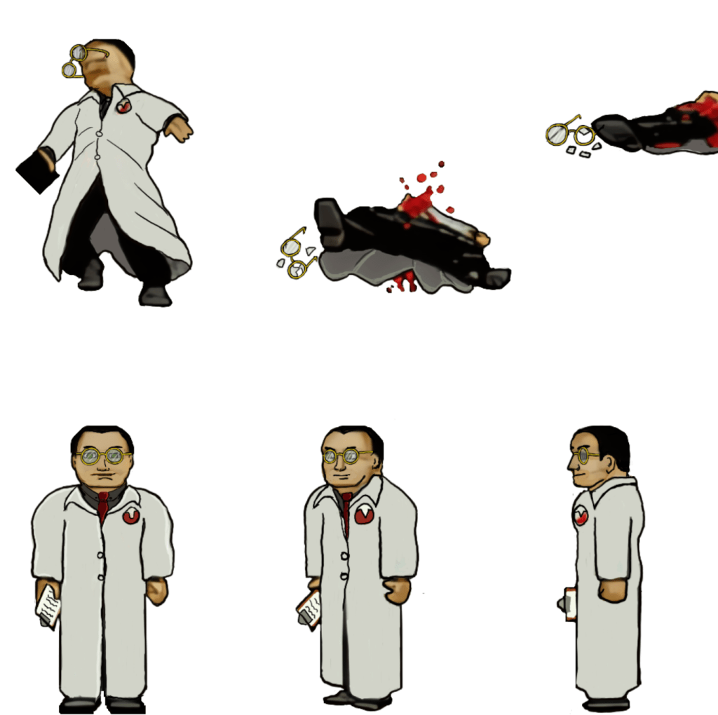
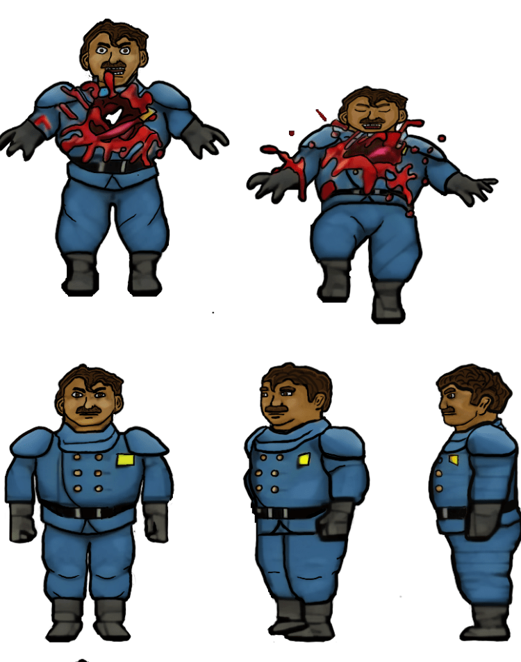
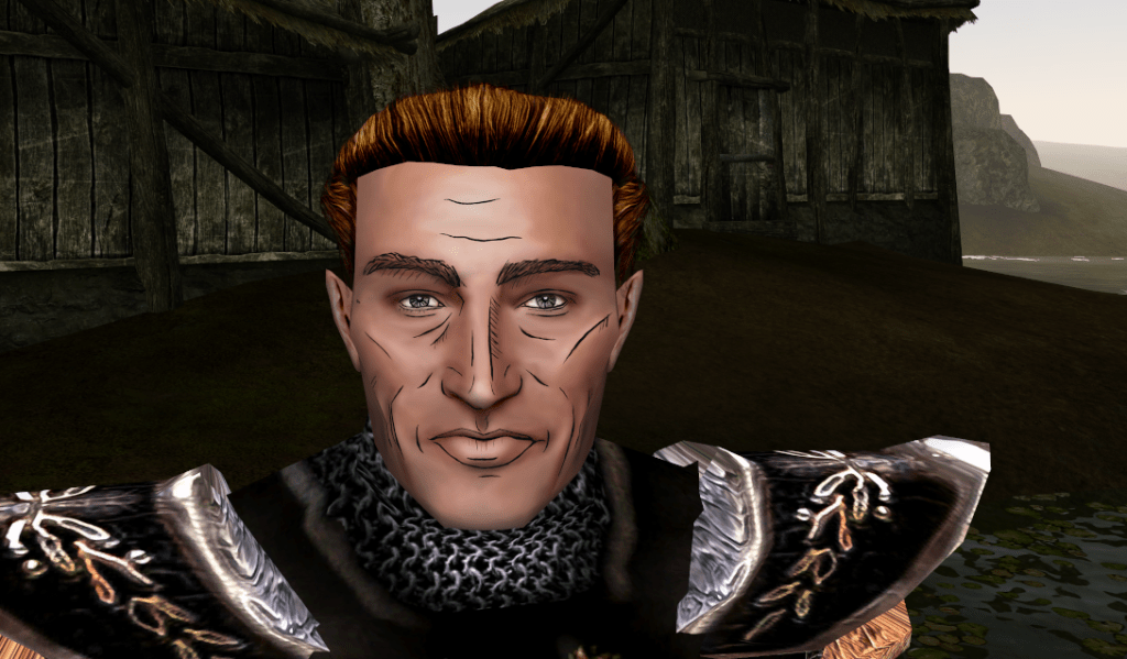
    The human NPCs are a pain in my rear

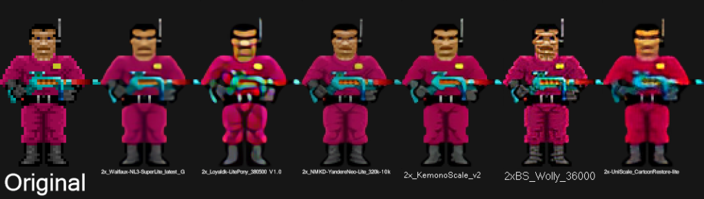
    Some of the images, such as above, are fairly straightforward and are easy to interpret for the new design. However, some of them aren’t the greatest in the original format or so low resolution that they require more creative effort to bring to life. The scientist’s face, for example, was a blobby mess that lacked defined detail in key places. I had to envision what the new one would look like and that too a lot of back and forth experimenting to get the vibe I wanted.

    Setbacks

    I do most of my work on my IPAD. I somehow corrupted a couple of my sprite sheets that I had already completed (but like a dummy hadn’t exported yet). That was about 150 completed textures (several of the monsters) of the thousand or so I’m redoing. It was a brutal motivation killer. I had to put the project aside for a while till the pain of it faded and I regained motivation.

    Now

    As with the TES Arena Depixelization Project (ADP), I’m slowing picking steam back up. I am also long overdue for a few sneak peaks. Please note, that these are still alpha. The combination of trying to keep the same shape and vibe of the amateurish looking originals and the fact that my versions are drawn on the IPAD “look” may seem slightly not ready for primetime (i.e., like a kids notebook drawings) but I have some post drawing steps to take to up the quality some more.

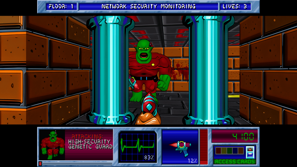
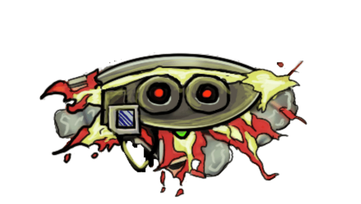
    SIDE NOTE: Some of these monsters are incredibly terribly designed. I wanted to change a few because of how childish they looked but decided to stick to the original version. So the goofy monsters are still goofy.

    Progress

    I have quite a bit done, most monsters have been completed or final designed. The initial security NPC is done, the scientist is 1/2 the way complete, but the other three are still pending. All miscellanceous textures are complete. The walls will be last but are the least difficult to fix.

    Enjoy

    Martin

  • ADP lives….yet again…well, technically it never died.

    THE RIGHT NOW

    Let’s just ignore the fact I haven’t posted in quite a bit (or that I started this project 13+ years ago). To be fair, I have released three other Arena mods in the meantime (more on that in the future).

    I recently started digging back into the Arena Depixelization Project (ADP), my graphics replacement mod for The Elderscrolls: The Arena, and I have been hitting it hard.

    I’m doing a recorded playthrough looking for missed art in the game and general quality control. This has led to me not only finishing missing textures but also tweaking (and sometimes overhauling) 90% of the work already done. I guess over 13 years of game art fiddling has matured my style slightly.

    THE SWAMP

    I first had to corral all my work over the last decade+. I had 7 different versions saved through the year and some files went missing so I had to extract them all compare and then pull any missing forward. This project was quite a mess (no file discipline at all, the shame). Then I had to relearn the tools, but that didn’t take too long. Then I created a new working directory and archived all the rest to clean up my sloppy work.

    In just 2 weeks, I have probably edited almost 100 textures already. As I record my playthrough, I save when a missing (or ugly/mismatch) texture is found and either fix it ASAP or catalog a bunch at once to do in a surge.

    GALLERY

    Here’s a slew of screenshots I made from the most recent version.

  • Blake Stone gets a glow up (PART 3)

    InGame

    Now the naming and image dimension issues have been resolved, so I loaded the game and it worked perfectly! Drunk with power, I ran a quick and dirty (i.e. impatient) bulk upscale on every texture just to get the payout of seeing that high resolution quality in gameplay. I wish I had a picture, but I don’t sorry. So you’ll just have to settle with one of my test pictures. The ultimate result of that initial effort was a messy, uneven upscale that wasn’t very good.

    WTF is upscaling?

    I’ll take this hot second to address this topic for those not in the know. One of the first “AI” booms was image upscaling using an algorithm model called ESRGAN (it stands for something, but no one cares). There are many models now, but that one paved the way. Note, when I say “AI”, that’s really just the media branding of this technology because the technical stuff is not as sexy. It (and most of the current AI stuff) is nothing more than highly sophisticated pattern recognition software. You teach it what 200 apples look like in low resolution and high resolution. It learns that when it sees a low resolution apple what the approximate of a high resolution apple might look like and gives you that. See how boring that already got….hence “AI”.

    I use a program called CUPSCALE, which is a frontend for the tech behind it. It allows bulk upscaling, supports most common image formats, and allows switching between different models. Best part, it will install all the needed files (python and all things related) for you, so it’s as close to plug and play as possible.

    Almost a mod?

    I spent many hours trying different combinations of upscale models. Finally, I settled on a workflow that best accomplished the cartoon look I wanted. I started with 1X upscales (meaning no change in size) just to clean up details. I focused on de-dithering, which was often used in old games and extremely low rez art, and sharpening detail a little, so colors weren’t bleeding as much (refocus model). Then I scaled it by 2X using 4XNickelBack model and reducing 50% afterwards. After much trial and error, I found this was the best option for Blake Stone art as it was the least destructive to the essence of the picture. After that I hit them with a couple rounds of a FSManga model to make them more cartoony, with a 50% resizing here and here. Ultimately, I ended up with game textures that were 6X the size of the originals that had a more cartoon appearance.

    UP NEXT TIME….A new mod is born!

    Part 4 will be about releasing my first full HD texture mod. But it doesn’t stop at Part 4 (wink wink).

    – Martin

  • “Extracting art from Blake Stone” is not a very funny title (Part 2)

    “Extracting art from Blake Stone” is not a very funny title (Part 2)

    Collecting Pixels

    Step one is figuring out how the game stores the art files (textures). Normally what I do is check for the largest files, as they are usually the texture and/or sound archive. However, with Blake Stone, I knew that this game used Wolfenstein 3d-style archives. Blake Stone’s format was slightly different and used the extension BS6. But it was close enough that Slade, a popular tool for actual Doom and Wolf3D games, worked perfectly to extract the files.

    FUN NOTE: I started this many months ago. I JUST noticed that BStone has a command-line option to extract textures. #facepalm #hashtags #DOH

    You may call me…”Tim…er… I mean SPRITE”

    The BStone program looks in the “aog” folder for any textures (Planet Stike has it’s own folder, “ps”). If it finds a texture there, it will use that texture instead of the original. Unfortunately, BStone only supports sprite and wall files. That means some elements can’t be replaced currently (mostly UI and cut scenes). For Blake Stone: Aliens of Gold, there are 1017 sprite and wall textures but there isn’t a folder structure. They all just go into that one folder which makes it easier to manage.

    I extracted all textures to a working folder and hit it with a quick and dirty upscale so I could check how it works in-game. After dumping them into the “aog” folder, I booted BStone and enabled “External Textures” in the option menu. It didn’t work. Turns out that the extracted files were names were very slightly misnamed when extracted (SPR instead of SPRITE, etc.). It was easy enough to fix with a utility called Bulk File Renamer. A quick touch up and I reloaded BStone to see if that fixed it.

    Stretching them on the rack (by rack I mean in Photoshop)

    It worked…sort of. The textures were definitely upscaled but many of them looked squished (skinnier than normal). Quick glance at the readme revealed that rendering of sprites was not 1 for 1 in-game.

    After a little experimenting, I realized that every texture just needed to be perfectly square. Maybe the extraction method was flawed, not sure. To fix it, I just made a quick macro on my Logitech keyboard (frequently my savior for repetitive tasks), dumped 100 or so textures on photoshop and ran the macro (it resized the canvases to be 64×64, saved and then closed the file). I just needed to hold down the macro button and let it work through each file. After finishing all 1017 textures, I saved a backup for the inevitable time I make a drastic mistake. (I will share the reformatted originals when I get around to doing Planet Strike)

    Up next time…..Version 1 of my Blake Stone HD texture mod

  • 2023 update…so…yeah..it’s been a smidge

    Peek-a-boo! I’m back and I have a ton of updates on the art side and just a few on the writing side. Lots of life changes slowed me down for a while. Though this might be a boring update, I’ve been gone long enough that it needs addressing. Sorry 😛

    THE WEBSITE

    It’s about time for an update to this website for 2023. Let’s hope I can make the next post before another 2 years pass. Though, I would like to transition to another web service eventually, but I’m not sure when that will happen. I need to figure out how I want to organize all the posts and what kind of menu it will have. I’ll keep this URL though. I kind of dig it 😉

    The idea is to make ArtInPinkerton.com the central hub for my various online activities and consolidate my nerdy world under one umbrella. Naturally, the key to “big plans” is the carry through and that can be the tricky part. A recent programming revelation has made me realize that the biggest barrier for me is the logistic preparations that have to take place before I get to do the thing I actually want to do. For example, I find WordPress clunky and the thought of having to wrangle it for when I write an entry often is enough to put me off.

    Right now, I want this website to highlight my various artistic endeavors and hobbies. Off the top of my head, that will include:

    1. Writing and stories
    2. My YouTube channel Martin Saves the Universe (video game play and modding)
    3. Painting and miniatures
    4. Boardgaming
    5. Podcast (Nerds and Normies, no longer active)
    6. Technology
    7. Other

  • I should punch myself in the face

    I should punch myself in the face

    256 color limitation

    One of the tricky aspect of working with Arena textures is that they are only 256 colors AND that color information is indexed from a palette file. That means the image doesn’t have the color info in the file, it has a reference point to a master color file (this saved valuable space in the old timey 3 1/2 floppy days). Colors in an image have to be one of those exact colors in the palette file. To work around this, I have been only using colors in whatever image I was working on. It worked, but it can limit in being creative. I did most of the project this way.

    Palette image

    DOH!

    Now, but a scant mere 9 years later, I realized to import the color palette in as a raw image similar to how I first did early in my hobby working on another project. Once imported, I could create a Photoshop swatch of all the working colors and boom. I’m blond, what can I say.

    Palette swatch

    More progress on actual files next update, although you can see a preview in the image above 🙂

    – Martin

  • Time to clean up the mess

    Time to clean up the mess

    Begin again

    So, I’ve finally got my stuff together, life has settled down, and the mojo to get back to my projects. I have a lot to post on other art projects I’ve done in the past (cough) couple years, but first, I figured I’d give an update on where I am with the Arena Depixelization Project. Yes, it’s still on.

    screenshot005

    Testing

    I have loaded up the textures into OpenTesArena. It allows very easy testing of levels without having to play the game. You can just select what level at the menu screen and load it. Right out the gate, I’m thrilled with the starter dungeon. No need to mess with that.

    screenshot003

    More testing

    However, the wall textures in the very next main quest dungeon are too jarring. So I have already toned them down for next iteration (not pictured below).

    screenshot000

    Then I skipped to the 3rd main quest dungeon and found these round blob walls that just don’t cut it. So next I will clean those up. My will systematically go through them all until there are sufficiently aesthetic pleasing (or tolerable) then I will release ADP 1.0.

    screenshot001

    Limitations of Arena

    There will be limitation right now, as the texture combination for some levels is very off. Maybe one day, OpenTesArena will allow us to edit the level files and add new textures. Then we’d be able to make matching or complimentary “tile sets” for each level, adding cohesion and variety overall. But, until then, this is what we got.

    – Martin

  • Shh…just sneaking in a post

    Shh…just sneaking in a post

    Took a self-imposed hiatus on personal hobbies (reading, modding, gaming, drawing, etc) until about fall of 2019. Real life is just very demanding right now and will let up by then.

    I have not, and will not abandon ADP.  It’s my fave little project. I know it’s been in the works for….ahem…many years, but I’m too close to not finish at least the base goal (of all walls, floors and surfaces).

    PLUS!!! if you haven’t heard, there is an open source project called OpenTesArena. It is fairly far along and you can find out more about it at https://github.com/afritz1/OpenTESArena or

    https://discord.gg/DgHe2jG.

    Although it won’t support hi-resolution textures out the gate, the author is considering mod support post 1.0. Hopefully at minimum, he supports a normal graphic file format. I have suggested a few things that would make graphics modding easier, so fingers crossed.

    Also, anyone looking for my other Arena mods…you can find them (and a few others) at

    https://www.nexusmods.com/tesarena?tab=popular+%28all+time%29

    – Martin

  • Wait, the city is built from a crashed plane?!

    Wait, the city is built from a crashed plane?!

    The A to the D to the P

    First up, I have been moving along nicely with the art for the Arena Depixelization Project (a name only a nerd could love). Not only have I got more new stuff done, I have been revamping the ones I don’t like as I go. I’m focusing on one location at a time in game and redoing all the wall/floor textures I find unfinished or that need a redo.

    Brownout 3

    I won’t post much on this for a while, but the previously unnamed but heavily hinted project is Fallout 3. Yes, another Bethesda game….what can I say. Oh yeah, I don’t have to say anything it’s my project so pbbbbtttt. Really, I tried playing Fallout 3 and like what I played but the artwork in the game is so (intentionally) degraded; it hides the games true potential. All they did was make super crappy textures and add a bunch of “noise” (dithering and random speckling) and a LOT OF BROWN.

    Fallout 3.2017-10-24.20.50.45.085
    Original heaping pile of…..muddy desaturated textures

    Cellout implies the wrong message

    I know what you’re saying “I sure wish he would give it a cartoony makeover”…. ME TOO! See great minds think alike. In reality, I’m using it to perfect my take on the Borderland (game for the computer) cell shading style. While inspired from that game, my style deviates in many small ways from it (besides my not truly knowing how they did it).

    Fallout 3.2017-10-16.23.10.15.440
    When I was feeling out how I wanted the style to look

    So much brown

    It really struck home when no one realized that Megaton (the first city you reach in the game) was built with pieces of a plane. There are pieces all over but the textures were so bad, you never realized that you were walking on pieces of a wing or that the shed above was part of a fuselage. Oddly enough, despite inspiring to make this a full project, I really not happy with how the jet pieces turned out and plan to eventually redo them.  I used them to learn how textures in FO3 worked and struggled to figure out the strange multiple way alpha maps were used along with normal maps. For the longest, I couldn’t get them to be selectively reflective of light. They were all shiny or no shiny at all, regardless of light. I worked it out (more when I actually talk about the project).

    It just needs a good scrubbing

    Ultimately, I want to remove the noise, define the textures better, add visual interest and color: all while trying to maintain the feel of a world in decay. I still haven’t honed the process down completely, but I am learning and pushing my developing Photoshop skills to the limit (TAKE IT…TO THE LIMIT…ONE MORE TIME). I want to perfect them before I return to my favorite game of all time, Morrowind. Oh yes, I’m not done with you yet, sweet Morrowind (too creepy?). Here are some more before and afters (note: some are still early prototypes or have already been reworked to be smoother and cleaner):

    I’m gonna focus on ADP for now and honestly, this Fallout 3 project is going to take years since I’m just working on it sporadically until I have enough free time to hit it hard.

    – Martin

  • Previously, on ArtInPinkerton Blog (dun dun!)

    Previously, on ArtInPinkerton Blog (dun dun!)

    Pixels so sharp they will cut you

    For anyone who reads this blog (all 3 of you), it’s no secret that I favor a more cartoonish and abstract style when editing game artwork. With the Arena Depixelization Project (ADP), this was mostly a necessity since I was looking at simplifying images because of the extremely low resolution and terrible graininess (grain E ness?).

    Textures so muddy, they have to take their shoes before coming inside

    However, with Morrowind, it was more of a desire to undrab (not even a real word, I’m pretty sure) it some. The individuals textures were unimpressive but all together they worked (for back in 120 A.D. when it was created). With my early experiments, I used the cartoon method to add interest to the individual textures, but it was crude.

    “You know my name is Simon and the things I draw come true”

    From here, I had a detour with a little experiment. For all the games I work on, I have a soft spot. Darkstone was one such game. Its low resolution blurry textures begged for me to edit them. It was a challenge just figuring out how to access them and understand the file structure: there are odd duplicates, art sheets (many art assets on one texture), and strange encryption. I wanted to create a chalk-like art style. It was a side diversion and never meant to be a full project, though. I really liked the results, though.

    STOP CHANGING THE DAMN FORMAT ALREADY!

    I had very little experience back then, and it was before Borderlands captured what I desired so well (ICE CREAM…wait no…CELL SHADING!). So I switched to working on Minecraft for my sons. I finished not only the main game but several of the most popular modification. However, Mohjang (the makers of Minecraft) changed the texture format and naming several times over the duration I was working on it; breaking my texture pack (Grrrrr!) more than once. I never released it as by the time they completed it, they had added so much more that I hadn’t done. However, it gave me time to work on learning the graphics software (GIMP…not the one from Pulp Fiction).

    But the name almost begged it!

    I’m not sure how I started working on it, but the next project I worked was Torchlight. I think I had just wanted to see if I could do it. During this phase, I dedicated quite some time experimenting with different styles and the software. Eventually, it turned into a full-blown project which I called “Toonlight”…I am so clever…so damn clever. Looking back, I think I lamented how little the backgrounds “popped” and though I could smooth and outline them to make them defined. My biggest failing on it (beside the wee-bit of amateurish work…cough cough) was that I was so focused on the individual textures, that I didn’t account for the whole picture and scene. So much detailed “polluted” the screen. This is relevant for when I get to my newest endeavor. Toonlight was never finished (I had illusions it might be). I didn’t like the results on a game level and didn’t want to start over. The creatures looked nice, though.

    Nailed it….

    Then came Borderlands. It perfectly encapsulated what I was going for. I loved the art style and now I had an inspiration to study and evolve my style. It was here I learned about rim lighting (making dark lines pop with a lighter line near it) and ways to make larger blank areas look less dull (hint: random lines and squiggles).  I didn’t try it for some time as I was working on finalizing ADP (which is….sigh…not done yet). When I finally took a break, I experimented with Morrowind again…this time on the faces; trying to capture that Borderlands style. Ultimately, I realized that my style was Borderlands-inspired but had my flavor added.

    Brown…so much grainy awful pixel-y brown

    I finally had enough experience to move forward. I had a few other side projects not “cartoon” style related (such as the FATE mod..so I can have all that crunchy 4K resolution…mmmmm tasty). Moving on, I had just the project in mind to hone those skills even further and put them to the test. Eventually, I’ll return to Morrowind and complete a full artwork overhaul once I’m done.

    By then, I should have most of my style and workflow on lock (see I’m cool…I said “on lock”…like a boss). More coming next post……. (oohhhhhh a teaser…what can it be…).

    Martin