Two more textures in timelapse. One very easy and the other still easy but a little more work.
– Martin
Two more textures in timelapse. One very easy and the other still easy but a little more work.
– Martin
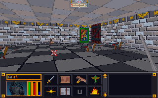
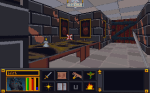
Interior doors
Last week when I was lacking of motivation to work on the walls sets, I decided to fiddle with the interior doors and more specifically the wooden doors. Those are the ones that connect rooms and hallways and not ones leading out of buildings or dungeons. These particular doors are one single texture that is a door (the entry exit ones have borders that match the interior walls). That door occupies one square of dungeon space (all dungeons are square chunks of one texture). While in-game it appears that there are only two or three different wood door textures, there are actually over a dozen. It’s just that there are only 3 different textures among them. Here’s a sample of one image among multiple IMG files:


5 Doors don’t have to equal 1
What I don’t understand is why Bethesda used multiple files with the same IMG when space and memory was a concern back then. They could have easily used one file through the INF files (the ones that decide what textures to use on each level). However, this does give me an opportunity to add some variation to the ingame art. As such, as with walls and etc., I will make each door appearance different.


Color balancing
After wandering around in the game, I started feeling a need to go back and tweak some textures. I was just not happy with some of the combinations. Sometimes it’s just best to strike while the inspiration is strong. So I have spent quite a bit of time adjusting colors, cleaning up some of my more “questionable” decisions, and generally making them all play a little better together. I especially tried to tone down the floors and ceiling so they don’t clash or draw away from the walls. Some of the texture combos are much easier on the eyes now. For some of them, I removed the splotches or other weird marks that I had left to stay close to the original…the resolution/texture sizes are just to low to be that craz…er creative.
Breaking away
I have stopped trying to adhere strictly to the source material in interest of keeping the textures unique and fun. Additionally, I plan to add some “detail” to the wall sets that are just a group of plain walls (e.g. a small object on the wall). I want each wall image in a set to be unique but I’ll be sure to keep unadorned walls too to balance the aesthetics.


Ingame appearance
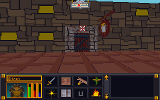
As I have worked on several games, I have noticed various oddities. I have covered one before: unused assets. However, there are a few others. In the game TES:Arena, most SET files are reserved either for walls or for floors. The exception is this one:

Which gives us the below separate ingame dungeons:

So far, it’s the only SET file to do that. Not sure what happened or why it’s like that. The main challenge with is that while I liked it on the floor against the dark walls, I don’t care for it as a wall texture. I’ll have to go back and tweak/balance it later. In theory, with further modding of the INF files (they determine which art files each level uses), it can be made so that a different file is used but I’m not inclined at this time to do that.
Ummm…what
Right off the bat, I’ll admit that my “working” copy of TES:Arena has been in use since I first started this project (several years now). It is now a Frankenstein-mess of my experiments. I expanded that executable file with an ancient program, expanded all the resource files, installed “WinArena” over top, fiddled with the INFs, etc. So I don’t know if the weird things I see in the game are my fault or not (easily enough to verify but I don’t really care that much).

I even had a very odd problem of an Imperial City textures completely changing from one style to another. I just walked into a mages guild and came out to a completely different looking city. I wished I had made a video of that weirdness.
-Martin
Wandering the land
I spent some time this week searching in-game for textures yet to be done using a pre-edited overpowered save file so I could roam unimpeded. I looked for dungeons, cities, wilderness, etc. that hadn’t yet been retextured. The side effect to this is that I found places where the textures WERE done but I had never seen them in-game or at least not in combination with other textures. From this I learned that some textures don’t work as well in-game as I hoped.
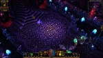
Proud Poppa
However, there are many that I feel are just right (or close enough for me to be happy). These I feel keep a unique appearance AND work well not only for their intended purpose but also with other textures. For example:


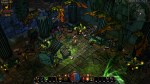
Avert your eyes
Of course, they all can’t be winners. I expected that I would have to go back and tweak later, but some textures combos were just horrible. To be fair to myself, I had two limitations: one, I was trying to make each texture unique and two, some textures were awful to begin with (one of the mage guild textures is a complete mess). These will be easy to tweak up though as all the hard work is already done.


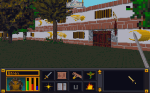
Dirty walls and floors
I have starting tackling some of the vague pixelly mess of some wall and floor textures that I have been avoiding. The limitations on resolution and colors will probably force me to deviate from “source” more than I care but it can’t be avoided. There are so many in the DW series alone (A through S). The reason I started looking for textures in-game was so I could see the context in which the textures were being used.


– Martin
Several years ago when I first started messing around with computer graphic art, I tested out visual concepts on a PC game called Morrowind (the third in the Elder Scrolls series that Arena started) . Although Morrowind was where I tested the waters, it was another game called Torchlight that became the focus of my first big project I “cleverly” decided to call Toonlight. Initially, I tried to change the art assets in bulk by using the various filters built into the GIMP software. However, while the end results were interesting, I didn’t find them very pleasing aesthetically.

So I took those results and experimented a little more by testing different tweaks and changes. Eventually, I narrowed down the look I wanted to pursue. Since I found the game art interesting but bland, I decided my goal would be to make it more vibrant and add cell-shading style lines. Surprise, Surprise 😉 I just felt that the WOW-esque muted coloring made the environment less interesting, washed out and a lot of detail. So I started adding “black outlines” and redoing each texture by hand. Then I would test them in-game. Each art set for the various types of levels were already separated into individual folders labeled “levelsets”, so I worked my way from one levelset to another. I was even close enough to completion that I thought I could beat Torchlight 2 being released. I had reworked almost all the level artwork and many of the monsters and props. However, I was in the midst of moving and my motivation waivered and the mod drifted down the priority list.


Recently, when I started recollecting all my data from various hard drives (including 2 that were on their deathbed, CDRs and memory sticks, I discovered my art files for Toonlight and my other “on hold” mod, Darktone, were missing and the only thing left was a very early version of my Toonlight mod. Although this is a tragedy for most, I had learned so much from working on that project (and had so much fun) that I don’t consider the time wasted. On top of that, upon further review, I found myself not overly satisfied with the few levels I did recover. The initial mine levelset now seems too sloppy for my tastes, the crypts are a little too green and non-descript in a few areas, and the sunken temples levels are a TOO busy. Only the lava level still pleases me but some of it didn’t get recovered. I’m still searching for them but worse case scenario, I have enough recovered to springboard myself back into the project. With that said, I’m focused on my Arena mod. Once I have gotten as far as possible, I will resume my other projects.

So where does that leave me…same as before. I still plan on completing it. One aspect all my art mods have in common (except Minecraft) is that they are older games that I’m doing for my personal enjoyment. I don’t feel the need to adhere to a timetable before the games become “irrevelant”. Arena was released over 20 years ago!
Here is the before and after for the in-game menu. I probably should have shown it more clearly in the last post (and the video). Overall, I’m very pleased with it.
– Martin

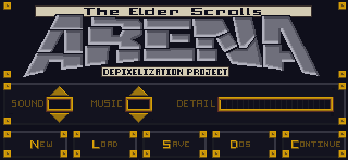
In-game menu
I’ve held off on doing the in-game menu because I didn’t feel the necessary inspiration to tackle it yet. For me that texture is the face of the game; the one the player sees most often and serves as a sort of “anchor” for the player. Another factor may have been that I knew I would end up spending several hours on it to get it just right. Going in, I knew I wanted to keep the ARENA word at the top in roughly the same shape but with a much cleaner design and that it needed to be similar to the HUD on the main screen. That covered most of the core design and all I was lacking was gumption.
Once I finally found the urge to tackle it, it didn’t take long for my mojo to kick in. I knew that although I only had 75% of the design mapped out in my head, the other 25% would either come to me while I was editing or result from trial and error (that’s my favorite part anyways). Although I sped this video up twice as fast as the last one, you can still see spots where I paused to consider how to continue and where I changed my mind or adjusted on the fly (very evident with the Save, Load, Quit buttons on the bottom). In the end, I even found room for the project name!
Shapes
I try to stick to colors pulled from the original image. This eliminates any guesswork on making sure the colors match the palette file (really only important for older games that use palette files). Once I have a rough idea of what colors to use, I try and gauge what I want the new image to look like. For bricks and stone, I’ll usually try to draw inspiration from what I start with. In that I mean that I will try and mimic the rough shape and design of the original. I do try and give each set of images as unique an appearance as possible while being aesthetically pleasing.
Video
Since one of my main motivators for creating this website was to chronicle my artistic endeavors, I decided to make some time-lapse videos to highlight the process. The first one below demonstrates what I’m talking about for “easy” textures.
Points of interest
A couple of things to point out from the video:
1. I outlined the shapes ahead of time to create a frame when I colored in the shapes.
2. I colored in one image in the SET file to get a good feel of the colors and general appearance that I’m going for.
3. I do a lot of on-the-fly tweaking (and sometimes overhauling). Sometimes what I end up with is nothing like what I started with.
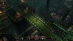
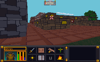
4. I have to check the image in the game in order to see if there are any issues AND to make the final decision on whether I like it or not. In this case, I ended up changing several of the other textures because I didn’t like how they looked. Note in the image below that the city wall and road are different (and in my opinion better) than in the video.

Arena Depixelation Project (ADP)
I made a lot of progress on the SET files and a few of the image files. However, I have decided to not count the files as often so as not to distract from getting work done. The Surface Pro has really allowed me to capitalize on downtime away from the main computer. So when I just want to sit with the family while they watch a show, I can work on more art files for the game. I’m trying to complete most of the simpler defined (and geometric) sets first since they require less “artistic license” to complete but every now and then I tackle a more difficult one (e.g. sand, gravel, swirly designs, etc.)

Bookshelf
So far the most involved SET file has been the bookshelf ( actually 4 bookshelves in one SET). The original was awfully blurred and visually unappealing all around up close. It’s one of the more obvious examples of artwork that was created at a higher resolution and then downsized (sampled?) to fit the game engines format and palette. I have been working on it on and off between other images for 2 weeks now and have finally finished. As with all my textures, I hope to retain some of the character while “cleaning” up the image or adding a more artistic appeal (you’ll need to click on the photos for a better view of the difference).


